Friday, 13 September 2013

Six interesting graphs from yesterday's Monetary Policy Statement

I know, you don't need another description of the monetary policy decision, or analysis of whether it's right or wrong, and you're not going to get one. Instead here are some graphs from the Monetary Policy Statement which I thought were interesting insights into how our economy is behaving.
Here's the first one.


I've seen similar pictures over the years, and every time I do, it bothers me. Look at that 'Non-tradables' inflation line. There's a stubborn structural persistence to our domestically-generated inflation: indeed, on the RBNZ's projections, domestically generated inflation will be running at around 3-4% a year from 2014 onwards. I appreciate that a lot of the non-tradables sectors don't benefit from the large productivity gains that can occur in some of the tradable sectors (eg much more bang for your buck across all sorts of ICT and electronic gear) and which helps keep tradables inflation lower than non-tradables inflation. But you'd still wonder if there isn't a slab of the domestic economy that still feels it can jack up prices with ease, unconstrained by competition.

Here's the second one.


If the first graph left you wondering about some structural rigidities in the New Zealand economy, this one gives you more optimism about flexibility. Real wages are clearly flexible, and track the cycle closely, slowing when there's excess capacity (i.e. on the graph when the output gap is in negative territory) and picking up in better times.

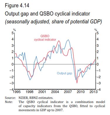
Here's the third one.


The point here is to show how useful business opinion surveys are (something I've noted before, here and here). On their surface they look very simple tools - asking businesspeople generally qualitative questions, and graphing the net balances that result (eg percentage optimistic less percentage pessimistic). And yet they systematically generate highly reliable and (I would argue) sophisticated insights into the cycle. In the graph, you've got the RBNZ's measure of the output gap, which is derived from some very fancy econometrics, and you've also got what the RBNZ calls the 'QSBO cyclical indicator', which is a combination of various capacity readings from the NZIER's Quarterly Survey of Business Opinion. In the end, they turn out to be virtually identical. The yes/no/maybe answers turn out to be just as accurate as the heavy duty econometrics.

Here's the fourth one.


This, I thought, was a nice way to illustrate the supply/demand dynamics in the Auckland housing market. The red line is the ratio of house sales to house listings, and (obviously enough) it rises when houses are selling faster than the stock of listings is, i.e. demand is growing faster than supply. And, as you'd expect, there's a strong link between this demand/supply indicator and house prices.

Here's the fifth one.


'PLT' means 'Permanent and Long-Term' migration of New Zealand citizens. And it shows some interesting patterns - we're still, net, losing people to Australia, but it's down from around 10,000 people a quarter in 2011 to more like 6,000 people a quarter now, as both fewer people are leaving and more people are coming back. And in turn that reflects (as the RB pointed out) a cyclical upswing here and a cyclical slowdown over there. More generally it shows the progressive integration of our two economies and the ability of people to make shrewd assessments of the two labour markets.

And finally there's this.


It shows the amount of earthquake reconstruction the RB expects, as a percentage of GDP. That's interesting in itself, but what's somewhat worrying me is the proportion of total GDP growth it represents. Over 2014-16 the RB expects GDP growth to average 2.6% a year: over the same period the rebuild is worth about 1.6% of GDP a year. That means the rest of the economy isn't doing much at all. Maybe all this is saying is that the economy has a short-run capacity constraint: we can rebuild Canterbury, and we can do a bit more of other stuff, and that's it. Fair enough, but I wonder if this graph leaves you with the same niggling thought it's left with me: absent the rebuild, what sort of longer-term growth rate is the economy capable of sustaining?

Thursday, 12 September 2013

What will fast broadband mean for you?

As my previous post on the latest developments in broadband pricing noted (and which, somewhat to my surprise, generated an unusually large number of page views), there is quite a range of opinion in the marketplace about the potential benefits of our new Ultra Fast Broadband (UFB) fibre network.

Some folks reckon that the potential economic and social benefits are so large that everything possible needs to be done to get the fibre rolled out ubiquitously and quickly, and that policies should be aimed to maximise early and extensive uptake of the new fibre-based broadband. They also point to the potential for strong network effects - the more people sign up, and the quicker, the more each one benefits from the presence of many others.

Others range from agnostic - broadband could well pay off, but it's uncertain what the payoffs will be or in what areas - through to the sceptical: the costs are high, whereas the benefits are arguably limited and distant.

It never hurts to have some evidence when you've got debates like these, and I've just come across a brand new study that's attempted to estimate what the payoffs might be to households from the likes of UFB. I haven't seen much coverage of it in New Zealand, so I thought I'd draw people's attention to it. It was done for Australia's Department of Broadband, Communications and the Digital Economy by Deloitte Access Economics. You can download it from Deloitte's site.

Here's the guts of the thing. Access Economics found that the benefits to the average Australian household, in today's money, would be worth about A$3,800 a year in 2020. This was on the assumption, by the way, that the Aussie version of our UFB, the NBN (the National Broadband Network), would be rolled out as the outgoing Labor government planned, with fibre all the way to your home, rather than (as the incoming Coalition government prefers as a cheaper option) fibre 'to the node', i.e. to a cabinet in your street, with a copper connection from there to your home.


Access found that roughly two-thirds of the benefit (A$2,400) would be money in your hand, one way or another, and the other third is their estimate of the implicit money value of things like time saved travelling. Around half of the total A$3,800 comes in that 'Productivity > Lower prices, better quality' line. This, Access say, "is made up of price reductions, improvements in quality, changes in wages, and higher profits from businesses they own". In turn those higher wages and profits come from an assumed economy-wide 1.1% of GDP productivity gain from the NBN, which in turn is consistent with the results from a study done for the World Bank on the 'Economic Impacts of Broadband'.

Access reproduce a key finding from that research, which I've also shown below.


Access commented that "The Qiang analysis [shown above] found that the economic impact of each ICT innovation was larger than all those previously...and that differences in broadband penetration among countries may generate long-run gains to overall economic growth for those that are
early adopters".

The Access study also breaks out (in Chapter 3) some detailed illustrations of how NBN/UFB would affect households of different kinds. They find that the benefits vary very widely from one set of family circumstances to another, and that there is "some evidence that the scenarios with greater impacts are where households face difficult circumstances, such as needing to find employment, move residence or where additional education is of significant benefit. This could suggest that broadband has the potential to play a role in improving opportunities for those in society facing disadvantage".

What should we make of this?

I suspect that I'm in the same place as many of you: I don't know (yet, and maybe never) what the payoffs from UFB might be, or whether they're worth the multi-billion-dollar gamble. As I've suggested before, there are times when I think it's worth rolling the dice, even when the stakes are large and speculative, and UFB could well be one of those times, and I also think that UFB or the like is going to be the stake you have to put on the table to play at being internationally competitive. I'm probably somewhere on the upbeat side of UFB-agnostic, and to that extent this latest research sits comfortably with that kind of view.

All that said, obviously one bit of research is far from the last word on anything. That's not to dismiss it. It's a solid-looking effort: I trekked through the various assumptions and calculations they made, and they look reasonably well-grounded to me (though if some kind reader can make a better fist of putting plainer English around their 'elasticity of substitution' line of reasoning than they have, I'd like to hear from you). And it likely leads you to think more about the upside aspects of UFB, though even if you conclude, "UFB is a corker of a plan", that still leaves you with some tricky policy issues about both copper and fibre.

In any event, it's got to go into the pot with whatever other evidence comes to hand. My plan from here is to post more good research on UFB and see where the results take us.

Incidentally, and I appreciate it's somewhat off-topic, this Access Economics research illustrates one of the core strengths of economics. Economics (particularly macroeconomics) and economists have to some extent become an easy target for post-GFC activists looking to substitute their approach (typically non-market) for ours. But when a government comes to place a couple of billion dollars bet on the likes of a UFB, it's worth noting that we still have the analytical tools and quantitative skills to help throw light on the bigger policy issues of the day.

Wednesday, 11 September 2013

The new Merger and Acquisition Guidelines

Last night we had the latest Law and Economics Association of New Zealand (LEANZ) event in Auckland, where a decent sized crowd came along to hear an explanation of the Commerce Commission's updated Mergers and Acquisitions and Authorisations Guidelines, presented by two of the Commission's senior staff, David Blacktop, Principal Counsel Competition, and Lilla Csorgo, Chief Economist Competition.

In the event the evening focussed very much on the M&A Guidelines. The previous ones came out in 2003, so it was timely for the Commission to have another look. Both the law and the economics have evolved since then, and the Commission has accumulated another decade's worth of practical experience with mergers: it was also an opportunity to take soundings from professional M&A advisers (there had been an earlier consultation round on a draft version of the guidelines).
You can read the Commission's summary here, and here's the link to the full text. If you're already reasonably familiar with the M&A landscape, then the bit of the Guidelines you'll want to focus on is the Chair's Introduction (pp5-6) where the substantive changes and the rationale for them are laid out.

Most of the changes came up one way or another in the presentation or in Q&A and discussion afterwards.

The former "safe harbours" terminology is gone, replaced by "concentration ratios", partly to avoid giving people a false degree of certainty that their merger is "okay" (market shares below the thresholds could still be problematic, market shares above them aren't necessarily the end of the world), and partly to deter gamesplaying, where it is tempting for merger parties to find market share numbers that squeak under the thresholds.

"Counterfactual" is gone, too, as a matter of terminology. Apparently the change was not without internal staff controversy: personally I'm glad to see the back of it. "Without the merger" is now the preferred description - good thing too, simpler and clearer. And the Guidelines now explain the "with the merger" and "without the merger" comparison in the light of The Warehouse cases.

"Barriers to entry" have had a makeover as well, but more substantively. "This change reflects the courts’ own move away from the language of ‘barriers’ to entry and expansion to the term ‘conditions’ – a more expansive concept", says the Chair's Intro, referencing the Air New Zealand/Qantas and NZ Bus cases. So now it's "conditions of entry" when it comes to applying the LET test for entry or expansion post-merger.

I'd add that it's not just the courts moving along, it's economics. I used to lean towards a Stigler approach to barriers to entry, but I had my mind changed for me by Dennis Carlton's paper, "Why Barriers to Entry are Barriers to Understanding".

Same applies to another change, on market definition. "New Zealand courts have reiterated that market definition is a tool to aid in competition analysis, rather than an end in itself. We have adopted this approach in these guidelines. In particular we have moved away from defining markets as a first step in the analysis and recognise that relevant markets need not always be defined precisely", again from the Chair's Intro. I appreciate that for the Commission, what the New Zealand courts say, goes, and in a way it doesn't matter a hoot where overseas regulators or economists have got to with market definition in merger cases, but the reality is that the New Zealand courts are only part of a global evolution in thinking on the matter.

It's been somewhat controversial, all the same. I know, for myself, that when I was involved in these merger decisions, issues only properly started to come into focus when some sort of provisional market definition had been adopted, so my instinct would have been not to stray too far towards a lesser role for market definition early in the piece. I certainly agree it didn't have to be too precise early on, but it gave you a framework to start with. In any event, wherever you might stand on that issue, the reality is that you're still going through the same exercise of identifying the competitive constraints on the merging parties.

There was an interesting question from the audience on whether the Commission will be using the Upward Pricing Pressure test. You may have seen this idea already - AUT's Lydia Cheung gave a paper on it at this year's NZAE conference - but if you haven't come across the idea before, here's a terrific video from MIT's Richard Schmalensee which explains it. The short answer was, no: the test may be a useful screening device to explore whether there are issues with a merger, but in a relatively small, interconnected economy like ours there are probably more direct ways of figuring out how close a substitute one product or company may be for another.

Another very productive evening from LEANZ - well done to David and Lilla, who are excellent speakers, and special thanks to Russell McVeagh, who hosted the event and put on drinks and nibbles afterwards.

Sunday, 8 September 2013

The latest on the price of your broadband

Once upon a time, you were looking at the prospect of cheaper copper-based broadband. And then you had the prospect snatched away. By your own government, no less, though the government says it's in your own best interest to have that nasty cheap copper price taken away.

Hmm.

Never mind: quick recap of how we got where we are, and then, more importantly, the latest twists and turns in the plot (there've been quite a few).

The Commerce Commission was proposing new, lower, prices for your internet service provider (ISP) to have access to the copper telco infrastructure. The price your provider will pay, the Commission said, is going to drop from $44.98 a month to $32.45 a month. That's because the component to pay for hiring the electronic equipment that handles the data traffic ($21.46) is going to drop to $8.93.

Like hell it is, was the government's response (which I wrote about here). Make the copper price at least $37.50 (where it won't be cheaper than the new fibre-based UFB infrastructure we're spending billions on), the government said, or else we'll set it there ourselves.

So here's what's happened in the past few weeks.

First, the Commission came out on August 13 with an update paper on how it might set that equipment price ('UBA' in the jargon). You can read the media release or, for true policy tragics, you can read the full paper and some supplementary expert economic advice that the Commission had got on the topic from Boston University's Ingo Vogelsang.

There were basically two key points.

First, the Commission has revised its proposed UBA price from its original $8.93 a month to $9.91 a month. In both cases, the proposed price had come from averaging the equivalent Danish and Swedish prices for a UBA service (these were the only countries found to have costed the thing the way we would, if we were to do a full cost-modelling exercise). The revision came about for all sorts of reasons - updated local costs at the Danish and Swedish ends, updated exchange rates, fixing a mistake in the Danish data, and pricing an average-data-speed service rather than a low-data-speed one - but the upshot is that the proposed price difference between cheaper copper and dearer fibre has narrowed by nearly a dollar. While this adventitiously defuses some of the government's wrath, it still leaves copper (now $33.43 rather than $32.45) cheaper than fibre ($37.50).

Second, the Commission said it was thinking of picking a higher price than the simple average of the Danish and Swedish prices.

Reasons?

Sweden is arguably more like us than Denmark is, so the Swedish price ($10.92) could well be a closer sighting shot on our likely UBA costs than the Danish price ($8.91).

Plus (as has happened in previous determinations, including ones I sat in on) it may be better from a dynamic efficiency point of view to err on the side of a higher price than a lower one. Yes, there would be a higher cost, and arguably for quite a long time for quite a lot of people, from setting the copper price on the higher side, but on the other hand  "this cost needs to be weighed against the benefits of accelerated migration [onto the fibre network] in bringing forward services dependant on UFB take-up. Thus over time we would expect the value of the additional capabilities of fibre to grow and benefits to end-users to accrue, offsetting the welfare costs of accelerated migration" (para 141 of the paper).

But in leaning towards a higher UBA price for these sorts of reasons (and this is where it gets hairier) the Commission also floated the possibility that its final word on the UBA price might be even higher than the Swedish price.

Come again?

The rationale, as I read it, is that there is (hypothetically) a whole range of UBA cost estimates out there, but we've only been able to corral two of them. And if there's this range, then arguably it extends above the Swedish price. For example (the Commission says), Denmark is $9 (roughly). Sweden is $11 (roughly). These are $2 apart. It's arguable, then, that there could be another price which would also be $2 away from the Swedish price, namely $13. Now you've got a range of $9 to $13. And if you want to pitch your UBA price towards the higher end of that hypothetical range, say at the 75% percentile, it could well come out above the Swedish price.

Well now. You've only got two data points, and yet you're somehow going to arrive not only at a range around and beyond them, but also at a probability distribution for that range. As Captain Jack Sparrow might have put it, that's interesting. That's very interesting.

In any event, the Commission said to everyone involved, get back to us by close of play September 3, and tell us what you think of all of this.

People did. I've read their submissions (they're here, if you 'expand' the documents under 'Submissions on UBA price review update paper'). Here's what I make of them. I've kept to the bigger pricing issues that people raised.

Chorus was somewhat sympathetic to the various tight corners the Commission finds itself in - trying to figure out where the best interests of consumers lie when you have a legacy copper network and a new fibre network coexisting and interacting with each other in complex ways, and having not a lot of guidance from overseas data to help you with the job - and liked that the Commission appeared to be leaning towards making fibre more of a goer quicker (as in that bit I quoted above).

But it also bowled the Commission's idea of trying to create a whole frequency distribution on the basis of two data points.You might well have guessed, intuitively, that the exercise was a non-starter, and you'd have been right. Chorus's statistics wizards - Neil Diamond of Esquant Statistical Consulting and Daniel Young from Competition Economists' Group (CEG) - concluded that "The two observations sourced by the Commission do not provide any basis to inform the shape of the underlying distribution of forward-looking UBA costs.  Nor do we understand there to be any other basis upon which to speculate on the shape of this distribution.  On this basis, we do not believe that a statistically robust estimate of the 75th percentile of this distribution can be estimated".

Chorus restated that its preferred way of getting past the two data points problem was to use more overseas benchmarks, even if they don't meet your comparability criteria straight out of the box, and adjust them so that they do.

Internet NZ, TUANZ (the telecommunication users' association) and Consumer NZ put in a joint submission (assisted by Covec). I'll just cite the Covec paper here. It too skittled the Commission's proposal to bootstrap an entire distribution from two points: it noted (and you might have spotted this, too) that the Commission's imagining a $13 price, $2 up from the Swedish one, could just as equally apply to imagining a price $2 lower than Denmark's, at $7. Covec didn't add, but I'm going to, that there's no end to this: if you've now got possible prices of $7 and $13, $6 apart, you can as easily imagine new prices $6 away from those, too, at $1 and $19. It's getting rather random and arbitrary.

Covec was right (I reckon) to conclude (para 11 of Covec's 'UBA Pricing Issues' submission) that "If the Commission’s proposed methodology becomes established as standard benchmarking practice, it will become very difficult for access seekers, access providers, and infrastructure investors to determine the likely outcome of any future benchmarking exercise" and "would increase regulatory risk and reduce incentives to invest".

Covec weren't impressed by the Commission's argument (quoted above) that a higher UBA price would see us getting the benefits of fibre faster. Like Chorus, they appreciate (para 64) that there are a lot of moving parts here with the copper and fibre (and wireless) networks: "changing the UBA price has very complex effects on outcomes in broadband markets. The immediate effects on consumers and Chorus’s revenues are clear, but the effects on incentives to invest in unbundling, incentives to invest further in UFB, incentives of consumers to migrate to fibre, and so on, are indirect and the magnitude of these effects is difficult to estimate", but for them (para 111) one of the bigger parts is the upfront cost to users of the copper: "probably the largest effect is the fact that at least 70% of end-users will pay the higher copper price and either never receive any benefit [from fibre] or only receive benefits in the distant future (after 2020)".

I'm a fan of letting workably competitive markets do their thing, as you'll have appreciated by now, so I quite liked two other points the Covec paper made.

One was this (para 85): "In summary, competition between copper- fibre- and LTE-based [wireless] broadband services will be lessened by the UBA price. The higher is the UBA price, the less incentive fibre and LTE service providers will have to offer consumers better value, and the weaker will be competition between them".

And the other was this (para 105): "The emergence of a new technology in a competitive market therefore never makes consumers worse off, not even temporarily. In contrast, the Commission is proposing to do exactly that – to make consumers of existing broadband technology worse off in
order to support a new technology that does not yet appear to offer significant benefits to most consumers relative to the old one. That is not how competitive markets work".

Telecom (assisted by NERA) said that you'd have to be very careful about overweighting Sweden on "most like us" grounds. If you gave 100% weighting to Sweden, you've effectively thrown away Denmark completely, and junked one of the only two data points you had (I agree). And like everyone else it didn't warm to the Commission's attempt to conjure up a possible distribution of overseas UBA prices starting with just two observations: "It is not entirely clear to us what the Commission’s justification is for shifting the distribution beyond the range of the benchmark set...In any case, it is not clear how the Commission would determine, in a robust manner, the amount by which to shift the distribution, or indeed what the distribution might look like" (p4 of their submission).

And, like Covec, they weren't convinced by the "fibre faster" benefits: "The Commission and Professor Vogelsang propose that an increment could be added to the UBA price to take advantage of network effects/externalities associated with UFB...This might be correct in concept, although there is a question about how important it is for a small country like New Zealand...But even if there is a positive externality, we question whether increasing the UBA price is the appropriate to way to internalise it. Raising the UBA price would decrease the differential between the UBA and UFB prices, but the more direct and orthodox approach would be to subsidise UFB – which is of course what is already happening.  It is not clear that any additional intervention on top of this is warranted" (p8).

Vodafone (assisted by Network Strategies) also picked up on the Commission's "imagine a distribution" option. "Should the Commission proceed with this option, a price point will be selected that is outside the benchmark range. This approach is entirely contrary to statistical theory – such an action would be purely subjective in nature and made without any recourse to real-life evidence" (p1 of Network Strategies' paper).

And they also noted (p17) the difficulties the Commission has in trying to assess the overall impact of its decision when there are multiple things happening at once and often pulling in different directions: "Professor Vogelsang has quite rightly characterised the issues facing the Commission in this pricing review as a series of trade-offs. As illustrated above, there are a number of potential static and dynamic effects that may occur in the event of over- or underestimation of the UBA price point.
Unfortunately there is no evidence available that would enable us to assign either probabilities to all of the different possible outcomes, nor to estimate the magnitude of the gains / losses". From which they conclude that the Commission can't have a reliable enough base of information to justify overbaking or underbaking the UBA price.

There's a lot of quality analysis in these submissions for the Commission to absorb (and quickly - it's meant to have its final decision out by October 31). It's got its work cut out for it, not only because of the inherent difficulty of the job but also because its proposed Cunning Plan (potentially picking a price higher than the prices actually benchmarked) has got a universal thumbs down.

If, indeed, it gets to make the decision at all.

There was one other submission, from CallPlus, which essentially said that the whole exercise is becoming a waste of time, since either the government will over-rule the Commission's low copper price, or Chorus will exercise its rights to have a full cost-modelling approach instead of all this benchmarking caper. Either way the Commission's proposed prices won't get a look in, so it should get a move on with a full cost modelling process.

It's a realpolitik analysis. But it could be a correct assessment of how things will play out.

Friday, 6 September 2013

And now ladies and gentlemen, bring your hands together for...

...all those private sector organisations that produce economic statistics on the sectors and topics that the official statisticians can't or won't or shouldn't.

It's a win-win all round. The sponsors get various commercial payoffs - publicity, kudos, and credibility for being on top of their trade - and the users get information they wouldn't otherwise have. The banks are particularly good at it - the ANZ's monthly business confidence, consumer confidence (with Roy Morgan) and commodity price surveys are well nigh indispensable for understanding where the economy is at, as are the BNZ/Business NZ monthly indices of manufacturing and services, and there's some excellent non-bank stuff available, too, notably the NZIER's Quarterly Survey of Business Opinion.

In some areas of the economy private sector data is pretty much all we've got. Commercial property is probably the best example. It's an important sector, with (for example) strong links to the potential for financial instability (both our 1987 share market crash and our recent finance company collapses had important elements of unwise or excessive commercial property development). But you'll have your work cut out for you trying to find out anything much about it from official or semi-official statistics. That's no criticism of the official statisticians by the way: they can normally rely on the private sector to provide good data on financial and investment markets, as the participants have good incentives to make this information available to would-be customers. It would be a waste of scarce official statistical resources to have (say) a Statistics NZ index of share prices.

So, partly as a public thank you to the organisations involved, and partly as a handy guide to folks who might have an interest in what's happening in the commercial property sector and/or what it might be telling us about the wider economy, here's my list of useful places to go.

For the New Zealand market, first stop has to be Colliers research reports. You'll find vacancy rates, yields, sales volumes, commentary, and forecasts nationally, by region, and by sub-sector (office, industrial, retail). They also do a very good quarterly Property Investor Confidence Survey (available at the same location). The other essential is the Property Council of New Zealand/IPD Property Index, which goes a long-term series on the total return from holding property (and splits it into income and capital components), both nationally and for sub-sector. The easiest place to find it is at this page on the IPD website - go to the drop-down box on the right hand side where it says 'IPD Property Indices' and select New Zealand. For some reason the Property Council hasn't put the latest results on its own website for some time.

For Australia, again Colliers are very good, as are Jones Lang LaSalle. I particularly like their quarterly Retail Centre Managers' Survey, which gives you a terrific insight into what's going on in the retail trade (particularly important at the moment, when the key to the Aussie outlook is whether domestic demand will pick up enough to offset slowing resource project investment). The Aussie Property Council material is also good: again they do a commercial property index in association with IPD (see link above), and while some of their research is not free, you can get a good enough flavour of the guts of it from their media releases. The NAB economists also produce a formidably detailed quarterly commercial property survey.

For global property markets, the Royal Institution of Chartered Surveyors has a qualitative survey of the property markets, covering investor and occupier sentiment, rental and capital value expectations for the next quarter, and the supply of and demand for distressed property, for a very wide range of countries, with some commentary. To see the whole thing you'll need to register on-line with the Institution, but that's no hassle, and it's free. The Institution also breaks out the Oceania results, which means Australia and New Zealand: as you'll see if you download it, currently our commercial property market is doing rather better than Australia's, reflecting the different points our economies are at in their business cycles.

Wednesday, 4 September 2013

What is this survey picking up?

Rather to my surprise, I read in the Herald this morning that "Confidence in job hunting drops". As the paper reported it, the local jobs market appears to have weakened: "The latest Randstad Workmonitor report says that jobseeker confidence and mobility at the end of the first half of the year had dropped to its lowest level since 2011". Other media, in their usual bad news fashion, had also run with this, but in rather more apocalyptic terms than the Herald, for example, "Worker Job Security a Thing of the Past" or "Employee mobility decreases dramatically - survey".

My first reaction was scepticism:  I hadn't heard of this survey before, or indeed of Randstad itself. Perhaps I should have: it is (I discover from its website) a global HR services company (recruitment, staffing and the like) which is headquartered in the Netherlands, listed on the Amsterdam stock exchange, has over 29,000 employees and had revenue of over €17 billion last year. It says it's globally number two in its line of business.

All up, a solid looking organisation with the reach to conduct serious global surveys. So I read the report. You can find a link to the whole thing here.

It's actually a very interesting survey of aspects of the global labour market. I'll get to the New Zealand specifics in a minute, but here is their big headline finding on global labour market mobility.


It shows that job mobility (the percentage of people expecting to move during the next six months to doing either similar or different work with a different employer) has been gradually rising since the worst of the GFC, although in a two steps forward, one step backwards sort of way. It looks to me as if the Randstad mobility index is indeed tracking the global economic cycle quite well: business activity over this period had been following the same gradually firming pattern, and with the same backing and filling.

Overall, and overall is the important qualifier here, you'd conclude that mobility (as measured here) and the state of the labour market look to be positively correlated: people start to shop around more when they think the jobs landscape is getting better.

But it won't always be a perfect link everywhere, and may not be at the level of individual countries. You can also imagine that in some countries, people could be expecting to shift to new jobs because they increasingly fear that the horse they are currently riding is about to drop dead beneath them.
Here, for example, are the biggest country-level moves in job mobility in the June quarter (and also the actual questions that people were asked)

What's Australia doing there, with the biggest rise (9%) in the percentage of people expecting to shift jobs? I'm pretty sure it's because the folks who up till recently have been absorbed into the booming resources sector are now saying: this was a nice gig while it lasted, but I reckon I'm going to have to be on my way in the next wee while. And both Belgium and Greece also look to be examples of countries where respondents are saying, my current job at my current employer isn't going to be around in six months time. I'm on my bike (if I can find one).

Conversely, in all of the five countries where surveyed job mobility fell significantly, economic activity is looking pretty good. It's possible that what's coming through is people feeling relieved that they won't have to shift jobs after all (very likely true of China in particular, where there was the biggest drop in mobility, and where the economy now seems to be picking up after a period where people had been worried about a slowdown).

In fact, you can see this directly in the survey, in the part where they ask about respondents' fear of losing their current job.


Right - moving along to the findings on New Zealand that got the local media in a tizzy. They were about the degree of confidence people had about finding a similar kind of job with another employer (in the data below, this is marked with a single asterisk) and their degree of confidence of getting a different kind of job with another employer (two asterisks).

First, here's the global picture.


And here are the countries with the biggest quarterly moves - and up we pop.


To be honest, I don't know what explains this pattern, either at a global level or at a country level. Over the past year people globally have progressively become a bit less confident about actually finding a job somewhere else, even though labour markets have (as a generalisation) been getting gradually better. And it's very had to see (or at least I can't see) what might explain the country-by-country variations. And as for New Zealand, people's perceptions about job availability are flatly at odds with what the statistics are telling us - see, for example my earlier post about the latest vacancies data.

If you've got an explanation for what's going on here, I'd love to hear it!

Tuesday, 3 September 2013

A balanced view of financial innovation

I was browsing around Slate magazine, as you do, and in one of those 'From Around The Web' sidebars I came across this - Economist Robert J. Shiller: Greed Isn’t Good, But Capitalism Still Is.

It's a price published in Credit Suisse's online magazine, The Financialist, which the bank describes as offering "An informed but inventive, offbeat take on things—never the conventional wisdom".
The piece certainly achieves that.

The conventional wisdom is that financial innovation in recent years has been the death of us, through not only bringing us the GFC but also contributing to various other issues, including widening income inequality.

What Shiller points out - and he holds more moral authority than pretty much anyone when it comes to overexuberant financial markets, having been correctly sceptical about both the dot.com bubble and US house prices - is that financial innovation has had social benefits, too.

Have a look for yourself. It's a good deal more balanced than a lot of recent academic comment on banking and the financial markets.

Someone else is developing a housing headache, too...

God knows how many column inches have been given over to the problems our Reserve Bank faces in trying to control a strong housing market, without simultaneously driving the Kiwi dollar even higher. And it's not getting any easier, as an article in today's Herald points out: 'Houses for sale fall to record low'.

There hasn't been the same attention given to where the Reserve Bank of Australia finds itself with its housing market. Most of the coverage of its recent policy decisions has been about whether it needs to ease further, and if so by how much, in order to help the Aussie economy pick up from its current sub-par state (which is, in turn, a result of the progressive winding down of major resource investment projects).

In the RBA's latest set of monetary policy minutes, for example, housing didn't pose much of a worry: "Borrowing for housing had picked up, as had dwelling prices, and there had been an increase in leading indicators of dwelling construction, but to date this had been moderate rather than strong".
Increasingly, though, I'm coming to the view that the RBA is going to have exactly the same sort of issues we've got.

For a start, Aussie house prices are on the rise, as you can see for yourself here. The respected RP Data Rismark house price series is running 5.4% up on a year ago across the five state capital cities of Sydney, Melbourne, Perth, Brisbane and Adelaide. Perth (+9.4%) is understandable: even in this relatively late stage of the Aussie resource boom, the joint has been jumping. The Sydney market's +7.0% rise, however, looks rather more worrying, especially set against the background of a fairly ho-hum business cycle.

Like the RBNZ trying to figure out whether Auckland's hot market is a localised relative price movement (as I've argued before, most recently here, I think it is, mostly), or a symptom of nationally lax credit or over-easy monetary policy, the RBA is very shortly having to turn its mind to whether the Sydney market is a local supply-and-demand one-off.

At the moment I don't have a strong view, but there certainly is evidence that the market is becoming more speculative. For one thing, the latest (July) Aussie lending and credit statistics (which you can find here) show that year on year growth in lending to property investors (+5.4%) is the strongest component of lending, ahead of lending to owner-occupiers (+4.1%), and well ahead of 'other' personal lending (+1.1%) and lending to business (only +0.8%).

Other hard data also tends to show Aussie house prices on the frothy side. I've posted the OECD's measures of real house prices relative to trend before, and which show both Kiwi and Aussie prices well down the expensive side, so for a change here's the Economist's take (from its latest issue).
Whether you compare owning to renting, or house prices to family incomes, either way both New Zealand and Australia look on the pricey side.

And then there is the more qualitative stuff. There are things like this, as reported by the Sydney Morning Herald'Barangaroo apartments sell out'. Barangaroo is a thumping great commercial and residential redevelopment of part of Darling Harbour in Sydney. And yes, the apartments will be modern, brilliantly located, with great Harbour views, and there won't (apparently) be anything else like them coming on stream in the foreseeable future. But even though they are priced as you'd expect ( one-bedroom apartment, A$1 million, and so on up), every single one sold off the plans in hours.
Can you easily disentangle the one-off in Darling Harbour from the Sydney market generally? Or the Sydney market from the right stance for national monetary policy? No. Maybe it is all just a shortage of supply in a popular city, just as Auckland's market is.

But my guess is that, before very long, we're going to start hearing less from the RBA about supporting the local economy through its quietish patch, and rather more about reining in speculative housing purchases.