Tuesday, 23 June 2015

A tale of two GDPs

Last week's lower than expected GDP growth in the March quarter - 0.2% compared with the forecasters' 0.6% pick - understandably got a lot of attention. But a couple of things have been niggling away at the back of my mind about it, especially as it doesn't seem to reconcile well with what the likes of the ANZ business survey or the BusinessNZ/BNZ performance indices were saying about business conditions at the time.

First thing is, what's the confidence interval around the actual 0.2%? If for example Stats says the number is 0.2%, but plus or minus 0.5%, then there's much less reason for angst over a number that's within the range. I couldn't find any info about a possible confidence interval in the detailed announcement so I got in touch with Stats, who tell me there isn't one (at least not in any formal statistical-theory sense). As a second-best approach, I thought I'd take a look at the historical volatility of the quarterly GDP changes, and here it is.


The upshot is that the quarterly change is quite a volatile beast. Yes, there tend to be strings of positive numbers during a business cycle expansion, but successive quarters are still rather erratic. More formally, the average quarterly change over the whole period is +0.6%, but the standard deviation is 0.8%: if the distribution were anything like normal you'd expect that two thirds of the time the quarterly change would be in a rather wide range between -0.2% and +1.4%. So my quick take is that we ought to keep some sense of calmer perspective about the March outcome.

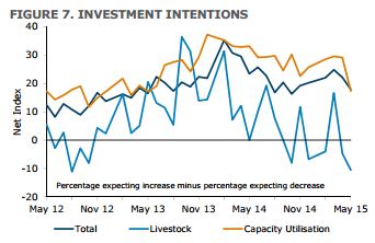
The other thing that seemed strange to me was the -2.8% fall in business fixed investment in the March quarter. The latest ANZ survey, for example, showed that (ex investment in livestock) investment intentions have been running strong by historical standards, as shown below.


But when you unpick the investment numbers, again you get to the same conclusion: there's less to an apparently weak number than meets the eye. There was a surge in investment in plant and machinery and in transport equipment in the September and December quarters of last year: in March the numbers dropped almost exactly back to where they were in June '14 ($9.88 billion compared to last June's $9.84 billion). Look at the numbers in a less volatile way - on a running four-quarters-total basis, for example - and the 'drop' in investment disappears completely.

All up, I'm prepared to believe we're past the peak of the current business cycle - the ANZ survey shows it pretty clearly- but I'm also prepared to believe that the headline March number made things look a good deal worse than they really are.

On the other hand I've also been looking at what's been happening to Australia's GDP: the graph below comes from the Reserve Bank of Australia's excellent Chart Pack, which is a very handy guide to the Aussie macroeconomy.


This looks very much like a gradual long-term deceleration in Australia's growth rate, and at first I thought it might have been due to the winding down of the resource project boom. But the timing is all wrong for that as an explanation: in fact, the mining investment boom did not get properly underway until around 2000, and did not peak until 2012-13. In fact the slowdown in overall GDP growth happened despite the substantial boost to activity from the mining sector.


There's been quite a bit of debate about whether developed countries are looking down the barrel of slower economic or productivity growth in the future: it's been a particularly big issue in the US and UK, where recent productivity growth performance has been very weak. Until I looked at these graphs, I hadn't really expected the Lucky Country to be in the frame as well.

Sunday, 14 June 2015

The dollar's down, interest rates are lower. It's all good. Or is it?

Every now and then I like to go to the fridge and get out the semi-frozen jar at the back that contains what's left of the old Monetary Conditions Index, the MCI. For those of you of tender years, this used to be how our Reserve Bank measured the overall tightness of monetary policy by combining the level of interest rates and the level of the Kiwi dollar into one single number.

It's fallen out of intellectual favour these days, but it still seems to me to say something valuable: it's indisputable that the overall effect of monetary policy reflects the combined impact of both interest rates and exchange rates, and something like the MCI that attempts, however roughly, to measure both at the same time gives you a better overall perspective than following moves in the OCR alone, or moves in the NZ$ alone.

Last time I did it, one result leaped out: the MCI was saying, correctly, that overall policy was way too tight. In that light it's not so surprising that last week we saw the RBNZ start its retreat from Moscow. So what's the MCI saying now?


Well, monetary conditions are still on the tighter side of neutral, if you take neutral to be the average level of the MCI since January 1991, when our Reserve Bank got going in its modern form. At the latest readings for 90 day bills (3.3%) and the TWI (73.2), the MCI comes out at the red star on the graph (876) - still somewhat north of neutral, which would be around the 600-650 mark*. So despite the interest rate cut and the drop in the dollar, businesses still face some modest level of monetary conditions headwind against them.

And, as I did last time, you can do a rough calculation of where 90 day bills or the TWI would need to be to make life merely neutral for businesses. To get to neutral, banks bills would need to drop to around 1% if the TWI stays where it is, or the TWI would need to drop by around 5% if bank bills stay where they are. If you were looking for some plausible combination of the two, bills at 2.75% and the currency 4% lower would do the trick. For things to work out well, we likely need the Reserve Bank to ease a little more than it indicated last week, and the forex markets to play ball: if we don't get that combo, then either inflation will remain below the Bank's target (not good), or the economy's growth rate will take a hit (not good) or both (double plus ungood).

* Since I last posted about the MCI, I've upgraded my calculations to use the new broader 17-currency TWI instead of the old narrower 5-currency one. The trend in the updated MCI  is exactly the same as the old MCI but the absolute numbers are a bit different.

Friday, 12 June 2015

What's happening in the telco sector

Earlier this week the Commerce Commission came out with its latest Annual Telecommunications Monitoring Report (pdf), and very interesting reading it was, too (as was last year's, as I commented here). In passing, it's daft that the Commission is obliged to report on the state of competition in the telco markets, while it is not allowed to publish proactive reports on the state of competition in the rest of the economy. If you're interested in the whole 'who can report on the state of competition' and 'market studies' issue, I'll be talking about it at this year's New Zealand Association of Economists annual conference - full programme here.

Back to the report. Lot of things to like by way of positive developments in the sector, though there is still quite a flavour of the deadweight legacy cost of the copper network, and the Commission's likely reduction of the copper price next month will be a positive move. In particular among the positives, consumers are mostly getting better value for mobile services: as the two graphs below show, mobile bundles are competitive by international standards, and prices have been falling.


But there are some oddities even on the mobile side. When you see the table and graph below you have to ask, why the very expensive prices by international standards for slugs of mobile data, and why aren't they falling, too?


I don't have any good rationale for this and neither does the Commission: on static prices, it comments (p33) that "This suggests there is a lack of demand for and/or competition to supply mobile broadband data when it is not part a bundle of mobile phone services, particularly when it is a relatively large amount of data". Don't know about lack of demand - you'd think there are plenty of people running around these days with lots of uses for their tablet-style devices - and you'd think mobile companies would compete harder for this upmarket business. Odd.

Apart from the prices, usage, revenue and investment sort of stuff, the report has heaps of other interesting stuff. For example, did you know this (below) about the percentage of our students who are taking computer science courses?


There was one pair of graphs which I had some difficulty with. I'd like to believe this one, which shows we're right at the head of the international pack for the proportion of businesses selling over the internet...


...but I can't square it with this one...


...which says that only 11% of small businesses make sales over the net. If (conservatively) you say 80% of all businesses are small businesses, you can't get to the national 47-48% figure of the first graph.

Never mind: this is still an excellent resource. As well as all the obvious stuff, it's also got a very useful chronology of events in the sector over the period January 2014 to March 2015: if, like me, you have to go away and look up things like the sequence of draft copper loop pricing decisions, it's all there in one convenient spot. 

Thursday, 11 June 2015

Where are we? Where are we?

We got a somewhat unexpected interest rate cut from the Reserve Bank this morning - though having been wrong on enough occasions about the macroeconomic cycle, I think I'm allowed to say that I personally wasn't too surprised - and inevitably the question arose for the folks at No 2 The Terrace: you raised interest rates back in 2014, and now you've had to change direction. Did you take a misstep last year?

The Bank came prepared for the criticism with Box A in the Monetary Policy Statement. Here are two of the graphs from that Box.

The first one (below) compares the Bank's expected track for 90 day interest rates at the time of the December '13 Monetary Policy Statement with the expected track in today's. Back then, the prospect was for a series of increases (with 100 basis points of increase actually delivered by the Bank in the first half of 2014); now, the prospect is for lower rates, with one 0.25% cut already in the bag and another likely. So there's no getting past the fact that what the Bank thought it had to do has gone through a complete turnaround, and the rises in 2014 now look rather odd. What happened?


That brings us to the graph below, which shows the Bank's perceptions of the output gap in December '13 (red line), its take on the state of the output gap as of today (blue line), and the difference between the two (the grey bars). The output gap is a measure of how close the economy is to full capacity, and positive output gaps (i.e. the economy going especially strongly) tend to bring inflationary pressures in their wake.


And as you can see, back at the end of 2013 the Bank thought that the economy was already bursting at the seams, and would become increasingly more strained again. Hence the need for interest rises to cut off the inflationary pressure that would be likely to follow. On more recent estimates of the state of the economy, however, we weren't actually at full capacity in late 2013 (mostly because labour supply was expanding faster than thought, thanks to sharply higher immigration and a higher participation rate), and it's only around now that we've got there.

So, not a mistake, just the best decision you can make on the best, albeit fragile, evidence in front of you at the time. And as I've said before, I have considerable sympathy for policymakers making these important decisions in what is essentially an economic fog. What's more, you can't rule out that there may be similar changes of direction in the future: self-evidently, these output gap measurements are fickle beasts, and you can't be sure they're telling you the right thing today, or won't tell you something different tomorrow.

Here's another chart (from p21 of the Statement): it shows the Bank's estimated range of uncertainty around the location of the output gap. Right now, their best guess is that we're roughly around full capacity, but for all we really know we could be somewhat below it (1% of GDP below) or quite a bit above it (by some 1.75% of GDP).


So while it's tempting to take pot shots at Reserve Bank governors backtracking - or Finance Ministers not quite getting to surplus, for that matter - hold your fire. Bag them if they make decisions at odds with the info at the time, sure. But they're not: this is what making sensible decisions under uncertainty looks like, and, unless there's a miraculous leap forward in the art of output gap assessment, probably always will.

Tuesday, 2 June 2015

Pssst! Do you want another US$4 billion?

Deregulation of the airline industry is one of the success stories of economics from a number of perspectives (as I wrote earlier here). It's not often that the politicians take the economists' advice, and rarer still when you have well dug-in interests with a previously protected patch to defend, but deregulation of the airline business not only got adopted in the US, and subsequently internationally to a greater or lesser degree, but has worked out exactly as the economists predicted: competition increased, prices fell, choice expanded, more people could afford to fly, and consumers benefitted hugely.

Oddly enough, until very recently nobody had put a figure on the size of the consumer benefits. Step forward Clifford Winston of the Brookings Institution and Jia Yan of Washington State University, who've done precisely that. Here's the Brookings announcement about their results, and if you want the whole nine yards the announcement has links to a longer media summary and to their academic journal article in the American Economic Journal: Economic Policy.

They principally looked at the impact of the "open skies agreements" that the US negotiated with other countries over 2005-09. Their model enabled them to identify the (substantial) declines in price and increase in choice that followed deregulation: it also let them  do the counterfactual "what if" exercise of running the model as if the deregulation had never happened. In that case (I'm quoting from p396 of the journal article)
eliminating the open skies agreements on US international routes that have been signed between 2005 and 2009 would initially raise fares in all segments, with the greatest effect, 50 percent, on business and first-class fares [it was 21% on full price economy and 13% on discount economy]; reduce passenger demand in all segments and market demand [by 13% overall]; reduce the number of flights; and increase the number of carriers per route. Travelers would lose $3 billion annually, nearly $2 billion from higher fares and $1 billion from fewer flights, indicating that they gained substantially from the open skies agreements that had been negotiated during that period. As noted, we are understating the total gains because we cannot measure the additional long-run effects that would increase the initial gains.
On top of the US$3 billion of gains from the 2005-09 agreements, they also found that consumers benefitted by close to a billion dollars more from agreements negotiated before 2000. And they also extended their model to the routes where the US has yet to negotiate open skies agreements, and found that deregulation and competition would yield a further US$4 billion of consumer benefit. And there are still further gains (actual and potential) left uncounted, including the benefits from domestic deregulation in the US and elsewhere, and the benefits of open skies agreements on routes not involving the US.

The numbers show the shabbiness of airline protectionism: pre deregulation, and to this day in some countries, governments had been giving a tiny group of 'flag carriers' - sometimes just a single operator in a country - free licence to rip off their own citizens. It's both stupid and perverse (as I've previously said, here or here).

You'd  think that by now the rort would be too anachronistic to survive:  the process for all the world is as if a medieval monarch were giving his gracious consent to the trade in beaver pelts. These days, it's who is allowed to fly into or out of Shanghai or Manila, but in essence it's no different to Charles I (as I've just read in Peter Ackroyd's Civil War) deciding who should be allowed to make pens, playing cards or spectacles.

Unfortunately governments still seem unwilling to leave the airline market alone, with the latest bunfight being US airlines' allegation that some Middle Eastern airlines are being given unfair competition-distorting subsidies and the US carriers' attempt to have open skies access for Qatar and the UAE rolled back (here's the Economist's article about the issues). The multi-billion dollar consumer benefits of further liberalisation are still going a-begging.

Thursday, 28 May 2015

Another good seminar from LEANZ

Last night we had the latest Auckland seminar from the Law And Economics Association of New Zealand (LEANZ): Richard Meade's "Should Customer-owned Monopolies face Different Regulation than Investor-owned Firms?", based on his PhD work at the University of Toulouse. Richard, before his studies at Toulouse, had been at Victoria's Institute for the Study of Competition and Regulation (ISCR), and is now at AUT.

It was an interesting evening. I learned, for example, that New Zealand is by no means unusual in having a large number of consumer-owned electricity lines businesses, and indeed that the customer-owned or cooperative model is common internationally in other utility sectors as well, such as water and telecoms. The general motivations seem to be a consumer defence mechanism against the market power of a monopoly, and undertaking infrastructure investments in areas that would not be commercially viable for an investor-owned utility. Ideology likely plays some part in some places, but the widespread adoption of the consumer owned model is generally more down to commercial practicalities.

In New Zealand, 12 of the lines businesses have been exempted from the price-and-quality regulation they would otherwise have had, because the main incentive that customer owned lines businesses operate under (low prices for the customers) does a perfectly adequate job of keeping the monopolies to heel. Exemption from regulation is also reasonably common overseas, though not a given. Richard's theoretical work (and he kindly spared us the maths you'd expect from a Toulouse economics PhD) found, however, that in some cases a regulator can't rely completely on the consumer ownership to achieve regulatory objectives by itself, especially if an objective is to nudge the business towards an optimal price/quality combination: consumer ownership will generally deal to price. but may not hit the price/quality combo that consumers might want.

That's probably right: one thought I had was that governance of cooperatives tends to be a political process with elected boards (the bit of Part 4 of the Commerce Act that allows for exemption of consumer-owned lines businesses includes a requirement for elections by the consumers), and that can give rise to political pressures to keep prices down today even if it jeopardises needed future investment tomorrow. The longer term quality of the service may not get a good enough look in.

Richard's presentation on the challenges that regulators face in trying to hit cost efficiency and quality targets simultaneously was also interesting. The latest round of the Commerce Commission's default price/quality paths for the lines businesses includes an automatic mechanism whereby companies' allowed revenue gets a bonus or a deduction depending on whether they beat or miss certain quality targets. I gathered from Richard's presentation that this puts us up somewhere near the regulatory policy frontier when it comes to using CPI - X incentive regulation to steer towards desired quality outcomes as well, but also that the theory and practice of quality regulation is still very much in its infancy.

Another excellent evening: if you're not a member of LEANZ, you should think of joining up, as it depends, as a charity, on members' fees to keep these valuable seminars going, or supporting it in other ways, for example by giving a presentation yourself (and yes, yes I have, which I summarised here). LEANZ also depends on the generosity of a variety of businesses so thanks to Gary Hughes from Wilson Harle who did the introductions (Ed Willis from Webb Henderson would have but couldn't make it) and to Ross Patterson of Minter Ellison who provided the premises and the refreshments afterwards.

Friday, 22 May 2015

Where are the profits?

Yesterday I wrote up the big themes from the Budget (and a few of the minutiae), but didn't have time to write up one of the more interesting forecasts in the documentation (and you may well have a devil of a time finding it yourself, as it's in the 'Budget Economic and Fiscal Update 2015 Additional Information' document, which is the befu15-11of11.pdf file in all the bumph - you can find it here).

It's the forecast for profits - strictly speaking, net operating surplus, but same diff - for agriculture and for the rest of the economy over the next four years (years ending in March). I've extracted the numbers (from Table 3) and put in the percentage changes, and here they are.


Three thoughts, assuming the forecasts are mostly on the mark.

One, agriculture looks to be doing it tough over the next couple of years, and you can see why farming cropped up as a topic at the Reserve Bank's financial stability report last week.

Two, it's not much of a profit boom for the rest of the economy, either, is it? You'd think that in a economy of moderate wage growth, low interest rates, and ongoing economic growth averaging 2.8% a year, there'd be more of a profit gusher than this.

And three, our share market has risen to quite fancy levels on measures such as p/e ratios. Those expensive valuations may be explicable in a world where asset prices of all kinds have been inflated by globally cheap money, but shares priced as growth stocks don't make much sense if this is the profit outcome that's actually going to unfold.

Thursday, 21 May 2015

Budget 2015 - the big picture

So here we are again: another year, another Budget - this one's 'A plan that's working' - and another round of sausage rolls in the Treasury lockup for Budget analysts.

Generally there are only two big things you need to know about any Budget. Despite the vast publicity it's going to get, neither of them (as I've said before here) is the precise level of the fiscal surplus or deficit in any one year. It's almost completely irrelevant, except for scoring cheap political debating points. The things that really matter are: whether it's realistically grounded on a reasonable view of the economic outlook, and whether it makes long-term sustainable sense.

Are the economic forecasts underpinning the Budget realistic? I'm a bit in two minds about this. On the one hand, the GDP growth forecasts for the next four years look a bit high. They average 2.8%, and don't drop off a lot: there's 2.4% pencilled in for the March 2019 year, when you might have thought that somewhere along the way the rundown of the Canterbury rebuild would have led to a larger slowdown. On the other hand, the assumptions about net migration look too pessimistic. Net immigration was 55,800 in the year to this March, and is expected to be 56,600 in the year to June '16, but then is assumed to drop like a stone to 12,000 in the year to June '17. Migration flows can change quickly, that's true, but that quickly? So I'm not surprised that one of the two alternative economic scenarios that got modelled as part of the Budget included one where net immigration was modestly higher.

Net net, maybe there's a bit of overoptimism about the runoff of the earthquake rebuild, and a bit of a downbeat estimate of likely immigration, leaving us roughly where we should be, but I'm left with a slight feeling that the growth forecasts could a bit too high. They're certainly a bit higher than the most recent consensus forecasts gathered by the NZ Institute of Economic Research, and you can also find forecasters in the marketplace (notably the BNZ) who see a substantially earlier and sharper slowdown.

There's also one internal oddity, which is that the participation rate - the proportion of people in the workforce, either employed or looking for a job, and which normally rises as good times roll in - does nothing of the kind in these forecasts. It's at a high level now, certainly, but then it's expected to drop a bit over the coming year, and stay at that level thereafter. That makes little sense to me, although it has a politically handy side-benefit for the forecasts: a lower participation rate makes the unemployment rate go down faster than it would have otherwise.

Overall, let's give the forecasts a pass mark. What about the longer-term fiscal plan?

First, the obvious: crises apart, in normal times what you want to see is steady progress. One step after another doesn't make for catchy headlines, but in fiscal policy dull is just fine. And on that score the Budget does okay, if you compare 2015 with where we're expected to be in 2019, as shown in the table below. The size of the tax take as a share of the economy goes down a little, the size of spending goes down by a bit more, and there's a steady rise in the fiscal surplus and a corresponding reduction in the size of the public debt.


It's also worth saying not only is this steady progress towards a sustainable fiscal outcome, but it's also pretty good when you compare it with some of the usual suspects, as shown below.


So why just 'okay' as an overall assessment?

Two reasons. Here's the first one (in the graph below) which shows that the government is expecting a $2.5 billion hit to its finances from decisions it will make in the 2017 Budget. We don't know precisely what they'll be, but a large part is likely to be tax cuts for low to middle income households. I'm as happy to take a tax cut as the next person, but when you're still in the earlier stages of a fiscal rehabilitation, I'm not sure that (say) a $1.5 billion tax cut on top of (say) an increased spend of $1.0 billion makes complete sense.


Especially, and secondly, as we're not completely out of the woods when you look at the real underlying picture of the fiscal deficit. By that I mean what does the deficit look like when you strip out transient cyclical influences - the deficit will appear to shrink in a business upswing, as the government takes in more taxes, but it will widen again when times are tougher. Beneath the cyclical waterline, nothing's really changed.

Fortunately, you can make a rough (and I do mean rough) estimate of the 'real' deficit, shorn of the business cycle effects, and it's shown in the table below as the 'Cyclically-adjusted balance', as opposed to the headline fiscal deficit which includes the cyclical effects, the 'OBEGAL'.


You'll see that the cyclically-adjusted balance comes in two flavours. One is plain, and one is sprinkled with a 'terms-of-trade' adjustment. The plain one is fine: the headline deficit and the 'real' deficit are pretty much the same. The one with sprinklings, however, makes the (arguably reasonable) assumption that we've been living in unusually good times when it comes to the prices we get for our commodity exports, and that we oughtn't count on them being around indefinitely. On that basis - and it might be over-cautious, but equally it might be just the sort of prudence you ought to steer by - we don't get back to surplus at all. It's deficits all the way. So again you get to the same point, that it looks a bit premature to be giving the deficit a $2.5 billion boost as early as 2017.

In sum, all pretty sensible, perhaps a bit optimistic on how things will actually pan out, but generally going in the right direction.

I won't go into many of the minutiae - you drown in press releases at Budget time, all the way down to ones publicising $2.1 million initiatives - but four caught my eye.

The end of the $1,000 starter subsidy for KiwiSaver. It came as a big surprise, but when I'd settled down, I thought - makes sense. There are 2.8 million of us who have two neurons to rub together and have already said yes please to a free gift of $1,000. If you haven't done it by now, why should the taxpayer bother with you?

That $52 million fund to help build housing on surplus government land in Auckland - fine idea, but a spit in the wind in terms of impact. It's not entirely clear how it's going to work - I asked one of the helpful Treasury people, and it seems as if the $52 million will be to buy the land from its current owners for housing development, with the precise development model yet to be determined - but if so it's not going to go very far. At a very, very conservative estimate of $100K per section, that will get 520 houses going, over a period of years. Well meant, but half of five eighths of the proverbial.

Funding for only 2 more charter schools - sorry, partnership schools. People have mixed views on them, but whatever your views, you'd want to see more policy experimentation going on than this. Particularly when one of Bill English's key priorities (rightly) is getting more value for each public dollar spent, and you'll never know if you are, if you stick to the same monolithic 'one size fits all' model that has typified much of health and education spending.

And finally that $25 million funding for 'Regional Research Institutes'. We don't know exactly where they'll be, and we don't know exactly what they'll do. But if I had to pick between them finding a cure for cancer or becoming boondoggle sops to "the regions are dying", my money would be on the boondoggle.