The Reserve Bank came out with a new discussion paper last week, 'Inflation expectations and low inflation in New Zealand'. While Discussion Papers are "mainly for academic and professional economists" - and, I should add, represent the staffers' views and not the Reserve Bank's - this one is relatively easy going, and worth a look, because the authors (Özer Karagedikli and Dr John McDermott) have had a go at investigating one of the major puzzles in modern macroeconomics: why inflation has stayed unusually low.
There are other biggies - why has productivity growth (assuming we've measured it right) slowed down and what if anything can we do about it, and what can (or should) policymakers do if they run out of fiscal space and/or hit the zero lower bound for interest rates - but the unexpectedly low inflation puzzle is front and centre across the developed world.
I'd love to say they nailed it, but once I'd got my head around what they'd done, I wasn't totally convinced.
The heart of their argument runs like this. Inflation expectations affect actual inflation: if (for example) people expect low inflation, they'll settle for low wage rises, which will feed into low actual inflation. Fair enough. And then they say: what if inflation expectations don't just arrive out of the blue but are (partially or largely) influenced by actual inflation? Suppose actual inflation is, unexpectedly, only 1.5% instead of 2.0%. People revise their expectations down in line with the lower actual rate, and their lowered expectations (and the price and wage behaviours that follow) drive actual inflation lower again, to say 1.0%. Expectations are revised again ... you get the idea. Voilà - a self-fulfilling circle driving inflation down (or up, if the initial surprise had been higher than expected actual inflation) and one that has nothing to do with the strength of the economy or other things you might have expected to dominate what happened to inflation.
So they built a nice little model, which worked just as they argue. If you'd like to go through the details I've got a summary below, though you'll find the paper accessible enough in its own terms if you'd prefer to go to the source.
It is an interesting paper. But I was left with several questions at the end of the exercise.
The first is around how they model expectations. They say, people's expected rate of inflation will be some blend of (a) the latest actual outcome over some recent period, a backward looking measure, and (b) the expected inflation rate as measured in a survey, a forward looking measure. And they find that, modelled this way, not only do expectations have a strong influence on actual inflation but the weight that people apparently place on the latest actual inflation rate has increased markedly since 2008-09. So you have an explanation for the persistence of low inflation: a self-validating and strengthening feedback loop from low inflation to even lower expectations to even lower inflation again.
But this is all rather odd. The survey that asks about people's expected inflation rate is their inflation expectation, by definition. Subsequently saying that expectations are actually a mixture of those expectations and actual inflation is a bit of logical gymnastics I can't quite follow. But, as they say, "The empirical treatment of inflation expectations is crucial for the purpose of this paper", and if you're not convinced by their formula (and I'm not), some of the results fall over.
Even if you go along with their approach, though, you're still left with other questions.
One is: why? Why did people change in recent years from putting more weight on what they expect to happen, to putting more weight on what's actually happened? Have they suddenly stopped believing that they can get a handle on what lies around the corner - which wouldn't surprise me, in a post-GFC, post Brexit world? The researchers may well have unearthed an interesting mechanism or process, but we're still left with an unsolved, if different, problem.
Another question is: in the world they've modelled, what's happened to central bank credibility? If everybody believed their local central bank would indeed keep inflation around 2% (or wherever), then their expectations would stay around 2% irrespective of any wobbles in actual inflation along the way. Perhaps people in New Zealand (and the eurozone, and Japan) have indeed thrown in the towel and now prefer to believe the evidence of their own lying eyes rather than subscribe to what central bank governors say. If true, that's important, but again it raises a whole new research agenda to unpick the next layer of answers.
Bottom line? Because of the somewhat idiosyncratic modelling of expectations in this research, I wouldn't get too hung up on its exact outcomes. But I think it does make a good, wider point. Expectations have always mattered: that's seen most obviously in hyperinflations and deflations. But clearly they matter in more normal times, too, and they may not have got the policy attention from central banks that they should have.
That's changing. In the US, the Fed has been paying more attention to the financial markets' view on five year forward inflation, for example, and recent Monetary Policy Statements from the RBNZ have been zeroing in on expectations, too: they've included an 'inflation expectations curve'. So far so good: the big issue, though, is having realised that expectations matter, and possibly matter a lot, do central banks know how to manage expectations back towards levels more consistent with the banks' inflation targets?
Monday, 27 June 2016

Wednesday, 22 June 2016
Competition is good for you, part 294
My post on how competition has been improving productivity and lowering prices in both Australia (retailing in general) and New Zealand (electricity) didn't go down well with everyone. One commenter on Twitter said that it was all very well for companies to try to become more efficient to cope with increased competition, but "In their desperation for competitiveness, where do the retailers push employee wages? Down. Migrants & casualisation".
As it happens, there hasn't been a lot of research on the distributional effects of greater competition: a big survey last year done by European Commission staff, 'Ex-post economic evaluation of competition policy enforcement: A review of the literature' found (p29) that

You can see that there are more jobs, and higher wages, for rich and poor alike, but poorer households' consumer spending goes up a good deal more than rich households' (because poorer households of necessity save less). And the rich unambiguously lose through the reduced profitability of the companies they, as the shareholding class, own.
I wouldn't necessarily go mad about this: these are early days for this kind of research, and the type of DSGE model used, while the bee's knees in modern modelling circles, can be a finicky hothouse contraption. But the results are exactly what you'd have expected: rolling back anti-competitive market power is good for consumers, and for poorer consumers more than richer. I'd draw an analogy with the producer market power created by protectionism: the poorer are disproportionately affected by the higher prices of the things that are typically 'protected' most (food, clothes, shoes). And it stands to reason that the poorer will be worst hit by any anti-consumer development: they had the least choice to begin with, whereas the rich have more options.
In any event we should know a bit more in the near future: this work was part of a conference the World Bank ran last year on 'Promoting Effective Competition Policies for Shared Prosperity and Inclusive Growth', and there's apparently a conference volume on its way.
Finally a hat-tip to the Vox website, the policy portal of the Centre for Economic Policy Research, which published these results. It's a terrific compendium of timely, wide-ranging, practical research, with something to say (in readable, short format) on all the important issues of the day. Highly recommended.
As it happens, there hasn't been a lot of research on the distributional effects of greater competition: a big survey last year done by European Commission staff, 'Ex-post economic evaluation of competition policy enforcement: A review of the literature' found (p29) that
But as luck would have it, along comes some new research, 'Competition policy and inclusive growth', which has had a crack at looking at the distributional impact of increasing competition (through the various effects of the European Union's policies against anti-competitive mergers and cartels). Their bottom line is that "Interventions have important redistributive effects that benefit the poorest in society", and here are some of the key numbers. The model captures the eventual economy-wide effect of a 'mark-up' shock (a setback to producers' profit margins from competition enforcement) on different groups in society.When a lack of competition raises prices and reduces the quality of products, it causes damages to all consumers, including the poorest people. In this context, it could be interesting to analyse the distributional effects of market power. Existing evidence seems to suggest that an increase in competition is particularly beneficial for low-income people. However, the literature in this area remains in its infancy and there are a number of topics deserving further research.

You can see that there are more jobs, and higher wages, for rich and poor alike, but poorer households' consumer spending goes up a good deal more than rich households' (because poorer households of necessity save less). And the rich unambiguously lose through the reduced profitability of the companies they, as the shareholding class, own.
I wouldn't necessarily go mad about this: these are early days for this kind of research, and the type of DSGE model used, while the bee's knees in modern modelling circles, can be a finicky hothouse contraption. But the results are exactly what you'd have expected: rolling back anti-competitive market power is good for consumers, and for poorer consumers more than richer. I'd draw an analogy with the producer market power created by protectionism: the poorer are disproportionately affected by the higher prices of the things that are typically 'protected' most (food, clothes, shoes). And it stands to reason that the poorer will be worst hit by any anti-consumer development: they had the least choice to begin with, whereas the rich have more options.
In any event we should know a bit more in the near future: this work was part of a conference the World Bank ran last year on 'Promoting Effective Competition Policies for Shared Prosperity and Inclusive Growth', and there's apparently a conference volume on its way.
Finally a hat-tip to the Vox website, the policy portal of the Centre for Economic Policy Research, which published these results. It's a terrific compendium of timely, wide-ranging, practical research, with something to say (in readable, short format) on all the important issues of the day. Highly recommended.
Friday, 17 June 2016
Competition is good for you, part 293
The Reserve Bank of Australia came out with its latest Quarterly Bulletin the other day, and in it there was a fascinating article, "Why Has Retail Inflation Been So Low?".
The authors wanted to find out why inflation in the Aussie shops was running lower than would have been expected, given the level of the Aussie dollar, as can be seen in the graph below, where the dark blue line (inflation) has been lagging below the pinky-purply one (the changing value of the A$).

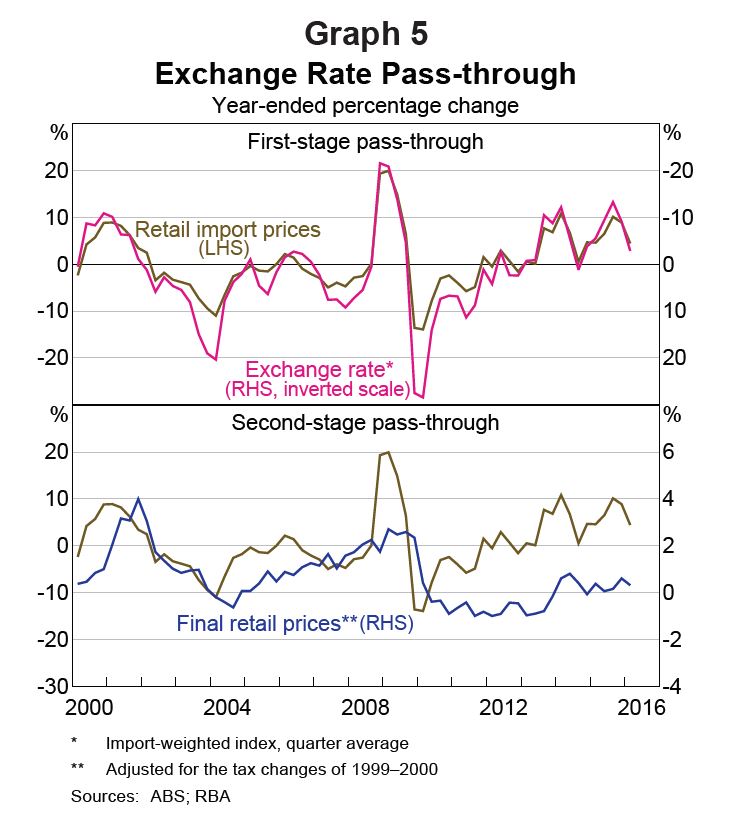
And when they looked at it more closely they discovered an interesting thing. They disentangled what happens when exchange rates change. There are two steps: the first is the impact on the landed Aussie cost of imports (which goes up when the A$ falls and down when it rises), and the second stage is what happens to that changed landed cost of imports as it works its way through the wholesale and retail domestic distribution chain.
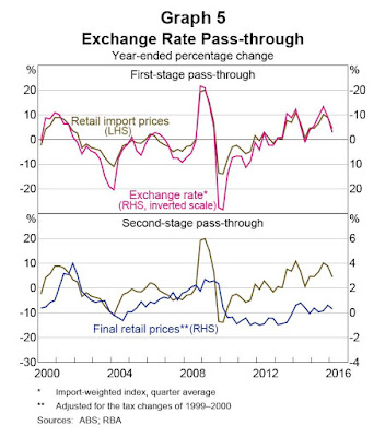
What they found was that the first stage hadn't changed at all: a lower A$, for example, was still feeding through to higher landed A$ costs of imports, just as it always did. But the second stage had changed quite a lot: from about 2010 onwards, there was less pass-through of those higher import costs into final consumer prices, as the graph below shows.
They weren't able to nail what had changed in the second stage using econometric methods, other than to confirm that statistical tests did indeed confirm a change in behaviour, so they had a qualitative fossick instead, based on what the RBA had been picking up from its regular programme of going round and talking to businesses ('liaison' in central bank geekspeak).
Increased competition appears to have been the reason (my emphasis added):
What a nice textbook outcome from increased competitive pressures: consumers have got a better deal, and producers have been pushed to improve their productivity. And it comes in a week where the latest instalment of MBIE's electricity price monitoring showed that retail electricity prices had dropped for the first time in 15 years, which MBIE said "was driven by increased discounting activity and incentive credits" - greater competition, in other words. Carl Hansen, the CEO at the Electricity Authority, said that the price fall "is one of the many indicators of strong competition in [the] residential electricity market. Another indicator is that smaller retailers have now grown their market share to 10 per cent which is putting significant pressure on the larger retailers".
It may be making a meal of the obvious, that competition is pro-consumer and pro-productivity, but the message doesn't always get through in New Zealand, or elsewhere. The lobbyists for the quiet life in sectors such as education, health and the professions are good at running the pro-producer line, and (like in bunfights over trade protectionism) the voice of the consumer doesn't get the hearing it should.
We need more competition across more markets, and you don't have to take just my word for it. The OECD, in the chapter on New Zealand in the latest update of its Economic Outlook, said that "Reducing barriers to FDI [foreign direct investment] and to competition in the electricity, transport and telecoms sectors would facilitate greater investment and innovation, increasing productivity and reducing prices". There's work to do if we're going to have the retail price and producer productivity benefits Australia is enjoying, and more of our utility bills going down.
The authors wanted to find out why inflation in the Aussie shops was running lower than would have been expected, given the level of the Aussie dollar, as can be seen in the graph below, where the dark blue line (inflation) has been lagging below the pinky-purply one (the changing value of the A$).

And when they looked at it more closely they discovered an interesting thing. They disentangled what happens when exchange rates change. There are two steps: the first is the impact on the landed Aussie cost of imports (which goes up when the A$ falls and down when it rises), and the second stage is what happens to that changed landed cost of imports as it works its way through the wholesale and retail domestic distribution chain.
What they found was that the first stage hadn't changed at all: a lower A$, for example, was still feeding through to higher landed A$ costs of imports, just as it always did. But the second stage had changed quite a lot: from about 2010 onwards, there was less pass-through of those higher import costs into final consumer prices, as the graph below shows.
They weren't able to nail what had changed in the second stage using econometric methods, other than to confirm that statistical tests did indeed confirm a change in behaviour, so they had a qualitative fossick instead, based on what the RBA had been picking up from its regular programme of going round and talking to businesses ('liaison' in central bank geekspeak).
Increased competition appears to have been the reason (my emphasis added):
They also found an interesting phenomenon where in a number of sectors, there was an especially aggressive competitor who was making life tough for the rest of the players:Liaison with retailers suggests that over the period of interest, competition in the retail sector has intensified, partly due to increased supply. There are numerous sources of this increase in competitive pressures, although some key themes have emerged from liaison.• Technology has enabled consumers to compare retail prices quickly and easily online and determine which retailer(s) are offering the lowest prices. The increasing online presence of traditional bricks-and-mortar retailers is contributing to this effect.• Relatedly, the supply of retailers has increased due to competition from foreign online retailers. This was particularly evident over 2010–13 when the exchange rate was relatively high...Over this period, domestic retailers became relatively less competitive against competitors based offshore.• Both established firms and new entrants, including international retailers entering the Australian market, are competing aggressively to gain market share
Competition in turn was forcing firms to improve their efficiency if they wanted to maintain previous levels of profitability, pushing them to look for "labour productivity gains through technological improvements, such as contactless payments systems, self-serve checkouts and better monitoring of staffing needs" and "other means, such as bargaining for lower rents, improving inventory management, sourcing from fewer suppliers, partnering with other firms to lower distribution costs and centralising some administration tasks".In a number of market segments, liaison has attributed the increase in retail competition to the actions of a perceived ‘market leader’, which is generally looking to expand their market share, effectively increasing supply. This has led a number of retailers to report that they believe demand for their goods is very price sensitive, and fear that they will lose sales volumes if they increase prices. Earlier work on Australian retailers found that a majority of firms primarily set prices based on the balance of supply and demand factors, such as market conditions or competitors’ prices, rather than setting prices as a fixed mark-up over costs
What a nice textbook outcome from increased competitive pressures: consumers have got a better deal, and producers have been pushed to improve their productivity. And it comes in a week where the latest instalment of MBIE's electricity price monitoring showed that retail electricity prices had dropped for the first time in 15 years, which MBIE said "was driven by increased discounting activity and incentive credits" - greater competition, in other words. Carl Hansen, the CEO at the Electricity Authority, said that the price fall "is one of the many indicators of strong competition in [the] residential electricity market. Another indicator is that smaller retailers have now grown their market share to 10 per cent which is putting significant pressure on the larger retailers".
It may be making a meal of the obvious, that competition is pro-consumer and pro-productivity, but the message doesn't always get through in New Zealand, or elsewhere. The lobbyists for the quiet life in sectors such as education, health and the professions are good at running the pro-producer line, and (like in bunfights over trade protectionism) the voice of the consumer doesn't get the hearing it should.
We need more competition across more markets, and you don't have to take just my word for it. The OECD, in the chapter on New Zealand in the latest update of its Economic Outlook, said that "Reducing barriers to FDI [foreign direct investment] and to competition in the electricity, transport and telecoms sectors would facilitate greater investment and innovation, increasing productivity and reducing prices". There's work to do if we're going to have the retail price and producer productivity benefits Australia is enjoying, and more of our utility bills going down.
Thursday, 9 June 2016
One-way traffic - or is it?
Today's Monetary Policy Statement (here are the links to the press release, the full thing, and the webcast press conference) went much as expected - overwhelmingly, forecasters had expected the Bank to stand pat, and it did, and generally they (and the Bank) expect one more 0.25% cut somewhere down the track, assuming that the next GDP and CPI data don't spring any major surprises.
The likely track of interest rates consequently didn't get a lot of airtime at the press conference, partly because it was assumed as obvious, and partly because the media were much more concerned about other things, especially the housing market and the prospect of further potential macroprudential controls. They were also somewhat interested in various accountability issues: has the Bank failed to keep inflation high enough? Has it been communicating well enough?
I was left wondering, though, whether this blasé assumption of a bleedingly obvious track for interest rates is as well founded as people seem to think. For one thing, as the Statement said (p28), the world's an uncertain place: "the paths key variables ultimately take may differ from the projection because of changes in economic relationships, the wide range of uncertainty around key assumptions, and unforeseen developments". Economies don't always play nice with consensus forecasts, even strongly or widely held ones.
And I was also struck by this graph, where the Bank showed how interest rates would need to behave if things panned out differently - if the Kiwi dollar didn't depreciate (the green line), or if house prices kept rocking along and people started to splurge some of their winnings (the red line).

I don't think there's a person in the country that thinks interest rates could go up in the next year or eighteen months. But that's essentially the same as saying, there's a zero probability of the "spend some of our housing gain" scenario. And I don't think it's a zero probability at all: on the contrary, it sounds like an entirely possible, and entirely understandable, way that things might play out.
I wouldn't say the current consensus on interest rates has become an outright "Nonsensus, n: a belief held by a majority or large dominant proportion of a population that is nevertheless complete bollocks" (as 'Lew' wittily put it on Twitter the other day). But I would say it's on the complacent side: interest rates have departed from the script in the US, the eurozone, Japan or Australia in recent months, and they could very easily do the same here.
The likely track of interest rates consequently didn't get a lot of airtime at the press conference, partly because it was assumed as obvious, and partly because the media were much more concerned about other things, especially the housing market and the prospect of further potential macroprudential controls. They were also somewhat interested in various accountability issues: has the Bank failed to keep inflation high enough? Has it been communicating well enough?
I was left wondering, though, whether this blasé assumption of a bleedingly obvious track for interest rates is as well founded as people seem to think. For one thing, as the Statement said (p28), the world's an uncertain place: "the paths key variables ultimately take may differ from the projection because of changes in economic relationships, the wide range of uncertainty around key assumptions, and unforeseen developments". Economies don't always play nice with consensus forecasts, even strongly or widely held ones.
And I was also struck by this graph, where the Bank showed how interest rates would need to behave if things panned out differently - if the Kiwi dollar didn't depreciate (the green line), or if house prices kept rocking along and people started to splurge some of their winnings (the red line).

I don't think there's a person in the country that thinks interest rates could go up in the next year or eighteen months. But that's essentially the same as saying, there's a zero probability of the "spend some of our housing gain" scenario. And I don't think it's a zero probability at all: on the contrary, it sounds like an entirely possible, and entirely understandable, way that things might play out.
I wouldn't say the current consensus on interest rates has become an outright "Nonsensus, n: a belief held by a majority or large dominant proportion of a population that is nevertheless complete bollocks" (as 'Lew' wittily put it on Twitter the other day). But I would say it's on the complacent side: interest rates have departed from the script in the US, the eurozone, Japan or Australia in recent months, and they could very easily do the same here.
Wednesday, 1 June 2016
Those falling Auckland housing consents - an update
Last month I wrote about the downturn in Auckland housing consents and wondered what was going on (and is still going on, as yesterday's release of April data from Stats showed). Lots of people have been wondering, too: the post got (by my blog standards at any rate) a lot of views.
A helpful reader, 'energy24.7', left this comment:

And as energy24.7 said, the fall is indeed down to apartment numbers dropping to virtually nothing, while house numbers have been gradually increasing.
Which all brings us to a new question, though: what's going on in the apartment sector? There are umpteen possibilities (and I'm hoping more housing-expert readers will chip in with their views). It could, for example, be happenstance: it's a fairly volatile series. But I'm not convinced: you'd expect apartment consents to be well above the minimal, credit-constrained levels of the GFC. Or it might be capacity constraints, though again that doesn't feel especially plausible.
Or are developers waiting for a potentially more intense-development-friendly environment under the new Auckland Unitary Plan? If so, we're in for at least a few more months of very low apartment consent levels, as the recommendations from the Plan hearings panel won't go public till July 27, and even then we don't know whether the Council will buy into them (they've got to notify their decision by August 19). And then there will be lags while developers go through the hoops of whatever planning process emerges from the whole debate.
Whatever it is, it needs to be fixed, pronto. Falling levels of apartment consents are the very last thing the Auckland housing market needs.
*An earlier version of this graph had the lines mislabelled (houses and apartments were the wrong way round). It's right now. Thanks to alert reader Mark who picked it up.
A helpful reader, 'energy24.7', left this comment:
And energy24.7 is absolutely right. I'd steered away from the seasonally unadjusted numbers so as to get a better feel for the underlying trend, which is fine in many circumstances, but the baby that went out with the bathwater was the information in the raw data. So here it is*.Check the raw numbers for consents. You'll pretty quickly see the downturn in trend is due to reduction in the volatile apartment series. Houses are still on their way up (excepting a little seasonal variation). But I'm not saying they're anywhere near where they need to be, just it explains the downturn in dwelling trend

And as energy24.7 said, the fall is indeed down to apartment numbers dropping to virtually nothing, while house numbers have been gradually increasing.
Which all brings us to a new question, though: what's going on in the apartment sector? There are umpteen possibilities (and I'm hoping more housing-expert readers will chip in with their views). It could, for example, be happenstance: it's a fairly volatile series. But I'm not convinced: you'd expect apartment consents to be well above the minimal, credit-constrained levels of the GFC. Or it might be capacity constraints, though again that doesn't feel especially plausible.
Or are developers waiting for a potentially more intense-development-friendly environment under the new Auckland Unitary Plan? If so, we're in for at least a few more months of very low apartment consent levels, as the recommendations from the Plan hearings panel won't go public till July 27, and even then we don't know whether the Council will buy into them (they've got to notify their decision by August 19). And then there will be lags while developers go through the hoops of whatever planning process emerges from the whole debate.
Whatever it is, it needs to be fixed, pronto. Falling levels of apartment consents are the very last thing the Auckland housing market needs.
*An earlier version of this graph had the lines mislabelled (houses and apartments were the wrong way round). It's right now. Thanks to alert reader Mark who picked it up.
Tuesday, 31 May 2016
The state of telco play, 2016
The Commerce Commission's latest annual report on the state of our telco markets came out last week. At the time I was too busy on other things to give it a good read - and if you're also up to your eyes, then there's a media release and a cheat sheet infographic to give you the gist - but I've now got round to it and, like the previous ones, it's well worth a look (my comments on earlier ones are here and here).
Before getting into some of the details, I'll just say - again - that we have a daft system for regulatory review of what's happening in our markets. The Telecommunications Commissioner, who is part of the Commerce Commission, is required to conduct and publish reports on what's going on in telco markets (under s9A of the Telecommunications Act 2010), but the Commerce Commission itself is forbidden to do it in any other markets (under the courts' reading of the Commerce Act). There are people in the bowels of MBIE looking at the discrepancy at the moment: let's hope they come down on the sensible side of the fence.
And there's a good example in this latest report on how proactive enquiries into the state of competition might work. The report was looking at market shares in the mobile market (p36):
This year's report is mostly a record of solid, ongoing progress in the sector, with greater uptake, faster speeds, decent levels of consumer choice, and somewhat lower prices (more obviously lower when quality-adjusted). Your interests may be different, but here are a few thoughts that occurred to me.
This is the graph showing how broadband download speeds have been improving.

All well and good, but the set of comparators looked a bit idiosyncratic. Where are the smaller OECD economies like Denmark or Ireland or Switzerland that we might normally want to match ourselves against? And why Malaysia, of all places? So I went to the original Akamai report these numbers came from, and I was able to find a table of download speeds for a wide range of Asia-Pacific countries (including us), and also a table of European speeds.

By Asian standards, we're doing pretty well, especially when you consider that some of the very densely urbanised countries like Korea, Hong Kong and Singapore must be a good deal easier to serve, compared to us having to trench our way up the Cobb Valley. But by European standards, we're not such hot stuff, even when compared with long, skinny, thinly populated places like Norway and Sweden which must have similarly challenging geographies.

If we were a European country, we'd rank only 21st on that table (behind Poland, ahead of France). And globally we rank 41st in the Akamai universe - not so flash. We'd expect to be somewhere in the top 20 on most other economic measures (the other day we came 16th in the latest World Competitiveness Rankings, for example). So by all means let's be happy that speeds have improved, but also let's be aware that we are (for whatever reason) still well behind the sorts of speeds our kids on OE can get (unless they're in Australia).
There was also a fascinating chart showing the extent of pent-up demand in New Zealand for decent online content, after years of limited choice, long delays, and high prices. The little arrow on the chart shows the immediate and ongoing surge in data consumption when Netflix arrived. I can only begin to imagine the existential angst in the strategic planning units of our telco and media companies: some current business models can't hold.

Finally, on the regulatory front, the report noted (p30) that
Before getting into some of the details, I'll just say - again - that we have a daft system for regulatory review of what's happening in our markets. The Telecommunications Commissioner, who is part of the Commerce Commission, is required to conduct and publish reports on what's going on in telco markets (under s9A of the Telecommunications Act 2010), but the Commerce Commission itself is forbidden to do it in any other markets (under the courts' reading of the Commerce Act). There are people in the bowels of MBIE looking at the discrepancy at the moment: let's hope they come down on the sensible side of the fence.
And there's a good example in this latest report on how proactive enquiries into the state of competition might work. The report was looking at market shares in the mobile market (p36):
Excellent - the Telecommunications team found something odd that might have been an issue with competition, investigated it, and was able to blow the All Clear. Exactly what should be happening in every other sector of the economy.We have noted 2degrees’ very small share of business market revenues in prior reports. We commissioned UMR to undertake a survey of the business mobile market in the latter half of 2015 to gain a better understanding of the market and check if there were any barriers to expansion. Overall, the survey revealed no evidence of anti‑competitive behaviour.
This year's report is mostly a record of solid, ongoing progress in the sector, with greater uptake, faster speeds, decent levels of consumer choice, and somewhat lower prices (more obviously lower when quality-adjusted). Your interests may be different, but here are a few thoughts that occurred to me.
This is the graph showing how broadband download speeds have been improving.


By Asian standards, we're doing pretty well, especially when you consider that some of the very densely urbanised countries like Korea, Hong Kong and Singapore must be a good deal easier to serve, compared to us having to trench our way up the Cobb Valley. But by European standards, we're not such hot stuff, even when compared with long, skinny, thinly populated places like Norway and Sweden which must have similarly challenging geographies.

If we were a European country, we'd rank only 21st on that table (behind Poland, ahead of France). And globally we rank 41st in the Akamai universe - not so flash. We'd expect to be somewhere in the top 20 on most other economic measures (the other day we came 16th in the latest World Competitiveness Rankings, for example). So by all means let's be happy that speeds have improved, but also let's be aware that we are (for whatever reason) still well behind the sorts of speeds our kids on OE can get (unless they're in Australia).
There was also a fascinating chart showing the extent of pent-up demand in New Zealand for decent online content, after years of limited choice, long delays, and high prices. The little arrow on the chart shows the immediate and ongoing surge in data consumption when Netflix arrived. I can only begin to imagine the existential angst in the strategic planning units of our telco and media companies: some current business models can't hold.

Finally, on the regulatory front, the report noted (p30) that
There is no obvious reason why our mobile termination rates should be well in excess of those overseas - at current exchange rates, roughly twice Australia's, and roughly 75% higher than Europe's. The technologies are the same, and on some opex costs we should be cheaper (our wage bills are lower, for example). I'm no great fan of extra regulation, and still less of extra price control regulation, but if the subtext of "We last reviewed the mobile termination rate five years ago" is "And, you know, it's about time we had another look", I reckon the Telecommunications Commissioner is on the right track.The wholesale cost of terminating a phone call on a mobile network is called the mobile termination rate and is regulated in nearly all countries. We last reviewed the mobile termination rate on 5 May 2011, and the last regulated reduction prescribed in that determination was to 3.56cpm (excluding GST) on 1 April 2014. The ACCC last year set the mobile termination rate for Australia at A1.7cpm, and as at July 2015 the weighted average for Europe was 1.22 eurocents per minute.
Friday, 27 May 2016
Overoptimistic Budget forecasts?
My post yesterday about the Budget concentrated on what I thought were some of the key higher level issues. But perforce you can't cover everything, and I didn't spend any time on whether Treasury's economic forecasts looked plausible or not.
Reading the various Budget commentaries that have come out since, however, apparently it's an issue that bothers some folk. So in an effort to clear the air, here's a table that compares Treasury's main forecasts (finalised on April 13) with the latest set of consensus forecasts collated by the New Zealand Institute of Economic Research (published on March 14). I've made them a bit more comparable by using Treasury's March year forecasts, rather than the headline June year forecasts in the Budget, and which are available on p138 of the Budget Economic and Fiscal Update: this matches the March years used in the consensus forecasts. There are still differences between them (eg some March quarter compared with full March year numbers), but they make no real difference. The Treasury set go out a year further than the consensus does.

My conclusion? They're not identical twins, but they're clearly describing the same economy. Treasury's got a slightly stronger GDP track, and when you unpack it and look at the more volatile components of GDP (house construction and exports), you find it's down to Treasury expecting a bigger and longer burst of housebuilding than the consensus did, and they could well be right.
There may well be a timing element involved, too. The set of consensus forecasts was collated after a very rocky period for global markets in January and the first half of February, when people had been anxious over the prospects for global economic activity (and particularly over China), and this may have helped produce a slightly weaker GDP outlook compared with Treasury's set, which had the benefit of seeing markets recover confidence in March.
But these are marginal points around the edges. For all practical purposes the Treasury forecasts aren't meaningfully different from the consensus. There's the odd item I'd quibble with - I wouldn't be surprised, for example, if Treasury's expected drop-off in net migration didn't materialise to the extent they think it will - but overall there's not a lot of evidence that Treasury's forecasts are idiosyncratically off the mark or systematically biassed.
And if you've still got some "smoke and mirrors" conspiracy view of the Budget numbers and projected surpluses, as I mentioned yesterday the overall picture of the fiscal position gradually moving into growing surplus comes through even when you use the alternative, lower growth scenario that Treasury also modelled in the Budget documents.
Reading the various Budget commentaries that have come out since, however, apparently it's an issue that bothers some folk. So in an effort to clear the air, here's a table that compares Treasury's main forecasts (finalised on April 13) with the latest set of consensus forecasts collated by the New Zealand Institute of Economic Research (published on March 14). I've made them a bit more comparable by using Treasury's March year forecasts, rather than the headline June year forecasts in the Budget, and which are available on p138 of the Budget Economic and Fiscal Update: this matches the March years used in the consensus forecasts. There are still differences between them (eg some March quarter compared with full March year numbers), but they make no real difference. The Treasury set go out a year further than the consensus does.

My conclusion? They're not identical twins, but they're clearly describing the same economy. Treasury's got a slightly stronger GDP track, and when you unpack it and look at the more volatile components of GDP (house construction and exports), you find it's down to Treasury expecting a bigger and longer burst of housebuilding than the consensus did, and they could well be right.
There may well be a timing element involved, too. The set of consensus forecasts was collated after a very rocky period for global markets in January and the first half of February, when people had been anxious over the prospects for global economic activity (and particularly over China), and this may have helped produce a slightly weaker GDP outlook compared with Treasury's set, which had the benefit of seeing markets recover confidence in March.
But these are marginal points around the edges. For all practical purposes the Treasury forecasts aren't meaningfully different from the consensus. There's the odd item I'd quibble with - I wouldn't be surprised, for example, if Treasury's expected drop-off in net migration didn't materialise to the extent they think it will - but overall there's not a lot of evidence that Treasury's forecasts are idiosyncratically off the mark or systematically biassed.
And if you've still got some "smoke and mirrors" conspiracy view of the Budget numbers and projected surpluses, as I mentioned yesterday the overall picture of the fiscal position gradually moving into growing surplus comes through even when you use the alternative, lower growth scenario that Treasury also modelled in the Budget documents.
Thursday, 26 May 2016
No drama - and that's fine
First thing I'd say about today's Budget is that I hope the central economic forecasts work out as expected. If we do indeed get annual economic growth of close to 3% a year, low inflation, and the unemployment rate gradually falling to 4.6% by 2019, we'll be doing quite nicely, thank you. The growth numbers aren't as hot if you do them on a per capita basis, as you really ought, but even so 1.3% a year isn't too shabby. And a 4.6% overall unemployment rate does a power of good for getting more marginal groups into employment.
The Budget is one of the few places where people can get some sort of feel for one particular facet of the economic outlook, namely what is likely to happen to business profits in coming years: we don't yet have a Statistics NZ measure (most other countries do), but fortunately Treasury has to forecast them to get a handle on likely company tax. For agriculture, it's not pretty, as you'd expect given the loss-making level of dairy prices in particular: agricultural profits are expected to have dropped by 5.6% in the March year just finished, and to drop a little more (‑1.6%) in the year to next March, before snapping back smartly in the years to March '18 (+29%) and March '19 (11.5%).
For non-agricultural businesses – the bulk of the economy – profits went up only 2% in the year to March '16, are expected to grow only slowly in this current year to March '17 (+1.0%) and to do rather better in the following two years (+8.75% and +7.25%), though it's far from a profits bonanza. Currently, our share market is trading on a historically high valuation: that is partly down to low interest rates making equities relatively more attractive but (if these Treasury numbers play out) it may also be down to unrealistically optimistic expectations on corporate profits.
There were no big tax or spending initiatives, and that's good. We may have more of a splurge next year as an election looms closer, but not this time round: on Treasury's measure of the 'fiscal impulse', this year's Budget was effectively neither expansionary nor contractionary. And that's okay: “steady as she goes” is – mostly – fine. Outside emergencies, we don't need abrupt, unsignalled change in fiscal policy. We certainly don't need populist Finance Ministers splurging to win elections, or running perennial deficits to build taxpayer-funded clientèle constituencies, which has been the fiscal downfall of a number of European exchequers. And the fact that our government finances are now in good shape by developed economy standards is a tribute to a succession of Steady Eddies in both major parties – not that they get much credit at the time from the squeaky wheels demanding public grease.
It's good to know too that the fiscal surpluses look reasonably robust to whatever the economic outlook eventually throws at them. As usual, Treasury runs some alternative 'better' and 'worse' scenarios, and even on the 'worse' outlook, the fiscal outlook remains solid. There are borderline deficits/surpluses for a couple of years, and then surpluses re-emerge in 2019 and 2020. And you can see other evidence of fiscal responsibility elsewhere in the Budget data. Since the last major economic update last December, for example, expected tax revenues over the 2016-20 period have improved by $3.6 billion, which in some hands would have been an excuse for a knees-up: in fact, expected spending has been revised down by an equal $3.6 billion.
I've qualified the fiscal outlook as “reasonably” robust, because there's still one factor in the background that's flattering the accounts, and that's our export prices. Sure, dairy prices are at a low ebb, but overall the country is still benefiting from export prices that are still substantially above their historical averages when compared to the cost of the things we import (our 'terms of trade'). Maybe they'll stay there. But maybe they won't. If they didn't, our fiscal picture would look more like this.

The dark blue line shows the fiscal deficit, adjusted for the state of the economy (the 'cyclically adjusted balance', or CAB), as a percentage of GDP. As a general rule, it's a much better guide to the true state of the fiscal books than the headline number you'll see in the newspapers, but at the moment it doesn't make a lot of difference as both the headline number and the cyclically adjusted number are showing the same thing: a modest surplus gradually turning into a more substantial one. But the dashed line shows what the deficit would be if our export prices compared to our import prices dropped back to where they've been on average over the last 30 years. We'd still be in deficit – not a big deficit, and even from this downbeat perspective we'd be back to breakeven by 2020 – but it's just worth remembering that, while we have been good fiscal managers in recent years, and genuinely do have some room to manoeuvre if we want more spending or less tax or less government debt, we still wouldn't want to go mad about it.
The tweak around the edges I'd have liked to have seen would have been more infrastructure spending, partly because we're short as things stand, partly because I think it's part of the answer to getting that 1.3% per capita growth up to something more substantial, and partly because borrowing costs are exceptionally low, so it's an excellent time to borrow to pay for assets with a long-lasting payoff. And one of the handout blurbs was headlined “$2.1 billion investment in public infrastructure”, which sounds at first blush like it got adequate attention.
But that's a total over four years ($700 million in opex, $1.4 billion in capex): per annum, it's not a lot in the great fiscal scheme of things. And it's also hugely dominated by the upgrade to the IRD's computer systems, which are going to cost a scarcely believable $1.4 billion ($1.06 billion opex, $350 million capex). Some of the rest is merely keeping pace with the growth in population (new schools are required, for example) or replacing and strengthening Canterbury infrastructure. There's very little left that you would regard as a genuine increment in the amount of infrastructure per capita – and little or nothing specifically targeted at the biggest infrastructural deficit of all, the one in Auckland.
More positively, it's good to see that Treasury plans to make at least some use of current exceptionally good borrowing terms. There are plans for a new 20-year bond to be launched later this year. That's a start, but other countries are way, way ahead of us in taking advantage of the current global borrowers' market. Switzerland has just done one for 42 years, France for 50, and Belgium (!) and Ireland (!!) have managed 100 year issues.
Overall? There were some nice micro measures (like funding for more apprenticeships and other aids to get people into jobs) – there may even have been too many micro programmes. But it was also missing a few things: there was a good deal of faffing, but less substance, on housing and multinationals' tax, and it should have done better, even within an overall conservative setting, on infrastructure. But, as I said earlier, not enough credit is given at the time to Finance Ministers who steer a steady course: another year of continuity and responsibility is a good outcome.
The Budget is one of the few places where people can get some sort of feel for one particular facet of the economic outlook, namely what is likely to happen to business profits in coming years: we don't yet have a Statistics NZ measure (most other countries do), but fortunately Treasury has to forecast them to get a handle on likely company tax. For agriculture, it's not pretty, as you'd expect given the loss-making level of dairy prices in particular: agricultural profits are expected to have dropped by 5.6% in the March year just finished, and to drop a little more (‑1.6%) in the year to next March, before snapping back smartly in the years to March '18 (+29%) and March '19 (11.5%).
For non-agricultural businesses – the bulk of the economy – profits went up only 2% in the year to March '16, are expected to grow only slowly in this current year to March '17 (+1.0%) and to do rather better in the following two years (+8.75% and +7.25%), though it's far from a profits bonanza. Currently, our share market is trading on a historically high valuation: that is partly down to low interest rates making equities relatively more attractive but (if these Treasury numbers play out) it may also be down to unrealistically optimistic expectations on corporate profits.
There were no big tax or spending initiatives, and that's good. We may have more of a splurge next year as an election looms closer, but not this time round: on Treasury's measure of the 'fiscal impulse', this year's Budget was effectively neither expansionary nor contractionary. And that's okay: “steady as she goes” is – mostly – fine. Outside emergencies, we don't need abrupt, unsignalled change in fiscal policy. We certainly don't need populist Finance Ministers splurging to win elections, or running perennial deficits to build taxpayer-funded clientèle constituencies, which has been the fiscal downfall of a number of European exchequers. And the fact that our government finances are now in good shape by developed economy standards is a tribute to a succession of Steady Eddies in both major parties – not that they get much credit at the time from the squeaky wheels demanding public grease.
It's good to know too that the fiscal surpluses look reasonably robust to whatever the economic outlook eventually throws at them. As usual, Treasury runs some alternative 'better' and 'worse' scenarios, and even on the 'worse' outlook, the fiscal outlook remains solid. There are borderline deficits/surpluses for a couple of years, and then surpluses re-emerge in 2019 and 2020. And you can see other evidence of fiscal responsibility elsewhere in the Budget data. Since the last major economic update last December, for example, expected tax revenues over the 2016-20 period have improved by $3.6 billion, which in some hands would have been an excuse for a knees-up: in fact, expected spending has been revised down by an equal $3.6 billion.
I've qualified the fiscal outlook as “reasonably” robust, because there's still one factor in the background that's flattering the accounts, and that's our export prices. Sure, dairy prices are at a low ebb, but overall the country is still benefiting from export prices that are still substantially above their historical averages when compared to the cost of the things we import (our 'terms of trade'). Maybe they'll stay there. But maybe they won't. If they didn't, our fiscal picture would look more like this.

The dark blue line shows the fiscal deficit, adjusted for the state of the economy (the 'cyclically adjusted balance', or CAB), as a percentage of GDP. As a general rule, it's a much better guide to the true state of the fiscal books than the headline number you'll see in the newspapers, but at the moment it doesn't make a lot of difference as both the headline number and the cyclically adjusted number are showing the same thing: a modest surplus gradually turning into a more substantial one. But the dashed line shows what the deficit would be if our export prices compared to our import prices dropped back to where they've been on average over the last 30 years. We'd still be in deficit – not a big deficit, and even from this downbeat perspective we'd be back to breakeven by 2020 – but it's just worth remembering that, while we have been good fiscal managers in recent years, and genuinely do have some room to manoeuvre if we want more spending or less tax or less government debt, we still wouldn't want to go mad about it.
The tweak around the edges I'd have liked to have seen would have been more infrastructure spending, partly because we're short as things stand, partly because I think it's part of the answer to getting that 1.3% per capita growth up to something more substantial, and partly because borrowing costs are exceptionally low, so it's an excellent time to borrow to pay for assets with a long-lasting payoff. And one of the handout blurbs was headlined “$2.1 billion investment in public infrastructure”, which sounds at first blush like it got adequate attention.
But that's a total over four years ($700 million in opex, $1.4 billion in capex): per annum, it's not a lot in the great fiscal scheme of things. And it's also hugely dominated by the upgrade to the IRD's computer systems, which are going to cost a scarcely believable $1.4 billion ($1.06 billion opex, $350 million capex). Some of the rest is merely keeping pace with the growth in population (new schools are required, for example) or replacing and strengthening Canterbury infrastructure. There's very little left that you would regard as a genuine increment in the amount of infrastructure per capita – and little or nothing specifically targeted at the biggest infrastructural deficit of all, the one in Auckland.
More positively, it's good to see that Treasury plans to make at least some use of current exceptionally good borrowing terms. There are plans for a new 20-year bond to be launched later this year. That's a start, but other countries are way, way ahead of us in taking advantage of the current global borrowers' market. Switzerland has just done one for 42 years, France for 50, and Belgium (!) and Ireland (!!) have managed 100 year issues.
Overall? There were some nice micro measures (like funding for more apprenticeships and other aids to get people into jobs) – there may even have been too many micro programmes. But it was also missing a few things: there was a good deal of faffing, but less substance, on housing and multinationals' tax, and it should have done better, even within an overall conservative setting, on infrastructure. But, as I said earlier, not enough credit is given at the time to Finance Ministers who steer a steady course: another year of continuity and responsibility is a good outcome.
Subscribe to:
Posts (Atom)