Showing posts with label US economy. Show all posts

Sunday, 9 December 2018

In their prime

Our latest monetary policy targets agreement requires policy to "contribute to supporting maximum sustainable employment within the economy", and the Reserve Bank now spends a fair bit of each Monetary Policy Statement reporting on where we are relative to the maximum sustainable level, using a suite of different labour market indicators.

In the latest Statement, the Bank said that "employment is near its maximum sustainable level" (p22). It might be above it: "Evidence reported by employers suggests the labour market is currently tight, and that employment is above its maximum sustainable level" (p22). Or it might be below it: "some other indicators of the labour market suggest that employment may still be below its maximum sustainable level. One example is the job-finding rate" (p23). But overall we look to be there or thereabouts.

While the Bank deploys a whole battery of perspectives on the state of the labour market, one line of attack that doesn't appear is what is happening to what the Americans call the "prime age labour force", those aged 25 to 54. They're the bedrock of the labour force - they're typically out of education and not yet contemplating retirement - and the argument is that it's the state of the core  labour force that matters most for things like wages growth.

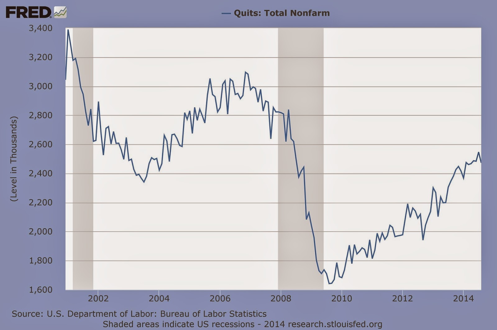
Overseas what's happening to the prime age labour force consequently gets quite a bit of air time: here, for example, is the Wall Street Journal's graph explaining the November US jobs report (from 'Did the Job Market Slow in November? Here’s How It Compares', if you've got access).


Interestingly, despite the long post-GFC expansion in the US, neither the participation rate nor the employment rate for prime age people have got back to where they were just before the GFC, and there is a mix of structural and cyclical trends going on: there looks to have been a gentle trend downwards in participation even before the GFC hit.

The corresponding numbers for New Zealand don't get much focus at all (they weren't mentioned, for example, in Stats' news release on our latest employment data), so in the spirit of inquiry I went and dug them out to see what they might be able to tell us (they're easily calculated from the data in Infoshare). Here are the headline unemployment results.


The unemployment rate for prime age people is, as you'd expect, markedly lower than for the labour force as a whole. And it's certainly signalling a tight market: the latest unemployment rate (2.0%) is getting close to its all-time low (1.5% in late 2007). You'd imagine that a fair chunk of this low rate is frictional unemployment, and that there's precious little cyclical unemployment left.

Here is the participation rate picture. It's harder to interpret: we're in uncharted territory, as the prime age participation rate has been hitting record highs. Can it keep on rising? Is there still a large reserve of people who could be tickled out into employment? Who knows, but you'd guess that the reservoir must be getting lower. We're down to only 14% of prime age people who are not in the labour force, and who are doing things like looking after young or elderly family.


The prime age participation rate is usefully splitabble into male and female participation rates, and here they are.


The overall rise to record levels of prime age participation is largely driven by a sharp and ongoing rise in female prime age participation, and like in the US there are surely both structural and cyclical things going on. That drop in the male rate over 1986-2000, for example, may well reflect the post-Rogernomics shrinking of traditionally male-dominated activities like meat processing. Changing social attitudes about (for example) who should stay at home and look after the kids will be in there, too. So it's very hard to unpick the purely cyclical component. I don't have any good feel at all for where the prime age female participation rate might peak.

Overall, the data don't give any huge overlooked insights into where we are relative to maximum unsustainable employment, mostly because the grand sweep of history and the changing attitudes to who works, and works at what, overlap the more cyclical aspects you'd like to isolate. If there is one useful extra bit of data, it's the prime age unemployment rate, which is confirming the RBNZ's "there or thereabouts" assessment.

Thursday, 10 May 2018

Unemployment strikes selectively (revisited)

A reader looked at the cyclical pattern of unemployment by ethnicity which I posted about the other day ('Unemployment doesn't strike evenly') - Maori and Pacific people fare unusually badly in downturns and require a long spell of labour market strength before their unemployment rates get back down closer to those for European and and Asian people - and asked me if the same pattern applied by education level.

You'd think the same pattern would apply for less qualified people compared to more qualified people, but off the top of my head I couldn't recall whether our labour market data included educational qualifications. The good news is yes, they do, but the bad news is that they don't go very far back in time (they start in the middle of 2013).

Here's what's available. To keep it manageable I've just picked out three levels of qualification: post-grad, the better end of a secondary school qualification, and no qualification at all. If you're interested in more detail, head for Infoshare and have a fossick: go to 'Work, income and spending', then 'Household Labour Force Survey', and then 'Labour force status by highest qualification'.


Unfortunately there isn't a big enough cycle going on over this time period to see what happens to the less qualified in recessions: all we know (which anyone would have guessed beforehand) is that those with the highest qualifications have the lowest unemployment rate.

In the US, though, we can see a longer picture of cyclical history: here's what's happened to those at the top of the educational ladder (adults with a PhD) and those at the bottom (adults with less than one year of high school). The shaded areas are recessions. Again you can get more detail for yourself from the excellent (and free) FRED database.


You do indeed get the same pattern happening as for ethnicity. Those who find it hardest to get work in good times also get hit far worse in bad times, but if the labour market stays strong enough for long enough, even those with no formal qualifications at all will start finding jobs. Remarkably, the unemployment rate in the US for those with no qualifications is now down to under 5% - but it's taken the longest peacetime expansion on record to get it down to those levels.

Policy lesson: no matter how you cut it, the groups with less going for them suffer disproportionately when the economy turns down. 

Saturday, 12 August 2017

Economics by walking around

You can read all the official data and reports you like, but I reckon nothing quite beats the insights you get from a spot of Economics By Walking Around - though an alternative interpretation is that I never quite switch out of my economics day job, even on holiday. Either way, and based on my first visit to the US in a long time, here in no particular order are what I found.

The US economy's doing fine - One of the things I always look out for in any country is the 'help wanted' signs in the windows: they're an excellent indicator. My trip wasn't a representative sample (San Francisco, Seattle, Portland, Chicago) but the short answer is, 'Now Hiring' signs were all over the place. The official labour market data for July came out when I was there: 209K new jobs, a rise in the participation rate, and a drop in the US unemployment rate to 4.3%, lower than ours.

You ain't seen nuthin' yet - all that hype about Uber and Airbnb and all those other online disintermediary threats to the established order? Believe it. They've become the new way of doing things. At the Navy Pier tourist trap in Chicago, for example, there are now designated pick-up points for Uber and Lyft (a competitor, and one we happily used). I wouldn't necessarily assume, as I think some investors do, that all of these markets are going to be network-effects-driven 'winner takes all': we found Lyft at least as good as Uber, and HomeAway better than Airbnb, and coexistence may be more likely than one-firm domination, or alternatively, they might default to one winner, but it may not be the current front-runner. And while investors could well be somewhat overexuberant, I can now see a bit more clearly why the sharemarket is prepared to pay 18.3 times expected earnings for the US IT sector. It's on a roll.

We are not alone - go to Seattle and Portland and you'll hear exactly the same sentiments about the housing market as you'll hear about Auckland's: first homebuyers can't get a look in, outsiders are buying up what's available, lower and middle income people can't buy homes near where they work (it's far worse again in San Francisco and the wider Bay area, and has been for some time). So we oughtn't think Auckland is a problem entirely unto itself: it's an outcome, like the US markets are, of generationally low interest rates, overall economic growth, regional concentration of growth sectors, demographics (including internal and external migration), and assorted supply constraints (notably planning and NIMBYs).

Public transport can work - there are days when I throw up my hands at the mismanaged mess that is Auckland transport, including the day we got back and tried to get through the chaos that is Auckland's North Shore, on a rainy day, towards the end of rush hour, with the schools back. Yet there are cities in the States who have made the thing work. Import someone from San Francisco or Portland, give them plenipotentiary powers and $5 billion a year, and tell them to get on with it. Preferably including light rail.

Are we falling behind? 1 - we like to think we're a bit ahead of the curve when it comes to social policies, but we're just tiptoeing towards issues like cannabis when it's already completely legal in some US states: we saw highway billboards in Seattle, for example, plugging the Ganja Goddess brand ("Taking Seattle cannabis to a new high"). Similarly with the taxi over-regulation revealed by Uber: the US has got on with it, we're still working it through. And it would be an interesting question which country is now the more regulated overall. Random examples: you can buy melatonin (a jet lag/insomnia thing) in your US supermarket, it's more tightly controlled here; cigar stores haven't been hounded out of existence in the US; you can buy your spirits in a San Francisco supermarket, you can't here; and dogs are welcome everywhere (including supermarkets and craft breweries), and nobody dies.

Are we falling behind? 2 - America's now our biggest export wine market. Excellent: looks like we're making great headway. Only we're a one-trick pony (Sauvignon Blanc, 86% of all exports by volume) that may be peaking - in a supermarket I saw one of our Savvie brands pitched as "low price, high quality", not where you want to be - whereas the quality of the US product is rising by leaps and bounds (try some outstanding Oregon Pinot Gris sometime). Ditto their beer and (at long bleeding last) their coffee.

We're still ahead - we're not perfect, but we have a more effective safety net than the States does. Very public homelessness and untreated mental illnesses are everywhere, particularly in San Francisco. And we should make a takeover bid for Washington state, because we sure would work it harder than its current farmers do.

The pollies have lost the plot - are the US politicians addressing issues like the homelessness? No. On the wall at breakfast in our Chicago hotel were three huge TV screens, one each for CNN, Fox, MSNBC. All of them were broadcasting as their big story - welfare? growth? homelessness? - no, a nasty intra-conservative row about whether President Trump's National Security Advisor was conservative enough. At the same time the pols were trying to restrict ordinary families' insurance access to the world's most exorbitantly priced medical care. Everything you've read about the intensely partisan and deadlocked US political system falls short of the disgraceful reality.

One step forward, one step back - we did the tourist things, especially art galleries. On the plus side, US galleries no longer care whether you photograph the exhibits (other than ones that would be damaged by camera flashes), even the ones in special exhibitions (we did Munch and Gauguin). On the minus side, when are they going to install ticket-vending machines and get rid of the entrance queues? San Francisco's Museum of Modern Art, that means you. The problem is, they're addicted to price discrimination (oldies/students, residents/nonresidents, members/nonmembers) but they've forgotten about the costs of running it. The ferry from West Seattle to downtown Seattle, for example, dispenses tickets on an ATM honesty basis (you can pick the 'senior' option if you want), and the sky doesn't fall.

A word of caution - I spend a lot of my time in front of a computer screen, so I've got a large 17.1" screen laptop. But taking it through US airport security currently makes you a marked man. As well as the whole body scanner that everyone goes through, twice I got picked out for the full pat-down search and the chemical swabbing. No dramas in the end, they let me through, and I understand what they're worried about. Just be aware, if you bring your own laptop, it'll be a bit of a performance.

Friday, 22 April 2016

Is market power on the march?

Last week I wrote about a piece in the Economist which made a case that corporate profits had become too big in the US - too big in the sense that the rise in profitability was more down to an unwelcome easing of competitive pressures (including through mergers of competitors), and a consequent rise in market power for incumbents, than down to any underlying efficiency gains or customer service improvements. My take was that if it's a potential issue for the US, it's potentially an even bigger issue for us if it's also happening here, as we're already an economy with high degrees of market concentration in various sectors. It would consequently be a good idea to see if we have (for whatever reason) become too relaxed about giving clearance to mergers, and have been allowing through ones that had actually resulted in a substantial loss of competitive pressure.

And it's like buses - right after the Economist, along comes the Council of Economic Advisers (CEA) in the US saying much the same thing in their 'issue brief', 'Benefits of competition and indicators of market power'. It's not a hard or a long (14 pages) read, but if life's too short you'll find a pretty good summary here, from the Stigler Center at the University of Chicago Booth School of Business. It also covers President Obama's consequent executive order, asking the American public sector to come up with specific ideas that would boost competition.

Where I've got to, after reading this latest effort and some of the sources it references, is that I'm in the same place as I was before. There's suggestive but (as yet) nowhere near knock-out evidence for the US, but if it's even a realistic prospect there, we need to be on our guard here that we haven't got a more severe case of it, and in particular that we aren't making the condition worse by inadvertently nodding through mergers that will reduce competition.

Let's look at some of the evidence. The CEA led off with this.

I
Well, yes, concentration is up, but often not to levels that ought to be in the least bit worrying: these are revenue shares for the top 50 companies combined, and they're often at entirely non-threatening levels. The CEA had to start somewhere, I suppose, but you'd need something a lot stronger to get to "there's a problem" territory.

The CEA do however reference some studies at a market level (which is the right frame of reference) which suggest it's happening there, too, and sometimes to levels that would indeed give you pause for thought. And other folk tend to find the same general trend, for example this paper on listed US companies concluded (p33) that
the decline in the number of industry incumbents is associated with remaining firms generating higher profits through higher profit margins. The results suggest that the increase in profit margin cannot be attributed to increased efficiency but rather to increased market power. Second, mergers in industries with a decreasing number of firms enjoy more positive market reactions, consistent with the idea that market power considerations are becoming a key source of value during these corporate events. Finally, firms in industries with a declining number of firms experience significant abnormal stock returns, suggesting that considerable portion of the market power gain accrues to shareholders. Overall, our findings suggest that despite popular beliefs, competition could have been fading over time
Of course, if you buy the idea that market power is on the rise, there could still be a bunch of reasons for it other than competition regulators not catching the anti-competitive impact of mergers, including (as both the Economist and the CEA mentioned) increased regulatory barriers to entry. It could be technology, for example: this graph from the CEA shows the already most profitable companies becoming even more so. But note that the acceleration in the top performers' ROE starts to take off mid-1990s, just when all the internet-enabled stuff started to take off. Are these the Googles of this world, and/or the companies outside the IT sector that made the best use of the new technologies?


And the CEA piece also shows that the US regulators have not been asleep at the wheel. The chart below shows that the US competition authorities have, rightly, been spending more of their time on the big (above US$1 billion) mergers than they used to. Proposed mergers ("Hart-Scott-Rodino transactions") over about US$78 million get notified to them: the regulators start "second request investigations" if they think there might be competition issues. In 2000, some 6% of proposed mergers were US$1 billion or more, and they accounted for about 25% of the push-backs from the regulator. In 2014, the big ones made up about 14% of all mergers, but were responsible for nearly 50% of the regulators' queries. If anything, you could make the case that the regulators had been spending a disproportionate amount of their time on the smaller stuff in 2000, and have got their act together since. They could, of course, still be letting "too many" through, but it's not obviously for want of kicking the tyres in the first place.


Where does this leave New Zealand and our policies and practices?

First of all, there's the law, and the Commerce Commissioners have got to call it as they see it, merger application by merger application. If they're "satisfied" that there's no substantial lessening of competition - that's the legal threshold - then it's game on. But, almost by definition these days, the proposals that come in the door are knotty. Getting to "satisfied" isn't easy. And to get there, I think Commissioners and their staff advisers would want a good deal of info to hand on trends in New Zealand corporate profitability and industry structure - what sort of 'natural experiments' are we seeing, for example when the third player in a market falls over, leaving just two? - and in particular they'd want to know what had happened when mergers "like" this one went through in the past. Against this background, ex post analysis of previous merger decisions is crucial.

Which, by the way, is also where Gary Rolnik, one of the professors at the University of Chicago's Booth School, has got to. No, there's (as yet, anyway) no smoking gun that excessive concentration and anticompetitive mergers are the issue: "these claims need more empirical studies before we can conclude, like The Economist, that for S&P 500 firms these exceptional profits derived from undue market power are currently running at about $300 billion a year, equivalent to a third of taxed operating profits, or 1.7 percent of GDP". But there's a real risk they might be: "the growing anecdotal evidence from many industries and the persistence of high profits margins in the face of stagnant growth and growing inequality deserves serious consideration".

We need to know, too. I can think of a lot worse projects for (say) our Productivity Commission to turn its mind to.

Thursday, 14 April 2016

Are mergers going too far?

A few weeks ago the Economist ran a leading article, 'The problem with profits' (here's a link, but it may be paywalled). It argued that
The naughty secret of American firms is that life at home is much easier: their returns on equity are 40% higher in the United States than they are abroad. Aggregate domestic profits are at near-record levels relative to GDP
It also said that
incumbent firms are becoming more entrenched, not less...Our analysis of census data suggests that two-thirds of the economy’s 900-odd industries have become more concentrated since 1997. A tenth of the economy is at the mercy of a handful of firms—from dog food and batteries to airlines, telecoms and credit cards. A $10 trillion wave of mergers since 2008 has raised levels of concentration further
and argued for a policy response:
take aim at cosseted incumbents. Modernising the antitrust apparatus would help. Mergers that lead to high market share and too much pricing power still need to be policed
I ran the numbers myself on the level of US profits relative to US GDP, and here they are (using the excellent FRED database). Pre-tax profits (the red line) tend to be the headline number, but the better measure is after tax profits with statistical adjustments for stock valuation and depreciation (the green line).


On one measure, profits as a share of GDP had been in long-term decline from the early 1950s up to about 2002-03, on the other (better) measure profits had been steady over the same period, but they both agree that profits have indeed taken off since. The GFC made only a temporary dent, and the drop in recent quarters may be equally transient as it reflects the impact of plunging energy prices on the US energy sector (notably on the 'fracking' industry) and it too may well dissipate if oil prices continue to firm. Overall, yes, the profits share has risen to a historically high level.

The hypothesis that overlax, Type 2 error, policing of mergers - allowing ones through that have ended up substantially lessening competition - isn't proven. But the possibility that it might be, ought to give competition authorities serious pause for thought. It's possible that economic and judicial thinking on mergers has indeed swung too far in the pro-merger direction. 

At one point in the US it had been right down the other, Type 1 error end, disallowing mergers that were extremely unlikely to cause any competition issues: classic errors of that kind had included the Brown Shoe case in 1962 and the Von's Grocery case in 1966. In the grocery one, Von's and its intended merger party would have had 7.5% of the highly unconcentrated Los Angeles market between them. Since then, opinion has evolved, less weight is put on pure market share numbers, and more, rightly, on whether there will be still be effective constraints on the merged entity post-merger. Mergers reducing four market participants to three, or three to two, will still receive intense scrutiny, as they ought, but they can get the tick today in a way that would have been unthinkable fifty years ago. Even two to one may get approved in exceptional cases.

But it may be time for a rethink, especially because (as the saying goes) you generally can't unscramble the eggs if you've mistakenly let an anticompetitive merger go through. And the downside risks are probably a bit higher in New Zealand since a fair few of our markets are fairly concentrated already. As it happens, there's a particularly good example in the pipeline right now, with Z's proposed purchase of the Chevron petrol stations. It's a doozie, or, as the Commission put it in November, "The merger application is complex and involves a number of markets throughout the fuel supply chain. We have identified and notified Z Energy of several areas that we are continuing to investigate...Further work is also required to investigate the retail supply of petrol and diesel, as there are a number of retail sites where, if the merger proceeded, few options would remain for consumers". I wasn't in the least bit surprised that in December the Commission gave it itself another four months to mull it over (the indicative decision date is now April 29). It's a tough one.

If it's indeed the case that merger authorities risk erring down the Type 2 end - and we may be at particular risk because of the structure of our economy and its Z/Chevron decision points - then it gives added force to the arguments for evaluating merger decisions after the fact. There are some folk who say it can't be done, mainly because (they argue) you can't tell what the counterfactual would have been if the merger had not gone ahead. I'm not among their number, and neither, latterly, is the Commerce Commission, which, as I noted here, has creditably gone back and looked at how they've been turning out.

The more I think about it, though, the more I'm beginning to wonder whether an independent third party shouldn't do the job (or at least be co-opted into the Commission's evaluations). I've got a good deal of confidence in the Commission's people and processes, but even so it's generally not a good idea to make one of the players the referee. And if merger authorities everywhere have accidentally strayed into allowing too-big mergers, it probably needs someone outside the consensus groupthink to say so.

Friday, 27 March 2015

Lies, damned lies, and durables orders

There are days when you really, really wonder about the efficiency of the financial markets.

Apparently (according to the AP coverage), US shares have been sold off because "Traders were discouraged to see that orders for long-lasting manufactured goods fell in February for the third time in four months". The weak state of US durables orders appears to be having effects closer to home too, with the Sydney Morning Herald saying yesterday that "The [ASX] market was down from the opening bell as Wall Street stocks were sold off sharply after unexpectedly weak US durable goods orders".

Could everyone get a grip, please?

Here are the durables data they're all supposedly worried about (from the terrific, and free, FRED data resource that the St Louis Fed provides).


Over longer timeframes, the monthly changes in the durables orders series are pretty much useless as a cyclical guide. You did get a run of consecutive falls in the post-GFC recession (the darker shaded area in the graph), but that's it. Even in what is now a prolonged recovery, you don't get a corresponding clear string of good durables numbers: if there is one in there somewhere, it's been well hidden by the monthly volatility.

It's even worse if you're not taking the longer view. Here's the past couple of years on their own.


The volatility is very large: 4% or 5% moves up or down in a single month are quite common, with the occasional even larger humdinger to throw you completely like that 22.6% spike in July '14 (some huge order for transport equipment, as it transpired).

So the noise is immense, and the signal (if there is one) is inaudible. I know journalists have to write something to keep the ads apart, and economists and analysts have to do something in the office till the pubs open, but durable goods orders? Really?

Thursday, 12 March 2015

Maybe a boom isn't what it used to be

Fascinating webcast of the media conference after the RBNZ's Monetary Policy Statement this morning (if you missed it live, there'll be a recording available here by close of play today).

The big thing I took away was the possibility of structural change - 'structural change' being economese for when the pre-existing relationships in the economy don't behave they way they used to and start doing less, or more, or happening faster or more slowly, or vanish completely, or indeed change to doing the opposite of what used to happen.

This is potentially a big issue for the RBNZ in setting policy. If the old relationships hold about wage and price setting behaviour, then our currently buoyant economy could well be leading to higher prices and wages, especially in the non-traded sector, where people setting prices and wages won't be held in check by the discipline of competition from imports. So the Bank would need to stay in "we're watching you very carefully, yes you over there, we can see you" mode, with the potential stick of higher interest rates in the background to restore order.

But what if that traditional link between boom times and boom time wages is nowhere near as strong? Then the Bank is overworried about something that isn't going to happen, or put another way, it's got monetary policy too tight. And so far non-tradables inflation is looking lower than you might have thought it would be in this strong economy, as you can see in the graph below, taken from the Statement. At the fag end of the mid 2000s boom, non-tradable inflation had blown out to 4.5%. In the current boom, it's 2.5%, and if anything falling.


And maybe the same thing is happening elsewhere. The Bank also included this graph, showing recent wage/earnings growth in the US, where they're having a sustained run of strong employment growth. As the Bank commented (p14), "Despite the significant decline in the unemployment rate over recent years, growth in nominal wages remains low relative to history".


You have to be careful about 'structural change': it can become an easy, lazy and unverifiable, way of explaining anything you didn't expect. But I suspect - and I suspect the Bank suspects - that there's something in this new story of wage and price setting not blowing out in booms like it used to..

Tuesday, 24 February 2015

Leave well enough alone

You may have noticed that there is a rather ugly (in my view) effort underway to bring the US Federal Reserve under closer political control. The latest attempt to pass a so-called Federal Transparency Act was introduced by Kentucky Congressman Thomas Massie, who said, "Behind closed doors, the Fed crafts monetary policy that will continue to devalue our currency, slow economic growth, and make life harder for the poor and middle class", a statement which (against stiff opposition) must combine more idiocies in a single sentence than anything else recently spouted by US politicians.

It's easy to smirk at the partisan piffle from Washington, but before we get too sanctimonious it's worth recalling that pretty much every one of our recent general elections has had one political party or another wanting to change our existing - and perfectly satisfactory - monetary policy arrangements. I've covered this before, but in the past few days I've come across a variety of further material which also points in the same direction: when you've got an independent, transparent, and inflation-targetting central bank, don't mess with it.

First, the Money and Banking site had an excellent article, "The Congressional Reserve Board: A Really Bad Idea", which hoed into the proposed bring-the-Fed-to-heel legislation. And along the way it included this graph (which is an improved, easier-to-read version of a graph in the original academic article), and which handily included New Zealand.


It shows how the world used to be: New Zealand used to have the least independent central bank of any developed economy, and consequently had one of the developed world's inflation rates. And countries with the most independent central banks had the lowest inflation rates.

The Money & Banking article also included a link to a poll of expert economists on the issue of potential tighter political supervision of the Fed. The results? As shown below, not a single expert economist was prepared to support the idea: a large majority thought it was a bad idea.


And then I came across this, which I think is the latest state of play as far as academic research goes: a 2014 paper on "The Effects of Central Bank Independence and Inflation Targeting On Macroeconomic Performance: Evidence from Natural Experiments", which is available as a pdf either from the Review of Economic Analysis here or as a working paper here.

Here are the key findings:
The main conclusions are: (1) When a central bank becomes more independent, it lowers the inflation rate and lowers the variability of inflation but has no effect on real GDP or unemployment. (2) When a central bank becomes an inflation targeter, it lowers the inflation rate, lowers the variability of inflation, lowers the variability of real GDP growth and the output gap, and has no adverse effect on the unemployment rate. The real GDP growth rate also increases but the source of this increase is unlikely to be inflation targeting. (3) An inflation targeter that becomes more independent delivers a similar outcome to that of a more independent bank that does not target inflation.
As the article notes, we were at the very front of the pack in adopting an independent, transparent, inflation-targetted monetary policy - "New Zealand made the first move toward greater central bank independence with the sweeping Reserve Bank of New Zealand Act 1989, which created an independent central bank with the single mandate to achieve price stability" - and we were right to do it, and to stay with it. As the article found, and other articles had found before it, there have been big ongoing payoffs, and no ongoing cost. It would be nice to think that come the next general election, the tinkerers-for-the-worse left our monetary policy arrangements alone.

Thursday, 19 February 2015

Don't block the entrance - or the exit

I wrote a while back about the excellent data the Bureau of Labor Statistics in the US produces on the labour market - what they call the JOLTS data (Job Openings and Labor Turnover Survey). You can access it yourself here. The graph below shows the key results from the latest (December '14) reading.


The mechanics of the thing are simple - when hires (the blue line) are greater than separations (essentially layoffs and quits, in red) total employment grows (in green). What's really striking about the US labour market - and indeed most labour markets - is the huge gross flows compared with the much smaller net outcome. In December alone, for example, hires were 5.1 million and separations 4.9 million: for 2014 as a whole, there were 58.3 million hires and 55.4 million separations, for a net gain in employment of 2.9 million.

We don't have the equivalent set of data in New Zealand, though it is on Stats' radar, but we do have some data that shows the same patterns operating here. Here, for example, are the numbers of jobs created at new firms, and the numbers of jobs lost through firms closing - the jobs associated with company 'births' and 'deaths'. The numbers come from Stats' Linked Employer-Employee Database, and again you can find them for yourself at Stats' (free) access site NZ.Stat under the 'Business demography statistics' heading.


This is only a slice of the labour market - the bigger part is the hiring and firing at ongoing firms - but it's interesting nonetheless. Again the gross flows are considerably larger than the net flows.

What's the relevance? It's because most folk (I believe) don't realise this is how the labour market works. I'd guess that most people reckon hiring dries up during a recession, and layoffs dry off in good times. They don't: there are very large numbers of new hires even in bad times, and very large numbers of layoffs even in good times. Rather, the ratio between them changes: hires drop faster than layoffs in bad times, and grow faster than layoffs in better times. But both power along in large volumes all the time, with a high degree of churn or turnover going on. There's a vast amount of matching and rematching going on all the time as both employers and employees look for the best fit. The efficiencies from a process where people are continually looking for the best option for both parties must be very large indeed..

The wrong idea, that layoffs happen only or overwhelmingly in bad times, tends to lead to a well-intentioned but wrong policy prescription: that if we stop the layoffs, we can keep employment up. Unfortunately in some over-regulated markets, 'job protection' measures, that aim to make it harder to lay off people, gummage up both sides of the labour market. Employers can't lay off people when they'd like (or need), and knowing that, they're less inclined to to hire in the first place, or only in unregulated ways (eg with short term contracts that don't accrue the same protection rights). Much of continental Europe is lumbered with high unemployment as a result. Well-meaning but inefficient job protections aren't the only reason for Europe's high unemployment, of course, but they're a part of it, and likely to be a substantial part of it when it comes to youth unemployment or the unemployment of more marginal groups in general.

There's also a school of thought that employees need to be protected, because the employers have the whip hand: there's some kind of market power on the employers' side. That's not true, either. Have a look at this, also from the latest JOLTS data.


In fact, things don't just 'happen' to employees at employers' discretion.  Most of the time, voluntary 'quits' are substantially larger than involuntary layoffs. In a bad recession, more people than usual prefer to sit tight, for obvious reasons. But usually there are substantially more people leaving jobs of their own volition than are leaving them because they've got the pink slip. Again the efficiencies - and personal career and life satisfaction - from a system where people can freely leave and freely find new jobs must be enormous. Anything that throws sand into this process - and it's not just job protection regulation, but could be barriers of other kinds, such as the US system of employer-provided medical insurance, or in New Zealand arguably differences in regional housing costs - risks jeopardising one of the main productivity engines of a modern economy.

Saturday, 3 January 2015

Fancy a spendup?

I really like Bill McBride's Calculated Risk blog, a great guide to what's happening to the US economy. Apart from the obvious coverage of the major macro stats, he's also got the gift of presenting the data well - I blogged before about his really impressive graph of the US labour market, and judging by the pageviews lots of others thought it was pretty neat, too - as well as the knack of finding data series that are somewhat off the beaten track but provide interesting insights into what's happening in America.

Here's his latest find, the Restaurant Performance Index produced by the National Restaurant Association and originally published here (where you can see the methodology of the thing). Bill calls it a "minor indicator", and he's right in the sense that it doesn't move markets or get much headline coverage in the business media, but that said, for me this is one of the best summary indicators of the US economy I've seen in ages.


You can see the GFC 'Great Recession', you can see the prolonged period from 2010-12 where double dips, treble dips and jobless recoveries were all in play, and then you see the more recent strong rise (particularly in 2014) where the US economy finally pulls free and starts to grow more strongly on a sustained basis. The Restaurant Performance Index is very closely aligned indeed with turning points in the overall economy, partly (as Bill notes) because it tracks largely discretionary spending decisions, which you'd expect (and you'd be right) would be highly sensitive to the economic cycle.

All of this got me wondering whether the monthly data Stats collects on electronic card transactions (latest example here) couldn't be turned into a roughly equivalent indicator for New Zealand,. One of the card series is electronic card spending on 'hospitality', which includes "accommodation, bars, cafés and restaurants, and takeaway retailing", which again is heavily discretionary and hopefully cyclically sensitive. It's unlikely to be as good a tracker as the American restaurant index, which is built up from a detailed industry survey, but it might show something interesting.

So I downloaded the series (it starts in October 2002 and at time of writing runs to November '14 - you can access it yourself on Stats' Infoshare, it's in the 'Economic Indicators' bit), ran a simple regression to eliminate the long term time trend, and looked at the residuals as a percentage of each month's hospitality spending. What you get is a graph that shows when spending on 'hospitality' is unusually strong or unusually weak, and it looks like this.


It's not too bad. There are oddities: I'm not sure why there's that cyclical weakness in 2003-05, which may be an artefact of how I've calculated the indicator (by construction there will be similar numbers of 'overs' and 'unders' whereas in real life expansion and contractions aren't the same length). But it catches the GFC and post-GFC weakness, and in particular it shows the strength of the current upswing. As far as the consumer is concerned, this is the best time for a bit of a spendup in the past dozen years.

Friday, 17 October 2014

Do we need some JOLTS?

...JOLTS being the Job Openings and Labor Turnover Summary that the American Bureau of Labor Statistics (BLS) publishes every month. You can find the text of the latest one here and it's on FRED (the St Louis Fed's economic database) if you'd like to download the data or create some graphs of your own.

Right now, the financial markets and the mainstream media have been heavily focussed on the big statistic that the BLS publishes - the monthly jobs report - and that's fair enough. So have I, in one of my day jobs as a tracker of the main macroeconomies.

But as I've got to know it a bit better I've found the JOLTS data actually gives you a much better feel for what's going on in the US labour market than the big headline jobs and unemployment numbers, and I'm beginning to think we could do with the same insight into what's going on in our own economy.

In the US, for example, in the most recent month there were some 4.6 million hires, offset by some 4.4 million 'separations', for a net employment gain around the 200K mark. 'Separations' were made up of 2.5 million 'quits' (people who voluntarily leave their jobs), 1.6 million layoffs and discharges (involuntary moves), and 0.4 million 'other' (retirements, deaths, disability etc). And yes, the numbers don't add up exactly, because of rounding, but that's the internal logic of the numbers. What the media mostly report - the net 200K gain - is actually the net resultant of giant (by comparison) gross flows, as I mentioned before in commenting on an excellent graphic display of some of these trends.

Looking at separations, here's the layoffs and discharges component. The shaded areas are recessions. There are always large numbers of layoffs, in good times and bad, because the US labour markets tend to be very flexible, but they're now way down on where they were during the worst of the GFC. Indeed they're down to the levels typically seen in pretty good times.


And here's what has been happening to quits. As you can see, quits drop sharply in tougher times: people are less prepared to risk leaving what they've got, plus there are fewer opportunities to move to. Interestingly, from this perspective, the US labour market hasn't yet got back to its buoyant pre-GFC level of quits.


And that's not because the opportunities aren't there. As the graph below shows, the number of job openings (red line) has actually just climbed back to its pre-GFC level. Actual hires, though (blue line), haven't quite got back there.


Overall, you'd say that this adds up to a positive picture. The haemorrhaging of layoffs has dropped to relatively low levels, and the number of job openings (which I'd take as the most forward-looking indicator in all of this) is back up at a robust level, though there seems to be some residual caution on both the employer (hires) and employee (quits) sides of the market. You don't get anything like the same degree of insight from the monthly new jobs number, or the monthly unemployment rate.

I think there's a good case for having the same sort of insight into our own labour market. I'm pretty sure that we don't have these American-style gross statistics (I did have a quick re-look at the Quarterly Employment and Household Labour Force surveys, and couldn't find them, but if I'm wrong, no doubt someone will put me right).

Yes, we know (say) what the total number of filled jobs was each quarter, so we know what the change in jobs was from one quarter to the next. But we don't know if a 10,000 increase in jobs was down to 10,000 hires, no quits, no sackings, or 100,000 hires, 60,000 quits and 30,000 layoffs. And I'm not sure you can make a good enough fist of either tracking the economic cycle or devising labour market policy without some clearer sighting of those gross flows.

We're even more in the dark on job openings (in US terminology) or vacancies (ours). That's not to knock MBIE's vacancies index (latest reading shown below), which is a useful macroeconomic indicator in its own right. But it's an index, of the main online job ads only, and not the sort of 'ask the employers directly' numbers the US collects.


I'm just about the last person who'd wish an extra or unnecessary burden on Stats - I've been up close and personal with them for a long time, and I know the pressures on resources - but I'm starting to think we could do with better tracking of the dynamics of our labour market. And we could probably do it cheaper than the Americans do, as we're more adept at re-using 'administrative data' (like the IRD's) that's been collected already for other reasons (the Americans use a separate standalone survey).

As it happens, it looks as if Stats think so, too. I dug out Stats' list of the important Tier 1 statistics (background here, list itself here as a pdf). 'Job and worker turnover' is listed as a currently produced Tier 1 statistic, though I'm not sure the 'turnover' part is comprehensive and I reckon this could usefully be expanded on JOLTS lines. MBIE's vacancies index was recently made a Tier 1 statistic, but is not yet anything like a full headcount of job openings. And layoffs, unfortunately, is on the long finger: 'redundancies' is at the research stage, with no decision thus far on how often the data might be collected, or when the exercise might start.

In sum, we know that the JOLTS data give us much better understanding of the US economy; we can be pretty sure they'd do the same for us if we had their equivalents; and we've agreed that they should be on the Tier 1 list. Maybe time to get on with it?

Monday, 13 October 2014

Did we lose the fiscal plot?

I've been engaged in a bit of tweeting to and fro about the rise in New Zealand's government debt in recent years, and what's behind it.

The background is that there's been a fair bit of political point-making going on about the large rise in debt on National's watch, with some people arguing that National seems to have got the kudos for responsible economic management while simultaneously presiding over a very large rise in government indebtedness.

Personally I don't care for or about the political point-scoring, and my take on it is that practically any New Zealand government, of virtually any political persuasion, would have ended up doing what National found itself doing - supporting the economy in the grim days after the GFC hit, and paying to rebuild the infrastructure destroyed by the Canterbury earthquakes. And there would have been a lot of completely appropriate questioning along the lines of 'have you forgotten the lessons of the Depression', and 'does the name John Maynard Keynes mean anything to you', if there hadn't been that support. I don't reckon there was a great deal of policy leeway for any incumbent government in these very unusual circumstances.

But it's kind of hard to make any kind of fact-driven argument in 140-character bursts, so I thought I'd take a bit of space to deal with one strand of the debate, namely how much of a fiscal boost did the government provide to the economy in the wake of the GFC.

Here are Treasury's estimates. They come from the 'Additional Fiscal Indicators' document which was part of the 2014 Budget Economic and Fiscal Update. The 'fiscal impulse' shown in the graph is the size of fiscal policy changes, measured by changes in the true underlying surplus or deficit, when you've taken out any cyclical effects affecting it. Bit of a mouthful, I know, but there you are.

What is shows is that there was a big boost to GDP, of the order of 3.5% of GDP, in the year to June 2009, and another fairly sizeable one, of about 1.75% of GDP, in the year to June 2010. In money terms, that's about $6.5 billion in the June '09 year, and about $3.4 billion in the June '10 year. Call it a round $10 billion or so for the whole package (you could probably add in a little more for another bit of fiscal support in the June '11 year). Formally, yes, $10 billion worth of fiscal boost occurred on National's watch over the two years, but I think it a very high probability that something similar would have happened - and should have happened - no matter who was at the helm.


But there's another way to see what might have happened if someone else's hand was on the tiller, and that's to look at what other governments did in exactly the same situation. So I've rounded up a bunch of the usual suspects and I've calculated the same 'fiscal impulse'. These data come from the IMF's World Economic Outlook database. Positive numbers are fiscal tightening, negative numbers are fiscal loosening.


You'll see that nobody was doing a lot in 2005, 2006 or 2007. Then fiscal policy gets loosened a good deal in 2008 (we're in the middle of the pack), even more again in 2009 (we're again in the middle of the pack), and generally was loosened a bit more in 2010, where we let it rip a bit more than the others. You'll note, incidentally, that at that point the UK took the 'austerity' route (a big fiscal tightening).

Over the three worst GFC crisis years, 2008-10, our cumulative fiscal boost was 6.7% of GDP, in the same ballpark as Australia's 6.1%, and a bit more than America's (5.6%) or Canada's (4%). The UK had chosen a completely different tack, and was taking back support in 2010, so its cumulative boost was least, at 3.1%.

Bear in mind that these numbers, while looking precise, are very spongy indeed (as even their creators will tell you), so they only tell a broad picture story, and the overall story is that everyone loosened fiscal policy, and everyone loosened appreciably, with us and Australia doing a bit more of it than the others. On the other hand we clawed back a good deal more than everyone else in 2012, so there's not a lot in it over a five year view (ex the UK). All of us took a distinctly Keynesian tack. So it's kind of hard to argue that there was something distinctively National about our absolutely typical response. Ditto if it had been Labour at the wheel.

Finally I came across a nice picture of US fiscal policy, for those of you who like graphs more than tables of numbers. It's from the Hutchins Center on Fiscal and Monetary Policy at the Brooking Institution. They call it their 'fiscal barometer', and you can see the original graph and read about the methodology here. It's a broader measure than the 'fiscal impulse' calculations mentioned thus far, so the numbers tend to be a bit bigger when it comes to measuring the fiscal impact. You want to look at the dark blue line.


You'll see that in 2007 US fiscal policy was not adding to GDP at all, shifted to a boost of around 1% of GDP by the end of 2008, to a boost of around 2.5% by the end of 2009, and peaked out at around 3% of GDP in 2010. That's a total of about 6.5% of GDP - pretty much identical to our cumulative fiscal impulse over the same period.

Look at it any way you like, the answer keeps coming up the same. A lot of countries, hit with the same sort of shock, responded in much the same way and to much the same extent, and appropriately so. The colour of the political rosette on the incumbent's lapel generally didn't matter a damn, except later in the piece in the UK. There was nothing unusual about our part in the proceedings.

Friday, 19 September 2014

Decisions, decisions

The US Fed met earlier this week, and said what people had expected it to: if things pan out as the Fed expects, it will stop its asset buying programme ("quantitative easing") after its October meeting, and on the interest rate setting front it said that "it likely will be appropriate to maintain the current target range for the federal funds rate for a considerable time after the asset purchase program ends".

The financial markets quite liked the sound of it,with (for example) American shares going on to hit a new record high. But there was one item from the Fed's published deliberations which caused some markets (including both the Kiwi dollar and the Aussie dollar) to have a spasm, and that was the range of views within the Fed about the future path for the policy interest rate (the 'Fed funds' rate). It's published as a graph, which I've shown below: it's sometimes called the 'dots plot'. It shows each attendee's view of where the Fed funds rate ought to be at the end of each of 2014, '15 and '16, and there's a 'longer run' opinion which we'll come back to.

Incidentally there are 17 dots but only 10 attendees who have a monetary policy vote: non-voting attendees' views are included as well.


What caused our local currencies to sell off was that some of the attendees at the meeting thought that the Fed funds rate ought to be raised quite a lot, quite quickly. If that happened, the gap between our local Kiwi and Aussie interest rates and US ones might close faster than previously expected, reducing the relative attractiveness of our local currencies.

The substance of the decision was interesting enough, but what was more interesting to me was what it shows about how monetary policy decisions are made, and what the Fed's take is on the potential long-term performance of the American economy.

First of all, I'm glad to see that monetary decisions in most places these days are a lot more transparent than they used to be. We don't have people's names against the Fed's dots, but at least we have the dots, and we do have names when it comes to the policy decision itself (an 8-2 split for it). Ditto for the Bank of England's policy decisions (7-2 at the latest one). Typically, the European Central Bank is the uninformative one out: the official announcement is the bare bones minimum, and while the President is a bit more forthcoming at the press conference - "On the scale of the dissent, I could say that there was a comfortable majority in favour of doing the programme" - I don't think this old style secrecy is at all consistent with what should be expected in a democracy from the experts delegated to make these important decisions on our behalf.

It also gets you thinking about whether the policy decision should be made by a committee or by an individual. The distinction is a little arbitrary - even single-person regimes like ours, where the Governor formally sits alone on the hot seat, have a lot of collective advisory mechanisms going on in the background, and committees tend to have informal leaders - but it's still useful.

The strongest argument for the committee is that collective decisions are usually better decisions: the best argument for the individual is the accountability pressure to get it right. And there are counterarguments both ways too: committees get groupthink, individuals get arrogant. I generally lean towards the individual approach (even though it looks like the minority approach these days).

Looking at the dots, I wonder if they say something about the way collective decisions are made. For example, I have some difficulty with the dot that says the Fed funds rate ought to be close to 1% by the end of this year, ditto with the dots saying it still ought to be close to zero at the end of 2015, and a lot of difficulty with the dot that says it should be close to 3% by the end of next year. These are in my opinion not credible views as straight down the line analysis. Rather they're there, I think, as a kind of "devil's advocate" marker, a psychological nudge to the rest of the voting members towards higher or lower rates. Maybe the decision's all the better in the end for these nudges from the fringes. Maybe. Can't say it's shifted me from one decisionmaker giving it their best shot.

The other interesting thing that comes out of these meetings is the "long run" estimate of where the interest rate should be. It's the Fed's stab at what the "neutral" rate would be when the economy is where it ought to be, in terms of growing at its long-run sustainable rate of GDP growth and generating an acceptable long-run rate of inflation. We can see those estimates, too (on the right hand side of the graphs below).

The edges of the shaded bit show the highest and lowest estimates, and the darker bit in the middle is the trimmed set of views after dropping the three highest and three lowest (so any "nudges" don't count). In passing, it's good to know that the cyclical outlook is looking solid, with not a single attendee picking a return to recession, or anything like it, while inflation is expected to remain well contained.


The best take the Fed has on the US economy is that in the long-run it can grow at a tad over 2% a year, with unemployment (not shown here) around 5.5%, while inflation stays at 2%, and the Fed funds rate would be 3.5-4.0% (from the dots graph).

Two per cent a year isn't a lot, and there's quite a debate within the US about whether in fact it's lost its mojo, and if so, why (permanent damage from the GFC? over-regulation? diminishing returns from technological innovation? demographics? international competitors eating its lunch?).

You end up wondering how New Zealand stacks up by comparison. And the answer is, pretty well. Taking a bit of licence with the numbers in the Reserve Bank's latest Monetary Policy Statement, especially those in Table A and Table D, I'd say our long-run growth rate is in the region of 2.9%, our long-run unemployment rate is in the low 5% area, our long-run inflation rate is about 2%, and the long-run neutral interest rate is an official cash rate in the region of 4.5%. Why we come out with a somewhat higher inherent interest rate isn't too clear, but otherwise we scrub up pretty well.

Friday, 15 August 2014

A brilliant graph

Here's a brilliant graph, from the Calculated Risk blog, an excellent site run by Bill McBride which mainly covers US macroeconomic developments. The graph came from this post, and I'm using it with Bill's permission.

It's about the US labour market, and even if that's not of great (or indeed any) interest to you, bear with me, because I've put up this graph for a variety of other reasons as well.

The first reason is to make the point, again, that national statistics authorities need to get their act together and think of better ways to present their data. I have no doubt that the good people at America's Bureau of Labor Statistics (BLS) are public-spirited professionals, but they don't know how to present data to save their lives. If you don't believe me, have a look at the BLS's release of the underlying data, which looks as if it was written in 1970 on an IBM Selectric typewriter. There isn't a single graph in the whole thing*.

Yes, I know, there's a school of thought that the official statisticians' job is just the facts, ma'am, but I think it's several decades past its use-by. The sky has not fallen when (for example) our own Statistics NZ puts out data, commentary, and several kinds of graphs (here's this week's full retail sales release, for example).

OK, here's the graph itself.


This is a really neat graphical summary of what's happening in the US labour market. On the one hand you've got voluntary job 'quits' (the light blue bar), and 'layoffs and discharges' (the red bar), which when added together gives you the total number of people who left or lost their jobs. And on the other you've got new 'hires' (the dark blue line). When hires outnumber quits plus layoffs, total employment rises, and conversely when hires fall short, employment falls. And, for completeness, you can new job openings (the yellow line), which is employers' demand for staff.

I loved everything about this graph - the clear, bright colours, the logic, the value add to the underlying data. But quite apart from its graphical excellence, it also says quite a lot about how economies work.

Often, the overall result in many markets is the net outcome of two very large gross numbers. Behind any small overall movement - employment, business creation - there tends to be a vast boiling undercurrent of gross turnover. It's emphatically not the case that employment falls (for example) because virtually everyone keep their jobs and a very small number lose theirs. The reality is that if employment falls in any given month, it's because there is a very large number of new jobs created, slightly outweighed by an even larger number of jobs lost or given up. It gives you a Schumpeterian shiver up your back.

The gross flows can be immense: as the BLS helpfully points out, "Over the 12 months ending in June 2014, hires totaled 55.7 million and separations totaled 53.3 million, yielding a net employment gain of 2.4 million. These figures include workers who may have been hired and separated more than once during the year". Which also reminds us not to read too much into statistics that are the small number resultant of two much larger numbers: whether it's net new jobs, or the balance of payments deficit, or the savings rate, little errors in any of the big gross numbers can be as large as the net resultant itself.

I'm personally of the view that these high levels of turnover reflect (and accommodate) efficiency and flexibility, and you stand in their way at your peril. There are plenty of people who disagree: they don't like the essentially 'fire at will' nature of the US labour market, and they'd rather that employers didn't have such a free hand. But less flexible, or outright inflexible, labour markets don't help anyone, as the youth unemployment rates across much of Europe demonstrate (they're not just a cyclical austerity story). Policy moral, in my view: mitigate the influence on individuals and communities by all means, equip people to the max with the skills to play the game, and get out of the way. You're doing employees and businesses no favours when you throw sand in the works.

Finally, for those who do have an interest in how the US is travelling, the news in the graph is pretty good. The dark blue line is keeping its head above the combined blue and red bars, so total employment is rising. The 'help wanted' ads have been steadily increasing: they bottomed out in the middle of 2009, and have roughly doubled since. And 'quits' are also increasing, which among other things reflects increased confidence about jobs availability. As you can see, the GFC left a big scar on the level of 'quits', which haven't got back to pre-GFC levels yet, and so far it's hardly a rip-snorter of a recovery: recent monthly net new jobs have been around the 200,000 to 250,000 mark, which aren't enough to make much of a dent in the unemployment rate. But even so, it still all adds up to a picture of sustained if still modest expansion.

*Update September 6 - I may have done the BLS a disservice here, apologies. I've just looked at the August jobs report, and the PDF version does indeed have graphs (though the HTML version doesn't), and a reference to the impact of a strike at a New England business.