Tuesday, 28 April 2015

Flying high?

Robert Litan, the Brookings economist who last year published Trillion Dollar Economists: how economists and their ideas have transformed business, has written a short article in the latest McKinsey Quarterly based on ideas in the book. It's called 'Economists: Don't leave home without one'.

One of the examples he gives of economic thinking having an enormous impact is transport deregulation, which started with deregulation of airlines in the US in the late 1970s. Not only have consumers benefitted wildly, but so have businesses. As he points out, the whole clicks and mortar world of e-commerce would likely not have got off the ground:
Had the transportation industry not been deregulated in the 1970s and early 1980s, and had the much more efficient and flexible systems built by companies such as UPS not emerged in response to competition, it is difficult to see how Internet retailers like Amazon, which came along roughly two decades later, would have been able to get started or succeed. Amazon would have had to begin with its own fleet of trucks or even planes to escape the strictures of the pre-1980 regulatory regime, a barrier to entry that almost certainly would have been impossible for new retailers to overcome.
I got to wondering if the deregulation of airlines could be seen in the prices we pay for international air travel, and the answer is, yes it can. Statistics NZ has prices series for air travel that, by happy coincidence, go back to March 1981, a little after the first US push to deregulate prices and the industry more generally. You can see them for yourself if you go to Stats' Infoshare and find your way via the Economic Indicators option to the 'CPI - Level 3 Classes for New Zealand'.

What you'll also find there is the price series for domestic air travel, and the comparison between the international and domestic air transport prices raises, for me, some disquieting thoughts.  Here's the graphical picture: I've rebased everything to 100 in March '81, and added what's happened to prices generally since then, as well as what has happened to the prices of some tradable goods (I've used footwear and new cars. I couldn't find a series for 'all tradables' that went back to 1981, so they'll have to stand proxy for what's happened to tradables more generally). For those who prefer numbers to pictures, there's also a table, where I've shown the average annual rate of price increase over the whole 1981-2015 period, and also, since the high inflation of the 1980s isn't so relevant anymore, over the period since the Reserve Bank Act went into effect (from March '90 onwards).


Some of these patterns were exactly what I'd have expected. Inflation in general has dropped since we - and the rest of the developed world - got our monetary policy act together. And I had expected international air travel prices to show only modest price increases over this period - we've had deregulation, increased competition, the rise of the budget airlines, and technological innovations in both aircraft (larger, more fuel-efficient) and airlines' own administrative systems (computerisation). International air transport prices have indeed risen very slowly over the whole period since 1981, and have actually been falling on average over the past 25 years. Other tradables - cars, shoes - show a similar pattern, where outsourcing to cheaper places in the developing world has played a large part, but international air prices have fallen even faster, and you'd have to think that the deregulatory process was one of the more important moving parts. Litan was spot on.

But then you come to domestic air transport prices, which show - to me at least - a disturbingly persistent pattern . Over the entire period, prices have risen a little faster than inflation as a whole, and over the lower-inflation post-Reserve-Bank-Act period have been rising considerably faster.

And that's rather odd, because some of the reasons that non-tradables inflation tends to be higher than tradables inflation don't apply to domestic air transport. True, you can't easily substitute an overseas product for a domestic one, just as you can't easily outsource your doctor's visit or your kids' secondary school to Vietnam or the Philippines: an ultra cheap fare between Dublin and Nice is no good when you want to go to Dunedin. On the other hand, another big reason why non-tradables tend to rise in price relative to non-tradables - it's harder to achieve the productivity gains you get in (say) manufacturing computer equipment because you can't suddenly make brain operations happen in a quarter of the time - doesn't apply. You'd think a good deal of the increases in aircraft and airline system productivity should have fed through to more modest rises in transport prices than we've seen.

So why didn't they? Much of the answer must lie in the smaller degree of competitive pressure that non-tradables like domestic air transport must face. In saying that, I recognise that there is some degree of domestic competition in air transport. Like everyone else I'm pleased to have snapped up some very low prices from time to time: on occasions, the cost of flying from Auckland to Wellington has been less than the cost of a return taxi between the North Shore and Auckland Airport. On average, however, the cheapies have not compensated for progressively higher airfares overall: in real terms, relative to the overall CPI, domestic prices are slightly higher than they were in 1981. International air travel prices, in real terms, are hugely lower. The numbers wobble around a bit, but you're paying a quarter or a third of what you would have paid back in 1981.

And I suppose there may be some good operational reasons, other than competition playing too weak a disciplinary role, why the domestic airlines haven't been able to match the falling international prices. They don't, for example, have the access to cheap secondary airports that the budget European and American carriers do: perhaps their fares have to reflect the market power of the airports. Or perhaps they've been lumbered with higher regulatory costs than your typical overseas operator. 

But you're still left with the feeling that competition isn't restraining local air prices as well as it might. It might be a coincidence, but the only time that domestic air price inflation lagged behind CPI price inflation as a whole, as you can see on the graph, was in the late '80s and through most of the '90s - precisely the period when Ansett New Zealand was most active.

Tuesday, 21 April 2015

The shape of our competitive landscape

Every now and then there's a debate about our industrial structure. Some argue that as a small economy we've already got an issue with industries that are too concentrated, and so need to be unusually alert to collusive oligopolistic behaviour, while others argue that we're nowhere near concentrated enough, and that our fragmented industries need to bulk up so we've got companies at the fighting weight to be internationally competitive.

There's a lot of interest in the issues. The viewing stats for this blog are currently showing that my most read piece at the moment is the post that criticised the 'national champions' approach, not that it's easy to kill it off. There have been a number of recent moves in that direction, as I reported here.

In any event, it occurred to me that I didn't have too clear an idea of the actual concentration of New Zealand markets and the strength of competition within them. And then I remembered that Stats' Business Operations Survey (assorted links to commentary and data here) has a question about how many competitors respondents thought they had. I've played around with the data, and here are the key results, by size of business.


Is this benign or troubling? On the plus side, the typical situation faced by a New Zealand business is one of many competitors, with a core of several bigger ones (the "several dominant" phraseology comes from the survey questionnaire, and is a bit at odds with how competition folk would normally use "dominant", but it's pretty clear what the responses must mean). Add in the 20% or so of firms who face multiple competitors, with no especially big ones in the mix, and you find that 70% or so of businesses operate in what are likely to be reasonably competitive markets (I know, numbers of firms don't automatically align with intensity of competition, but it still looks the way to bet).

On the troubling side, close to one fifth of all businesses say they operate in a duopoly or triopoly, and another 5% say they've got a completely captive market with no competitors at all (and, I'd guess, some of those in the 5% of "Don't knows" might be in the same boat, but would probably not prefer to say so).

So after a first pass through the data, there's no knockout evidence either way: there's evidence for a mostly competitive economy, and there's evidence of potentially problematic concentration. If you feel like having a closer look yourself, you'll find the underlying data at NZ.Stat, in Module A of the Business Operations Tables.

Incidentally, if you were minded to take the radical step of asking a competition authority to account for whether it's making any difference or not, you could do worse than put "the proportion of businesses reporting a captive market or no effective competition" onto its shopping list.

Friday, 17 April 2015

How do supermarkets compete?

In the previous post I wrote up the results of the Electricity Authority's latest survey of competition in various industries: supermarkets came out tops in terms of people's assessment of whether they are getting a competitive deal from businesses they deal with. While it wasn't a full economy-wide survey, and maybe there are unsurveyed sectors that would have shown up better than the supermarkets, it was nonetheless very interesting that people feel they are getting a fair deal from supermarkets vying for their custom, and all the more so because there have been concerns about a potential duopolistic shakedown.

As it happens, I just came across another new survey which tells us in more detail what people value from supermarkets (it's Australian, but I'd suggest it's equally applicable here). It comes from Roy Morgan Research's 'Single Source' surveys, which are very large scale: this supermarket one had close to 16,000 respondents, all interviewed face to face. The press release is here (the full thing costs serious $, which is fair enough given the scale and value of the exercise).

Here's the core result, where we can see the various dimensions across which supermarkets compete, and which ones most press consumers' buttons.


Before seeing these results, I'd have guessed that some dimension of all-in-one convenience would have topped the list, supermarkets being (you'd think) the classic economies of scope/minimise transactions cost model, but I'd have been wrong. There are, to be sure, some convenience dimensions in the most valued characteristics of a supermarket. And there are some price/value dimensions, too, which you'd also expect to be high up the list. But the surprise packet - for me - was the very high ranking of quality, with 'high standards of food safety', 'hygienically prepared food', 'good quality' fruit and veg and 'clean and tidy' taking four of the top nine spots, including the top one itself.

Apart from its intrinsic interest, and the insight it gives into the real nature of the supermarkets' value proposition (and, I'd guess, a glimpse of their likely strategic thinking), it's a good reminder that competition is more than competition on price. Sure, most of us involved in thinking about competition have taken the idea on board, most of the time, and there's even an acronym SPQR (Service, Price, Quality, Range) that people sometimes deploy to make sure they've got all the potential bases of competitive rivalry covered. But it's nonetheless easy to lapse into using price as a proxy for everything. In some lines of business, and supermarkets are clearly one, that could lead you badly astray, and in several directions. You could easily assume there is less competition that there actually is. And, if rivalry diminished on one of those non-price dimensions, you could easily miss that, too.

Tuesday, 14 April 2015

Are we getting a competitive deal - 2015 version

The Electricity Authority has done everyone a service. It's just come out with its latest surveys of the state of competition in the electricity industry and - because it needs to know whether the level of competition in electricity is good, bad or indifferent compared to other industries - in a range of other sectors. It's got two surveys, one of the general public and, if you're into electricity, one of stakeholders in the electricity industry. These surveys are a great thing to do, especially as they are now beginning to develop a bit of history: when I first wrote about them, there were only two surveys' worth of data, but now there are four, and we can maybe start to see patterns over time.

Here's the key graph from the survey of the public, which shows people's responses to the question, "Using a 0-10 scale where 0 means not at all competitive, 5 means just adequate and 10 means extremely competitive, how competitive are the following businesses in terms of working to get your business and offering you the best deals? If you do not know enough, just say so".


It's hard to know which of these results is the most intriguing. The ranking of industries is interesting: for all the concerns expressed about our supermarket duopoly, consumers evidently feel that it's a competitive one, with the the two of them duking it out in the marketplace, and they rate the deal they're getting ahead from the supermarkets a little bit ahead of the others in the survey. The low ranking of online bookstores, by the way, is because there's an unusually high proportion of 'don't know' answers, which kind of surprises me as I'd have reckoned anyone buying a book these days must have given the offshore services  a go by now, but there you are. If you're interested in the minutiae of the poll results, I've out a detailed table at the end of this post, 'over the fold' as they say.

The most recent trend, admittedly on this short series, is a little bit of a worry: except for petrol stations, the trend over the past year has been for the degree of competition to ease off a bit. Perhaps in the currently strong economy, sellers don't feel they have to compete quite as hard to earn a crust? As for petrol stations, while I'd generally go on the assumption that people are perfectly capable of making good judgements about suppliers and the deals they're offering, I'm not sure in this particular case whether motorists have been able to separate out how much of lower prices is due to lower import costs and how much to any increased intensity of competition (you might be interested in my earlier post about what's happening at the petrol pump).

These are great surveys: full marks to the Electricity Authority for running with the idea. It does, naturally, raise the question why the Commerce Commission isn't doing the same across a wider range of sectors. As I've argued before, "I reckon it's time for the Commerce Commission to belly up to the bar and tell us what real differences [in levels of competition] are happening in our markets".

And if they don't, or can't, or won't, maybe we should pirate one of the recommendations of Australia's Harper review of competition policy (if you haven't caught up with its excellent work, start here or go to the thing itself). It argued (in Recommendations 43 through 47) for a new pro-competition advocacy body, an Australian Council for Competition Policy, that would among other things "develop an understanding of the state of competition across the Australian economy and report on it regularly" (p76). It's a good idea, and we should steal it.

Finally, for anyone who wants the more detailed responses, here they are.

Monday, 13 April 2015

Australia's got the competition gospel. Have we?

At the end of last month Australia's 'Harper Review', or more formally the Competition Policy Review, issued its final report (where there are links to the chapters, the full report, and, if life's too short, a series of cheat sheet infographics which will give you the guts of the thing). I'd loved its draft report when it came out last September: it was a breath of fresh air to find a review body that was systematically on the side of the benefits of competition and against the privileged interests created, for example, by restrictions on parallel imports. In particular I'd liked its proposed change to s46 of Australia's Competition and Consumer Act, which is the equivalent of s36 of our Commerce Act, the bit that deals with misuse of a substantial degree of market power, and I was very pleased with its forthright stance against creating "national champions" shielded from domestic competition.

And there was also a whole bunch of other worthwhile stuff dealing to impediments to competition, notably (I'm quoting from the relevant cheat sheet) removing regulations that inhibit competition in areas such as aviation, shipping and taxis, and dealing immediately to archaic anti-competitive arrangements by reforming retail trading hours, parallel importing, and pharmacies. Predictably the pharmacists have responded with the usual special pleading, but there was an excellent riposte by the University of Melbourne's Prof Philip Clarke which said among other things that "the lack of competition in the sector comes at a cost to the consumer, both in terms of the choice of where they can shop and in the prices that must be paid...a packet of aspirin, which may cost as little as $3 in [the] retail marketplace costs up to $12 when it is dispensed under the PBS [Australia's Pharmaceutical Benefits Scheme]".

The final report has a few changes from the draft version (the relevant cheat sheet is here), including a new and sensible recommendation (p51) that "Competition principles, particularly those promoting choice and a diversity of providers, should be incorporated into [government] procurement, commissioning, PPP [Public-Private Partnerships] and privatisation policies and practices" and the equally sensible recommendation that "Non-employment trading restrictions in awards and industrial agreements should be subject to competition laws".

On the misuse of market power, the Review was originally minded to allow a defence that
the prohibition would not apply if the conduct in question would be both:
• a rational business decision by a corporation that did not have a substantial degree of power in the market; and
• likely to have the effect of advancing the long-term interests of consumers
but as the Review notes (p342), "This proposed defence is generally not supported by submissions", including, incidentally, our own Commerce Commission's, and they dropped it. Their final position (Recommendation 30) is
The primary prohibition in section 46 of the CCA should be re-framed to prohibit a corporation that has a substantial degree of power in a market from engaging in conduct if the proposed conduct has the purpose, or would have or be likely to have the effect, of substantially lessening competition in that or any other market.
To mitigate concerns about inadvertently capturing pro-competitive conduct, the legislation should direct the court, when determining whether conduct has the purpose, effect or likely effect, of substantially lessening competition in a market, to have regard to:
• the extent to which the conduct has the purpose, effect or likely effect of increasing competition in the market, including by enhancing efficiency, innovation, product quality or price competitiveness; and
• the extent to which the conduct has the purpose, effect or likely effect of lessening competition in the market, including by preventing, restricting or deterring the potential for competitive conduct in the market or new entry into the market.
This for me is a good finishing point, and I'd like to see MBIE, who are looking at what to do about our s36, adopt it holus bolus and move smartly on.

I also liked the Review's recommendation that the net benefits of its proposals ought to be formally modelled (they suggest, by Australia's Productivity Commission). Yes, obviously, it's rather a heroic exercise, and you'll find a discussion of the issues involved in s30 of the report (from p492 onwards), but where we can, we should all be moving to policy that's based on at least some stab at reasonable numbers rather than on wishful thinking or ignorance. I'd suggest the net benefits of their overall package could be very large: the Review helpfully included (pp497-8) some existing estimates of specific reforms, and they're sizeable. Here are a couple of them:
In respect of parallel imports (see Recommendation 13), the PC [Productivity Commission] found that, in 2007-08, a selection of around 350 books sold in Australia were on average 35 per cent more expensive than like editions sold in the US. In many cases, the price difference was greater than 50 per cent.
In regard to planning and zoning (see Recommendation 9), in New South Wales, a recent study commissioned by the state government into the potential benefits of comprehensively reforming planning and zoning in that state showed net benefits ranging between $569 million and $1,482 million per annum, depending on the reform option considered.
So hats off to the Aussies. They haven't done the political hard yards to implement it yet, but at least they've come up with a terrific blueprint for advancing a more productive, more competitive economy and for dismantling the Olde Spanish Practices that have been rorting Australian consumers.

On the other hand I wish I could see a similar appetite for reform in New Zealand. As I've said before, when another Aussie review also came up with a hatful of competition and regulation reforms, you struggle to see the same issues being treated with the same degree of urgency here at home.

Tuesday, 31 March 2015

Bernanke on economics

There's been quite a lot of coverage of former Fed chairman Ben Bernanke starting up a blog and a Twitter account. Someone - apologies, can't remember who - resurrected his 2013 speech, 'The Ten Suggestions', at the Baccalaureate Ceremony at Princeton, where he said of economics
Economics is a highly sophisticated field of thought that is superb at explaining to policymakers precisely why the choices they made in the past were wrong. About the future, not so much. However, careful economic analysis does have one important benefit, which is that it can help kill ideas that are completely logically inconsistent or wildly at variance with the data. This insight covers at least 90 percent of proposed economic policies.
The whole thing is worth a read - humour yes, but also quite a bit of wisdom. Speech here, and a video here.

How fast has wealth been growing?

Yesterday I posted about some new data that the Reserve Bank has collated on household balance sheets. It's important stuff, and unsurprisingly other commentators have also been talking about it. As part of the Twittering I rushed in where angels fear to tread, and have subsequently had to shelter in a foxhole in No Man's Land while the salvoes fly over my head.

The debate is about showing the full picture of what has happened to household wealth (and not just sub-sets of the history), and also about the growth rate of household wealth (with some unspoken subtexts, I'm guessing, about who was in government when wealth grew slower or faster).

So in the interests of putting some facts on the table, here are two graphs. They both show the growth rates of GDP and household (net) wealth, and they go back as far as the wealth data do, so this is as full a picture as you can show. Both take rolling four quarter totals, to smooth out the quarterly statistical noise: a side effect is that you lose some quarters at the beginning. And both use year on year growth rates rather than quarter on quarter ones, again to smooth out the noise, which means you lose some more quarters at the beginning, and so the graphs start at December 2000 rather than December 1998 which is when the household wealth series starts.

The only difference is that the first chart shows nominal wealth (the headline dollar number that the RBNZ has calculated) and nominal GDP, so both are in dollars of the day, and the second chart shows real wealth (which is nominal wealth which I have deflated by the CPI) and real GDP (which is Stats data, using the expenditure measure). Both have their uses, and there's already been some cross-fire about which to use, but for many purposes I'd suggest the second graph is likely to be the more relevant. That said, you get much the same shape of growth profile in both cases, so I wouldn't die in a ditch over which one to reach for.

Here they are.

Year on year growth rates - nominal $ terms

Year on year growth rates - real terms

What can you say about these results? First, that wealth is a good deal more volatile than GDP, which is as you'd expect, as asset prices can move a lot across the business cycle. Second, that the current business cycle isn't as strong as the heady days of the early to mid 2000s: GDP is growing respectably at a 2.5-3.0% sort of pace, but it's not as strong as the 4.0-5.0% pace we saw in the early 2000s, and wealth is definitely growing more slowly that it did back then. If people can see other trends in there, let us know.

As for who might get credit or blame, I'll just say what I said in a different context a few days ago - I was talking about jobs but it's as applicable here - that "voters these days know that governments don't create jobs (or not the bulk of them, at any rate). Governments can often, and fairly, take credit for allowing or facilitating or improving the environment for job creation, and that's no small thing: just look at all the counter-examples, from France to Venezuela, where governments have been incompetent managers of the macroeconomic environment. But job creation itself? Nah".

Monday, 30 March 2015

What do we own, and what do we owe?

The Reserve Bank has done everyone a big favour by coming up with improved data on households' assets and liabilities. This latest improvement is part of a series where Rochelle Barrow and her colleagues have been toiling away at finding or improving statistics that throw light on macrofinancial issues - I posted a while back about their extensions to the suite of interest rate data - and it's an especially important one. With the current Auckland housing boom, for example, we need good data on what the vulnerabilities might be in people's balance sheets - have they gone overboard on leveraging into a red-hot market? - and there are also other concerns, including what looks like an unusually low household savings rate by international standards.

You'll find the Bank's news release about the new household data here, the background paper (pdf) that goes into all the technicalities here, and the data themselves (Excel) here and here. By far the major significant improvement is the inclusion of households' equity in small and medium sized businesses (whether incorporated or not). As in many economies, it's a big slab of the economic landscape: in New Zealand households' measured wealth goes up by $312 billion when their business equity is counted. "Goes up", by the way, is meant as a matter of arithmetical comparison between the old data on household wealth and the new ones: households haven't suddenly become much richer, it's just that the RBNZ data are now measuring what was always there, whereas before they weren't.

Here's a snapshot of what New Zealand households own, from the background paper.


The business equity that is now being counted is the darkish blue segment towards the bottom. Housing makes up about half of everything (more like 60% if you add in rental property, which I'll come to in a minute). Whether you regard that as normal, or as yet another illustration of Kiwis' one-eyed preoccupation with housing an as investment, is up to you, but the good news is that, because these new RBNZ statistics are being compiled on an internationally consistent basis, we'll be in a better place to make international comparisons and judge whether we're normal or odd. It won't be a stroll in the park - "Neither the previous New Zealand household sector balance sheet data, nor this new data, will necessarily be fully comparable with data presented by authorities in other countries", as the paper says, partly because other countries have their own funny ways of counting things - but we'll be able to move a good deal closer to making reasonable judgements about how we scrub up compared to other places.

I wondered where our KiwiSavers are, and the answer is, in that purplish segment second one down, 'net equity in superannuation funds'. KiwiSaver came in in 2007, and in December '07 households' equity in super was $31 billion. By December '14 it had risen to $57.8 billion: I know there is recent research from Treasury saying KiwiSaver didn't add to overall wealth accumulation, and perhaps KiwiSaver only shifted around how wealth is held, and maybe that's right. But in any event there's now a sizeable KiwiSaver pot where there wasn't one before.

Unfortunately, one of the side effects of moving to an internationally standardised way of measuring these things is that rental property - which you and I would regard as an archetypal household asset - is classified as a business activity rather than a household activity in the international Book of Armaments. As the background paper says, "most analysts will want to include the liabilities of rental properties as household liabilities because of the full-recourse nature of mortgages in New Zealand", and so the Bank "will continue to provide statistics that include rental property as an adjunct to the new series". Jolly good.

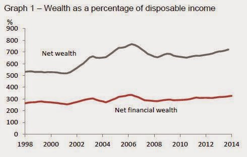
The only quibble I've got - and I had it about the older less complete data, too - is that I think the headline way of summarising the data doesn't really show the situation  in the intuitive way most of us would like to see. It's got its uses, I dare say, but it doesn't hit the spot for me. Here, for example, is one of the RBNZ's summary graphs.


There's net wealth at the top - fine, got that, your total assets less your total liabilities, no problem there. And then there's net financial wealth, which is your financial assets (money in the bank, the KiwiSaver, those Mighty River Power shares) less your financial liabilities (the mortgage, the credit card). But I'm afraid I find the net financial wealth calculation of no practical interest or utility at all: it makes more sense to me to net off the financial liability of the mortgage against the non-financial asset of the house (to show housing equity) and to show financial assets net of any other financial liabilities.

Here's my rejig, including rental property and mortgages secured against rental property. It's horses for courses, but for me this is a better way of showing how much we've got in the house and how much in other things. Indirectly, though, it  shows, again, the utility of the data, as they can be spliced and diced to suit your interest.


While a statistician's work is never done, it looks as if these enhancements to the household picture have largely filled in the one large big gap: the background picture notes some possible future extensions but I doubt if they're going to be of the order of $312 billion worth (though converting the SME equity from its current book value to market value could be worth a bob or two to the picture of household equity). We're now in a clearly better place when it comes to having a good picture of household wealth and debt - well done, the RB.