Economics is a highly sophisticated field of thought that is superb at explaining to policymakers precisely why the choices they made in the past were wrong. About the future, not so much. However, careful economic analysis does have one important benefit, which is that it can help kill ideas that are completely logically inconsistent or wildly at variance with the data. This insight covers at least 90 percent of proposed economic policies.The whole thing is worth a read - humour yes, but also quite a bit of wisdom. Speech here, and a video here.
Tuesday, 31 March 2015
Bernanke on economics
There's been quite a lot of coverage of former Fed chairman Ben Bernanke starting up a blog and a Twitter account. Someone - apologies, can't remember who - resurrected his 2013 speech, 'The Ten Suggestions', at the Baccalaureate Ceremony at Princeton, where he said of economics

How fast has wealth been growing?
Yesterday I posted about some new data that the Reserve Bank has collated on household balance sheets. It's important stuff, and unsurprisingly other commentators have also been talking about it. As part of the Twittering I rushed in where angels fear to tread, and have subsequently had to shelter in a foxhole in No Man's Land while the salvoes fly over my head.
The debate is about showing the full picture of what has happened to household wealth (and not just sub-sets of the history), and also about the growth rate of household wealth (with some unspoken subtexts, I'm guessing, about who was in government when wealth grew slower or faster).
So in the interests of putting some facts on the table, here are two graphs. They both show the growth rates of GDP and household (net) wealth, and they go back as far as the wealth data do, so this is as full a picture as you can show. Both take rolling four quarter totals, to smooth out the quarterly statistical noise: a side effect is that you lose some quarters at the beginning. And both use year on year growth rates rather than quarter on quarter ones, again to smooth out the noise, which means you lose some more quarters at the beginning, and so the graphs start at December 2000 rather than December 1998 which is when the household wealth series starts.
The only difference is that the first chart shows nominal wealth (the headline dollar number that the RBNZ has calculated) and nominal GDP, so both are in dollars of the day, and the second chart shows real wealth (which is nominal wealth which I have deflated by the CPI) and real GDP (which is Stats data, using the expenditure measure). Both have their uses, and there's already been some cross-fire about which to use, but for many purposes I'd suggest the second graph is likely to be the more relevant. That said, you get much the same shape of growth profile in both cases, so I wouldn't die in a ditch over which one to reach for.
Here they are.
What can you say about these results? First, that wealth is a good deal more volatile than GDP, which is as you'd expect, as asset prices can move a lot across the business cycle. Second, that the current business cycle isn't as strong as the heady days of the early to mid 2000s: GDP is growing respectably at a 2.5-3.0% sort of pace, but it's not as strong as the 4.0-5.0% pace we saw in the early 2000s, and wealth is definitely growing more slowly that it did back then. If people can see other trends in there, let us know.
As for who might get credit or blame, I'll just say what I said in a different context a few days ago - I was talking about jobs but it's as applicable here - that "voters these days know that governments don't create jobs (or not the bulk of them, at any rate). Governments can often, and fairly, take credit for allowing or facilitating or improving the environment for job creation, and that's no small thing: just look at all the counter-examples, from France to Venezuela, where governments have been incompetent managers of the macroeconomic environment. But job creation itself? Nah".
The debate is about showing the full picture of what has happened to household wealth (and not just sub-sets of the history), and also about the growth rate of household wealth (with some unspoken subtexts, I'm guessing, about who was in government when wealth grew slower or faster).
So in the interests of putting some facts on the table, here are two graphs. They both show the growth rates of GDP and household (net) wealth, and they go back as far as the wealth data do, so this is as full a picture as you can show. Both take rolling four quarter totals, to smooth out the quarterly statistical noise: a side effect is that you lose some quarters at the beginning. And both use year on year growth rates rather than quarter on quarter ones, again to smooth out the noise, which means you lose some more quarters at the beginning, and so the graphs start at December 2000 rather than December 1998 which is when the household wealth series starts.
The only difference is that the first chart shows nominal wealth (the headline dollar number that the RBNZ has calculated) and nominal GDP, so both are in dollars of the day, and the second chart shows real wealth (which is nominal wealth which I have deflated by the CPI) and real GDP (which is Stats data, using the expenditure measure). Both have their uses, and there's already been some cross-fire about which to use, but for many purposes I'd suggest the second graph is likely to be the more relevant. That said, you get much the same shape of growth profile in both cases, so I wouldn't die in a ditch over which one to reach for.
Here they are.
 |
| Year on year growth rates - nominal $ terms |
 |
| Year on year growth rates - real terms |
What can you say about these results? First, that wealth is a good deal more volatile than GDP, which is as you'd expect, as asset prices can move a lot across the business cycle. Second, that the current business cycle isn't as strong as the heady days of the early to mid 2000s: GDP is growing respectably at a 2.5-3.0% sort of pace, but it's not as strong as the 4.0-5.0% pace we saw in the early 2000s, and wealth is definitely growing more slowly that it did back then. If people can see other trends in there, let us know.
As for who might get credit or blame, I'll just say what I said in a different context a few days ago - I was talking about jobs but it's as applicable here - that "voters these days know that governments don't create jobs (or not the bulk of them, at any rate). Governments can often, and fairly, take credit for allowing or facilitating or improving the environment for job creation, and that's no small thing: just look at all the counter-examples, from France to Venezuela, where governments have been incompetent managers of the macroeconomic environment. But job creation itself? Nah".
Monday, 30 March 2015
What do we own, and what do we owe?
The Reserve Bank has done everyone a big favour by coming up with improved data on households' assets and liabilities. This latest improvement is part of a series where Rochelle Barrow and her colleagues have been toiling away at finding or improving statistics that throw light on macrofinancial issues - I posted a while back about their extensions to the suite of interest rate data - and it's an especially important one. With the current Auckland housing boom, for example, we need good data on what the vulnerabilities might be in people's balance sheets - have they gone overboard on leveraging into a red-hot market? - and there are also other concerns, including what looks like an unusually low household savings rate by international standards.
You'll find the Bank's news release about the new household data here, the background paper (pdf) that goes into all the technicalities here, and the data themselves (Excel) here and here. By far the major significant improvement is the inclusion of households' equity in small and medium sized businesses (whether incorporated or not). As in many economies, it's a big slab of the economic landscape: in New Zealand households' measured wealth goes up by $312 billion when their business equity is counted. "Goes up", by the way, is meant as a matter of arithmetical comparison between the old data on household wealth and the new ones: households haven't suddenly become much richer, it's just that the RBNZ data are now measuring what was always there, whereas before they weren't.
Here's a snapshot of what New Zealand households own, from the background paper.

The business equity that is now being counted is the darkish blue segment towards the bottom. Housing makes up about half of everything (more like 60% if you add in rental property, which I'll come to in a minute). Whether you regard that as normal, or as yet another illustration of Kiwis' one-eyed preoccupation with housing an as investment, is up to you, but the good news is that, because these new RBNZ statistics are being compiled on an internationally consistent basis, we'll be in a better place to make international comparisons and judge whether we're normal or odd. It won't be a stroll in the park - "Neither the previous New Zealand household sector balance sheet data, nor this new data, will necessarily be fully comparable with data presented by authorities in other countries", as the paper says, partly because other countries have their own funny ways of counting things - but we'll be able to move a good deal closer to making reasonable judgements about how we scrub up compared to other places.
I wondered where our KiwiSavers are, and the answer is, in that purplish segment second one down, 'net equity in superannuation funds'. KiwiSaver came in in 2007, and in December '07 households' equity in super was $31 billion. By December '14 it had risen to $57.8 billion: I know there is recent research from Treasury saying KiwiSaver didn't add to overall wealth accumulation, and perhaps KiwiSaver only shifted around how wealth is held, and maybe that's right. But in any event there's now a sizeable KiwiSaver pot where there wasn't one before.
Unfortunately, one of the side effects of moving to an internationally standardised way of measuring these things is that rental property - which you and I would regard as an archetypal household asset - is classified as a business activity rather than a household activity in the international Book of Armaments. As the background paper says, "most analysts will want to include the liabilities of rental properties as household liabilities because of the full-recourse nature of mortgages in New Zealand", and so the Bank "will continue to provide statistics that include rental property as an adjunct to the new series". Jolly good.
The only quibble I've got - and I had it about the older less complete data, too - is that I think the headline way of summarising the data doesn't really show the situation in the intuitive way most of us would like to see. It's got its uses, I dare say, but it doesn't hit the spot for me. Here, for example, is one of the RBNZ's summary graphs.
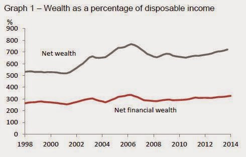
There's net wealth at the top - fine, got that, your total assets less your total liabilities, no problem there. And then there's net financial wealth, which is your financial assets (money in the bank, the KiwiSaver, those Mighty River Power shares) less your financial liabilities (the mortgage, the credit card). But I'm afraid I find the net financial wealth calculation of no practical interest or utility at all: it makes more sense to me to net off the financial liability of the mortgage against the non-financial asset of the house (to show housing equity) and to show financial assets net of any other financial liabilities.
Here's my rejig, including rental property and mortgages secured against rental property. It's horses for courses, but for me this is a better way of showing how much we've got in the house and how much in other things. Indirectly, though, it shows, again, the utility of the data, as they can be spliced and diced to suit your interest.

You'll find the Bank's news release about the new household data here, the background paper (pdf) that goes into all the technicalities here, and the data themselves (Excel) here and here. By far the major significant improvement is the inclusion of households' equity in small and medium sized businesses (whether incorporated or not). As in many economies, it's a big slab of the economic landscape: in New Zealand households' measured wealth goes up by $312 billion when their business equity is counted. "Goes up", by the way, is meant as a matter of arithmetical comparison between the old data on household wealth and the new ones: households haven't suddenly become much richer, it's just that the RBNZ data are now measuring what was always there, whereas before they weren't.
Here's a snapshot of what New Zealand households own, from the background paper.
The business equity that is now being counted is the darkish blue segment towards the bottom. Housing makes up about half of everything (more like 60% if you add in rental property, which I'll come to in a minute). Whether you regard that as normal, or as yet another illustration of Kiwis' one-eyed preoccupation with housing an as investment, is up to you, but the good news is that, because these new RBNZ statistics are being compiled on an internationally consistent basis, we'll be in a better place to make international comparisons and judge whether we're normal or odd. It won't be a stroll in the park - "Neither the previous New Zealand household sector balance sheet data, nor this new data, will necessarily be fully comparable with data presented by authorities in other countries", as the paper says, partly because other countries have their own funny ways of counting things - but we'll be able to move a good deal closer to making reasonable judgements about how we scrub up compared to other places.
I wondered where our KiwiSavers are, and the answer is, in that purplish segment second one down, 'net equity in superannuation funds'. KiwiSaver came in in 2007, and in December '07 households' equity in super was $31 billion. By December '14 it had risen to $57.8 billion: I know there is recent research from Treasury saying KiwiSaver didn't add to overall wealth accumulation, and perhaps KiwiSaver only shifted around how wealth is held, and maybe that's right. But in any event there's now a sizeable KiwiSaver pot where there wasn't one before.
Unfortunately, one of the side effects of moving to an internationally standardised way of measuring these things is that rental property - which you and I would regard as an archetypal household asset - is classified as a business activity rather than a household activity in the international Book of Armaments. As the background paper says, "most analysts will want to include the liabilities of rental properties as household liabilities because of the full-recourse nature of mortgages in New Zealand", and so the Bank "will continue to provide statistics that include rental property as an adjunct to the new series". Jolly good.
The only quibble I've got - and I had it about the older less complete data, too - is that I think the headline way of summarising the data doesn't really show the situation in the intuitive way most of us would like to see. It's got its uses, I dare say, but it doesn't hit the spot for me. Here, for example, is one of the RBNZ's summary graphs.
There's net wealth at the top - fine, got that, your total assets less your total liabilities, no problem there. And then there's net financial wealth, which is your financial assets (money in the bank, the KiwiSaver, those Mighty River Power shares) less your financial liabilities (the mortgage, the credit card). But I'm afraid I find the net financial wealth calculation of no practical interest or utility at all: it makes more sense to me to net off the financial liability of the mortgage against the non-financial asset of the house (to show housing equity) and to show financial assets net of any other financial liabilities.
Here's my rejig, including rental property and mortgages secured against rental property. It's horses for courses, but for me this is a better way of showing how much we've got in the house and how much in other things. Indirectly, though, it shows, again, the utility of the data, as they can be spliced and diced to suit your interest.
While a statistician's work is never done, it looks as if these enhancements to the household picture have largely filled in the one large big gap: the background picture notes some possible future extensions but I doubt if they're going to be of the order of $312 billion worth (though converting the SME equity from its current book value to market value could be worth a bob or two to the picture of household equity). We're now in a clearly better place when it comes to having a good picture of household wealth and debt - well done, the RB.
Saturday, 28 March 2015
A must-read report on people's attitudes to competition
Economists sometimes get taken to task for wishing competition onto people, and there are often proponents of the idea that there are less divisive and less conflicting, or more collegial and more cooperative, approaches to life.
So it's extraordinarily useful to have a comprehensive survey of what a large group of people actually think about competition. It covers the Eurozone, and it's the latest in the European Commission's series of what they call Flash Eurobarometers, or "ad hoc thematical telephone interviews conducted at the request of any service of the European Commission. Flash surveys enable the Commission to obtain results relatively quickly and to focus on specific target groups, as and when required".
This latest one is on "Citizens' Perception about Competition Policy", and it's terrific. If you've got the slightest interest in competition, it's a must-read. The summary is here (pdf) and the full report is here (also pdf).
First of all, let's deal to the canard that people would prefer the quiet cooperative life without the jostle or hassle. The two graphs below say it all.


It's also true that people can see the other side of the coin, and are fully aware of the downside of having inadequate competition, as this graph shows.

That's the guts of the results, but there's lots more that's also fascinating. For example, some competition authorities - including, I'd suggest, our own - take the view that it's too hard to measure the state of competition, and if you wanted to, you could certainly convince yourself that HHIs are imperfect and you can't measure price to marginal cost and so on and so forth. Funny, though, that the person in the street in Paris or Prague doesn't have much difficulty seeing a lack of competition when it sneaks up on them, as this next graph shows.

So it's extraordinarily useful to have a comprehensive survey of what a large group of people actually think about competition. It covers the Eurozone, and it's the latest in the European Commission's series of what they call Flash Eurobarometers, or "ad hoc thematical telephone interviews conducted at the request of any service of the European Commission. Flash surveys enable the Commission to obtain results relatively quickly and to focus on specific target groups, as and when required".
This latest one is on "Citizens' Perception about Competition Policy", and it's terrific. If you've got the slightest interest in competition, it's a must-read. The summary is here (pdf) and the full report is here (also pdf).
First of all, let's deal to the canard that people would prefer the quiet cooperative life without the jostle or hassle. The two graphs below say it all.
It's also true that people can see the other side of the coin, and are fully aware of the downside of having inadequate competition, as this graph shows.
That's the guts of the results, but there's lots more that's also fascinating. For example, some competition authorities - including, I'd suggest, our own - take the view that it's too hard to measure the state of competition, and if you wanted to, you could certainly convince yourself that HHIs are imperfect and you can't measure price to marginal cost and so on and so forth. Funny, though, that the person in the street in Paris or Prague doesn't have much difficulty seeing a lack of competition when it sneaks up on them, as this next graph shows.
You couldn't ask for a better roadmap of competition problems (and indeed you could easily see how repeated surveys along these lines would help show any competition authority whether it is making progress).
And it gets better: if you go to the full report, you can see the country/sector breakdowns where you can immediately identify the hot spots. If the European Commission was born anew today, knowing nothing whatever about the state of competition across the Eurozone, in five minutes it would establish (from pp17-21 of the full report) that it should be looking at the energy sector in Bulgaria, Cyprus and Latvia; at the transport sector in France, Finland and Ireland; at the pharmaceutical sector in France, Ireland and the Netherlands; at telecoms and the internet in Croatia, Belgium and Spain; at food distribution in Finland, Greece and Lithuania; and at financial services in France, Ireland and Denmark. That's an immensely powerful guide to competition policy and enforcement priorities, and a very suggestive input into the kinds of structural reforms many of these countries need to undertake.
I won't go on much further: it's a great report, and you should really read it for yourself. I'll finish with just one final, and I thought somewhat poignant, point, and that's how attitudes to competition have changed. Some of those countries in the EU28 are relatively recent converts to the market economy, and back in 2009, when the previous survey was run, there were, for obvious reasons, relatively high levels of "don't have a clue, mate" responses to how competition feels and what it does or does not achieve.
Fast forward to 2014, when this latest survey was taken, and the "don't knows" have shrunk. In Romania, for example, they used to make up 16% of the populace: now it's only 2%. And where did those votes go? Overwhelmingly towards a more positive view of competition: when exposed to the wicked market ways of the West, 90% of Romanians now agree that competition gives consumers more choice, a 17% rise in just five years. Those who disagree have dropped from 11% to 8%. And there are similar shifts in opinion in Hungary, Lithuania, Bulgaria and Estonia, and smaller shifts in the same positive direction in Poland and Latvia.
It's not completely universal: the Czechs, for example, don't seem to have made much of a success of their move to a more market economy. But as a general rule when people who have never had decent choice or fair prices get them, they love it. Something to remember for the next time a politician is afraid of the backlash from some protected group whose privileges are being exposed to competition: the vast majority of citizens will be behind you.
Friday, 27 March 2015
Lies, damned lies, and durables orders
There are days when you really, really wonder about the efficiency of the financial markets.
Apparently (according to the AP coverage), US shares have been sold off because "Traders were discouraged to see that orders for long-lasting manufactured goods fell in February for the third time in four months". The weak state of US durables orders appears to be having effects closer to home too, with the Sydney Morning Herald saying yesterday that "The [ASX] market was down from the opening bell as Wall Street stocks were sold off sharply after unexpectedly weak US durable goods orders".
Could everyone get a grip, please?
Here are the durables data they're all supposedly worried about (from the terrific, and free, FRED data resource that the St Louis Fed provides).

Over longer timeframes, the monthly changes in the durables orders series are pretty much useless as a cyclical guide. You did get a run of consecutive falls in the post-GFC recession (the darker shaded area in the graph), but that's it. Even in what is now a prolonged recovery, you don't get a corresponding clear string of good durables numbers: if there is one in there somewhere, it's been well hidden by the monthly volatility.
It's even worse if you're not taking the longer view. Here's the past couple of years on their own.

The volatility is very large: 4% or 5% moves up or down in a single month are quite common, with the occasional even larger humdinger to throw you completely like that 22.6% spike in July '14 (some huge order for transport equipment, as it transpired).
So the noise is immense, and the signal (if there is one) is inaudible. I know journalists have to write something to keep the ads apart, and economists and analysts have to do something in the office till the pubs open, but durable goods orders? Really?
Apparently (according to the AP coverage), US shares have been sold off because "Traders were discouraged to see that orders for long-lasting manufactured goods fell in February for the third time in four months". The weak state of US durables orders appears to be having effects closer to home too, with the Sydney Morning Herald saying yesterday that "The [ASX] market was down from the opening bell as Wall Street stocks were sold off sharply after unexpectedly weak US durable goods orders".
Could everyone get a grip, please?
Here are the durables data they're all supposedly worried about (from the terrific, and free, FRED data resource that the St Louis Fed provides).
Over longer timeframes, the monthly changes in the durables orders series are pretty much useless as a cyclical guide. You did get a run of consecutive falls in the post-GFC recession (the darker shaded area in the graph), but that's it. Even in what is now a prolonged recovery, you don't get a corresponding clear string of good durables numbers: if there is one in there somewhere, it's been well hidden by the monthly volatility.
It's even worse if you're not taking the longer view. Here's the past couple of years on their own.
The volatility is very large: 4% or 5% moves up or down in a single month are quite common, with the occasional even larger humdinger to throw you completely like that 22.6% spike in July '14 (some huge order for transport equipment, as it transpired).
So the noise is immense, and the signal (if there is one) is inaudible. I know journalists have to write something to keep the ads apart, and economists and analysts have to do something in the office till the pubs open, but durable goods orders? Really?
Thursday, 26 March 2015
Wings clipped. Good
On Tuesday the ACCC said it was minded not to allow a proposed coordination agreement between Qantas and China Eastern on the Sydney-Shanghai route (media release here, full draft decision as a pdf here).
Good. It was hard to see how they could find otherwise as the likely detriments were large and the benefits (though real) small in comparison. As the Summary of the decision noted
Good. It was hard to see how they could find otherwise as the likely detriments were large and the benefits (though real) small in comparison. As the Summary of the decision noted
Qantas and China Eastern had a combined share of capacity (seats flown) on the Sydney – Shanghai route of 83% over the 12-month period from October 2013 to September 2014
...the ACCC considers that Qantas and China Eastern are the major carriers on the Sydney – Shanghai route and each other’s closest competitors. The competitive constraint they impose on each other is likely to be lost if the Proposed Conduct proceeds.
For these reasons the ACCC considers that the Proposed Conduct is likely to result in significant public detriment. It is likely to give Qantas and China Eastern an increased ability and incentive to unilaterally reduce capacity, or limit growth in capacity, relative to that which would occur in the absence of the Proposed Conduct, thereby allowing the Applicants to increase airfares on the Sydney – Shanghai route
The ACCC considers that the Proposed Conduct is likely to result in a range of public benefits. However, the ACCC considers that the magnitude of these benefits is likely to be limited.
The ACCC considers that on the Sydney – Shanghai route the extent of the reduction in competition, and associated public detriment, is likely to be significant and outweigh any benefits of the Proposed Conduct.The airline industry, left to its own devices, can be too clubbable by half, and there's a very strong argument for regulators outside the industry, like the ACCC or the Commerce Commission, to be an arbiter of proposals like these: we need someone to take the pro-consumer, and not just the pro-industry, line. I don't know exactly what "regulatory approvals" Air New Zealand says it needs for its proposed coordination with Air China, but I hope they include our competition authority.
Playing monopoly
Monopoly is in the air. The kiwi fruit people want more of it: the Herald's coverage of their recent industry poll is here - where I learned that the polite word for "monopoly" these days in kiwifruit circles is "single point of entry" - and the meat industry would like some, too.
That's one of the core recommendations in a recent report by Meat Industry Excellence (and I should tip a hat in the direction of John Small's website, where I first saw mention of it). They're a ginger group who describe themselves as "passionate farmers and industry supporters who can clearly see the opportunities (and the barriers to progress) for our red meat sector. They are a diverse group who are prepared to stand up, collaborate and work with farmers and industry to create sustainable profitability for all players".
Fair enough, and actually I have some sympathy for their diagnosis of what ails the meat industry and for their vision of creating and capturing high value add through a focus on the end consumer (though if you can also hear the hoofbeats of a "But" galloping towards us, you're right). Stock numbers have dropped sharply, stranding processing assets, which means that a deadly game of musical chairs is underway. Processors are playing over the odds to get stock through their plant rather than the other fellow's, adding to the financial costs of carrying the surplus capacity, and leaving nothing over to pay for the marketing and innovation that would raise industry incomes all along the value chain (there's an argument that that the processors were never that good at the marketing end even in better times, but that's for another day).
Their suggested ways forward are some combination of industry aggregation (to something like a Fonterra-sized processor), a collective approach to rationalisation of the spare capacity including a cunning plan, 'chain licensing', which would cap capacity, and a collective or coordinated approach to export marketing, perhaps along Zespri lines. That's my potted summary: Rod Oram's got one here, and Lincoln's Agribusiness and Economics Research Unit have a rather longer one here.
What bothers me about this is the strong lean towards monopoly market solutions at the expense of competitive market solutions. It's not universal: the draft paper on the chain licensing says, for example, that
One is that there are, in fact, good working examples of thriving, competition-based, agricultural export industries, with the outstanding example being our own wine industry (and arguably another in the making, in the craft beer trade). And the French wine and cheese trades successfully get their Cotes du Rhone and Roquefort to me using exactly that model of large numbers of French companies competing against each other for the same overseas customers that is supposedly the "problem" that the Zespri route is meant to "solve". So it's by no means a given that Fonterra-style or Zespri-style models beat market models, where competing companies are forced to add value and to innovate to succeed. And it is worth remembering that the Commerce Commission, when the original Fonterra idea came through their door in 1999 before the thing got its own legislation, found that "the Commission has reached the preliminary view that it cannot be satisfied that the public benefits of the proposed merger are likely to outweigh the competitive detriments".
And the other is that chain of links that goes: create a monopoly, generate more profit, use the money to fund product and market development. You can certainly do the first two, but the third leg looks highly suspect. A monopoly is just about the last organisational form you would expect to be highly consumer-focussed and highly innovative. We've got the magnificent diversity of our premium wine offerings, very largely driven by micro, small and medium-sized companies, all jostling with their ideas in the marketplace: does anyone seriously believe a Wine Export Board would have achieved a tenth of that success?
That's one of the core recommendations in a recent report by Meat Industry Excellence (and I should tip a hat in the direction of John Small's website, where I first saw mention of it). They're a ginger group who describe themselves as "passionate farmers and industry supporters who can clearly see the opportunities (and the barriers to progress) for our red meat sector. They are a diverse group who are prepared to stand up, collaborate and work with farmers and industry to create sustainable profitability for all players".
Fair enough, and actually I have some sympathy for their diagnosis of what ails the meat industry and for their vision of creating and capturing high value add through a focus on the end consumer (though if you can also hear the hoofbeats of a "But" galloping towards us, you're right). Stock numbers have dropped sharply, stranding processing assets, which means that a deadly game of musical chairs is underway. Processors are playing over the odds to get stock through their plant rather than the other fellow's, adding to the financial costs of carrying the surplus capacity, and leaving nothing over to pay for the marketing and innovation that would raise industry incomes all along the value chain (there's an argument that that the processors were never that good at the marketing end even in better times, but that's for another day).
Their suggested ways forward are some combination of industry aggregation (to something like a Fonterra-sized processor), a collective approach to rationalisation of the spare capacity including a cunning plan, 'chain licensing', which would cap capacity, and a collective or coordinated approach to export marketing, perhaps along Zespri lines. That's my potted summary: Rod Oram's got one here, and Lincoln's Agribusiness and Economics Research Unit have a rather longer one here.
What bothers me about this is the strong lean towards monopoly market solutions at the expense of competitive market solutions. It's not universal: the draft paper on the chain licensing says, for example, that
Competition and choice at the farm gate must remain. Animosity by some processors against competition is misplaced.
Competition is essential for the Industry. It is overcapacity and lower livestock numbers which has led to the low plant utilization within the Industry...Marginal pricing, refusal to close plants because of high redundancy costs, focus on throughput and fixed cost amortization, excessive use of third party buying agents, and adding extra capacity are all competitive responses that are rational within the current structure of so much additional capacity. They result not from the principle of competition but from overcapacityBut otherwise it's pretty much pervasive among those casting around for potential ways forward to reach for Fonterra and/or Zespri as proven models from other industries. Fortunately, some of these ideas are non-starters. Animosities and incompatibilities among the processors likely put the kibosh on all the grander schemes of agglomeration, as would the Commerce Commission, since I don't see the required authorisation as likely to be forthcoming: orchestrated stitch-ups to create monopsony power against suppliers and monopoly power against consumers rarely get the nod, and for good reason. And the chain licensing idea would also need some get of jail free card, as it too looks bang to rights under the Commerce Act. But even if they were enabled through the meat industry equivalent of the legislation that created Fonterra, they look to me to be the wrong approach, for two reasons.
One is that there are, in fact, good working examples of thriving, competition-based, agricultural export industries, with the outstanding example being our own wine industry (and arguably another in the making, in the craft beer trade). And the French wine and cheese trades successfully get their Cotes du Rhone and Roquefort to me using exactly that model of large numbers of French companies competing against each other for the same overseas customers that is supposedly the "problem" that the Zespri route is meant to "solve". So it's by no means a given that Fonterra-style or Zespri-style models beat market models, where competing companies are forced to add value and to innovate to succeed. And it is worth remembering that the Commerce Commission, when the original Fonterra idea came through their door in 1999 before the thing got its own legislation, found that "the Commission has reached the preliminary view that it cannot be satisfied that the public benefits of the proposed merger are likely to outweigh the competitive detriments".
And the other is that chain of links that goes: create a monopoly, generate more profit, use the money to fund product and market development. You can certainly do the first two, but the third leg looks highly suspect. A monopoly is just about the last organisational form you would expect to be highly consumer-focussed and highly innovative. We've got the magnificent diversity of our premium wine offerings, very largely driven by micro, small and medium-sized companies, all jostling with their ideas in the marketplace: does anyone seriously believe a Wine Export Board would have achieved a tenth of that success?
Thursday, 19 March 2015
We are not alone
We all know that demand for housing in Auckland is high, and supply is scarce. As the Governor of the Reserve Bank put it in a speech in February

While the report, and the Council, are rather critical of local authorities' performance in issuing enough building consents, that doesn't seem entirely fair to me. Look at Canterbury in the table. According to the Great Plan From On High, Canterbury was supposed to issue building consents for 263 dwellings a year (column 1 of data). In the event it actually issued 324 (column 2), and got a gold star for achieving 123% of target (column 3) with 61 more than needed (column 4).
Unfortunately for the Canterbury planning office, however, those damn cussed humans weren't following the Great Plan when it came to deciding where to live. Far more of them were actually living in Canterbury than the Great Plan favoured: ideally there should have been 611 new dwelling projects consented to house the actual inhabitants (column 5). Building consents were 287 less (column 6) than actually needed, or only 53% (column 7) of what they needed to be. So rents and prices soared, and living space became tighter, as people were forced to scrunch up with their families, friends and flatmates. People, in short, didn't want to buy what the Great Plan was selling.
So yes, there is still an issue of local authorities not reacting to the actual demand for housing with enough consents in good time (though to be fair, the likes of Canterbury may well have felt constrained to stick to somewhere in the general vicinity of the Great Plan). And the planning process in Sydney is as rickety and slow and expensive and inconsistent as it is here: if you're into the microminutiae of planning processes the MacroPlan report has some detailed suggestions for improvement on page 28, most of which look as if they would be equally applicable to us, including "A broad scale review of employment trends and new employment needs in conjunction with housing needs — to identify land-use opportunities for housing development such as rezoning disused
industrial lands to residential", and "A more responsive development assessment system that curbs costs and recognises that ‘speed to market’ is crucial".
But there's also the bigger issue of getting a better match between the Great Plans of this world and what people will actually sign up for. I can see value to a Great Plan from a variety of environmental, social and economic perspectives (coordination with infrastructure investment, for example). And no doubt many planners would say that their Great Plan is the end result of extensive community consultation, and at some level is what the people want. Well, maybe. But in Sydney at least - and maybe Auckland planning aficionados will chip in about the situation closer to home - it hasn't turned out that way.
Auckland’s housing shortage is estimated to have increased over the past year to between 15,000 and 20,000 dwellings, and the Auckland Council estimates that 10,000 houses a year will be required for the next 3 decades. Residential building permits are currently running at an annual rate of 7,700 – a 70 percent increase over 2012 and twice the 2011 level, but well short of the increase that needs to be sustained over a long period.What people may not know is that our problem is not unique: Sydney's exactly the same, as a recent report prepared by MacroPlan Dimasi for the Property Council of Australia shows. Here's the guts of the findings, from the Property Council's press release, and the full report is here as a pdf.
Here's an extract from the key Table 2 in the report which seemed to me to be quite interesting.
While the report, and the Council, are rather critical of local authorities' performance in issuing enough building consents, that doesn't seem entirely fair to me. Look at Canterbury in the table. According to the Great Plan From On High, Canterbury was supposed to issue building consents for 263 dwellings a year (column 1 of data). In the event it actually issued 324 (column 2), and got a gold star for achieving 123% of target (column 3) with 61 more than needed (column 4).
Unfortunately for the Canterbury planning office, however, those damn cussed humans weren't following the Great Plan when it came to deciding where to live. Far more of them were actually living in Canterbury than the Great Plan favoured: ideally there should have been 611 new dwelling projects consented to house the actual inhabitants (column 5). Building consents were 287 less (column 6) than actually needed, or only 53% (column 7) of what they needed to be. So rents and prices soared, and living space became tighter, as people were forced to scrunch up with their families, friends and flatmates. People, in short, didn't want to buy what the Great Plan was selling.
So yes, there is still an issue of local authorities not reacting to the actual demand for housing with enough consents in good time (though to be fair, the likes of Canterbury may well have felt constrained to stick to somewhere in the general vicinity of the Great Plan). And the planning process in Sydney is as rickety and slow and expensive and inconsistent as it is here: if you're into the microminutiae of planning processes the MacroPlan report has some detailed suggestions for improvement on page 28, most of which look as if they would be equally applicable to us, including "A broad scale review of employment trends and new employment needs in conjunction with housing needs — to identify land-use opportunities for housing development such as rezoning disused
industrial lands to residential", and "A more responsive development assessment system that curbs costs and recognises that ‘speed to market’ is crucial".
But there's also the bigger issue of getting a better match between the Great Plans of this world and what people will actually sign up for. I can see value to a Great Plan from a variety of environmental, social and economic perspectives (coordination with infrastructure investment, for example). And no doubt many planners would say that their Great Plan is the end result of extensive community consultation, and at some level is what the people want. Well, maybe. But in Sydney at least - and maybe Auckland planning aficionados will chip in about the situation closer to home - it hasn't turned out that way.
Subscribe to:
Posts (Atom)