Showing posts with label inequality. Show all posts

Tuesday, 31 October 2017

Competition improves inequality?

There's a fascinating debate going on about whether market power makes income inequality worse or, putting it the other way round, whether more competition would reduce inequality.

It's been spurred in particular by a piece which appeared recently on the OECD's website, 'Inequality: A hidden cost of market power', where you can find links to the full working paper by three OECD staff economists and to a shorter, more plain English version published by Competition Policy International (CPI) as part of a symposium, 'Antitrust's Inequality Conundrum?'.

The gist of the idea is straightforward. Businesses are disproportionately owned by the rich, which is largely uncontroversial, since we know that there is a heavily skewed distribution of wealth. If businesses manage to exert market power, they can raise prices to above-competitive levels. Consumption is relatively evenly distributed, so everyone feels the pain to much the same degree. But the benefits from above-normal profits flow to the owners of the firms, whose incomes increase even further. Inequality worsens.

The authors have even had a go at measuring the impact, based on sectoral data on firms' mark-ups over cost in eight economies. They've got a model where they can use observed data to back out what pricing in a competitive economy would have looked like, after allowing firms to earn a competitive return. "To illustrate", as they say on pages 17-18 of the full paper, "in the sector of wholesale and retail trade and repairs, the mark-up observed in the UK is 16% and the minimum mark-up (found in
Germany) is 12% [i.e. they're taking this as a benchmark of what a 'normal' mark-up needs to be]. The UK excess mark-up for that sector is then calculated as the difference, i.e. 4.0%". They do the same calculation across all sectors and all economies.

Summing up for all eight countries and sectors, they find the average 'normal' mark-up over cost to be 10.2%, but the actual observed mark-up to be 18.0%, leading to an 'excess' market-power-driven mark-up of 7.8%. And with their model they trace the distributional consequences of this excess mark-up (p23): "Market power may contribute substantially to wealth inequality, augmenting wealth of the richest 10% of the population by 12% to 21% for an average country in the sample...Market power may also depress the income of the poorest 20% of the population by between 14% and 19% for an average country in the sample".

It makes for some pretty dramatic pictures, such as this one from the CPI version of the paper


As you can imagine, this graph has been making the rounds of social media like nobody's business.

But you'll have noticed that the authors carefully said "may" contribute and "may" depress, and that I've included a question mark in the title of this post. We needed to: while it is tempting for pro-competition campaigners to add "substantially lower inequality", like that in the graph, to the list of good things that more competitive markets might achieve, it's a stretch. There's a lot that this model glosses over.

For one thing, it assumes that wages don't rise in response to the higher prices consumers are facing: that's a big ask right there. As the authors concede (p10 of OECD paper), "In fact, if market power increased prices and wages in the same proportion, the redistributive effect of market power would likely be negligible, since workers and business owners would be affected in the same way".

There's also the point that some of the above-normal profits are entirely benign, and not something to be regulated away or deplored: if you've got the hottest software or smartphone or blockbuster movie, good for you. As the authors say (on p6 of the CPI version), "We are by no means suggesting that wealth acquired from market power is in any general sense improper. Much of the profit from market power, and quite possibly the majority, is derived from legitimate sources, such as patents, trademarks and brand differentiation". You should really only be bothered about the inequality (and other) impacts of "bad" market power from, for example, excessively concentrated markets.

And you can pick other holes in it, as for example University of Michigan professor Daniel Crane does in his symposium contribution, "Further Reflections On Antitrust And Wealth Inequality" (there are other critical articles there, too). Pro-competition interventions might themselves be regressive: he has an example of one constraining real estate agents, but benefiting their, wealthier, house-selling clients. The profits from market power don't always accrue to the shareholders, but get siphoned off by key personnel or indeed employees more generally. And the costs mightn't be borne as much by the ordinary guy in the street as you might at first think. It may be, for example, that high market power prices in the health sector might be paid largely by the government, which is actually funded on some progressive tax basis. Richer, higher rate taxpayers end up wearing the bill.

I'm kinda inclined to the view, which Crane says (p5) is the "most salient" response to his critique, that, all qualifications considered,  "Even if many other interests within the firm capture a share of monopoly rents, shareholders capture enough of them to skew this one effect to such a degree that it necessarily outweighs all countervailing effects".

But as Crane puts it, "Maybe. I don’t know. Nor, I suspect, do the people making this assertion. And that’s my point. Before turning to antitrust as a lever to fight income inequality, we need to admit a degree of modesty about what we really know and don’t know. The story is not so simple as it is made to seem".

He's right. We don't know for sure that less market power means lower inequality, even if, to some of us, it looks the way to bet: after all, how likely is is, really, that those with the incentive and ability to raise prices would end up flattening the income distribution?

Fortunately inequality is high on many institutions' and researchers' agendas at the moment, and we'll be seeing a lot more research in this neglected area: there's been surprisingly little until quite recently. Even if they're only along case study lines, like the Mexican mobile phone prices cited in the CPI version of the OECD paper, they'll be a welcome advance in our understanding of something we in the economics and policy trades should have looked at long ago.

Wednesday, 22 June 2016

Competition is good for you, part 294

My post on how competition has been improving productivity and lowering prices in both Australia (retailing in general) and New Zealand (electricity) didn't go down well with everyone. One commenter on Twitter said that it was all very well for companies to try to become more efficient to cope with increased competition, but "In their desperation for competitiveness, where do the retailers push employee wages? Down. Migrants & casualisation".

As it happens, there hasn't been a lot of research on the distributional effects of greater competition: a big survey last year done by European Commission staff, 'Ex-post economic evaluation of competition policy enforcement: A review of the literature' found (p29) that
When a lack of competition raises prices and reduces the quality of products, it causes damages to all consumers, including the poorest people. In this context, it could be interesting to analyse the distributional effects of market power. Existing evidence seems to suggest that an increase in competition is particularly beneficial for low-income people. However, the literature in this area remains in its infancy and there are a number of topics deserving further research.
But as luck would have it, along comes some new research, 'Competition policy and inclusive growth', which has had a crack at looking at the distributional impact of increasing competition (through the various effects of  the European Union's policies against anti-competitive mergers and cartels). Their bottom line is that "Interventions have important redistributive effects that benefit the poorest in society", and here are some of the key numbers. The model captures the eventual economy-wide effect of a 'mark-up' shock (a setback to producers' profit margins from competition enforcement) on different groups in society.


You can see that there are more jobs, and higher wages, for rich and poor alike, but poorer households' consumer spending goes up a good deal more than rich households' (because poorer households of necessity save less). And the rich unambiguously lose through the reduced profitability of the companies they, as the shareholding class, own.

I wouldn't necessarily go mad about this: these are early days for this kind of research, and the type of DSGE model used, while the bee's knees in modern modelling circles, can be a finicky hothouse contraption. But the results are exactly what you'd have expected: rolling back anti-competitive market power is good for consumers, and for poorer consumers more than richer. I'd draw an analogy with the producer market power created by protectionism: the poorer are disproportionately affected by the higher prices of the things that are typically 'protected' most (food, clothes, shoes). And it stands to reason that the poorer will be worst hit by any anti-consumer development: they had the least choice to begin with, whereas the rich have more options.

In any event we should know a bit more in the near future: this work was part of a conference the World Bank ran last year on 'Promoting Effective Competition Policies for Shared Prosperity and Inclusive Growth', and there's apparently a conference volume on its way.

Finally a hat-tip to the Vox website, the policy portal of the Centre for Economic Policy Research, which published these results. It's a terrific compendium of timely, wide-ranging, practical research, with something to say (in readable, short format) on all the important issues of the day. Highly recommended.

Thursday, 2 July 2015

Gini needs friends

I've been away at the NZ Association of Economists' annual shindig - full conference programme here, with links to abstracts and to quite a few of the full papers, including my own one on why our Commerce Commission should have the right, and obligation, to carry out market studies - and it's been the usual interesting mix.

This afternoon I went to the session on 'Income and Inequality' - yes, I know, it's very trendy these post-Piketty days, but I went all the same - and I learned something that maybe I should have known before, but didn't. Here it is.

A conventional way of looking at income distribution is to calculate the 'Gini coefficient' (0 if everyone earns the same, 1 if one person earns it all). And the session presented by Treasury's Christopher Ball - a reprise of the recent Treasury Working Paper written by him and Victoria's John Creedy - showed us how inequality measured by the Gini coefficient has behaved over the past 30 years, as shown below. The 'market' line shows the distribution of pre-tax incomes, the 'disposable' line shows the distribution of post-tax post-transfer-payment incomes, and the 'consumption' line shows the distribution of consumer spending.


This chart has been all over the blogosphere already - mostly because people have wanted to point out that, contrary to what the fuss about Piketty might have led you to believe, income inequality peaked some 20 years ago and has either stabilised or dropped since - so I won't belabour it much further. My only comment would be that I suspect the low level of inequality in 1984 was somewhat artificial and somewhat undesirable, in the sense that the wage freeze and fixed wage relativities of late Muldoonery were gummaging up the efficient workings of the labour market: pay rates were not able to move to reflect supply and demand for different occupations. But in any event, there you have it: inequality rose mid '80s to mid '90s, then steadied or maybe declined.

You knew that. I knew that. But what I certainly didn't appreciate was how misleading a Gini coefficient can be, looked at in isolation, and I learned that from a very interesting paper presented by Athene Laws (of Motu Economic and Public Policy Research) and co-written by Athene, Victoria's Norman Gemmell, and the ubiquitous John Creedy.

Athene's big point,which I've taken from the abstract of her paper - was that
In answering distributional questions that are important for many economic phenomena, researchers and analysts should not solely examine cross-sectional aspects to the neglect of income dynamics and mobility across time. 
In other words, the Gini coefficient is based on a cross-section of income in a single year. But what if, one year, I start off  working as a wage slave, the next year I make pots of money from a book or an app, the year after I make nothing when my second book or app goes phut, the year after that I'm back working for someone else. One year I'll have been right up the wealthy end of the income distribution, the next year right down towards the poor end.

On average, I may have done reasonably okay over time. And if everybody else has been experiencing the same thing, they'll have done reasonably well, too. Over time, we may all end up much the same, which means when you look at our incomes over a longer time-frame, the Gini coefficient could well turn out quite low, even if the Gini snapshot of any individual year still shows quite a wide disparity of earnings. And Athene's data (based on access to an anonymised sample of IRD tax returns) showed precisely that pattern: there is income mobility over time, and the longer the timeframe you use to look at people's earnings, the less the actual income inequality.

So that's what I learned: never trust a Gini coefficient on its own. It may or may not be telling you something interesting, but at a minimum it needs to be read alongside what's happening to mobility. That doesn't mean that you can wave a magic mobility wand and all inequality concerns are wizarded away: unfortunately, there seems to be evidence that in some places equality of opportunity is diminishing, and the gateways to those good years at the top of the income spectrum are getting narrower (eg as the kids of the already well-to-do get a bigger share of entry to the better universities). But it does mean that you need a bigger picture of what's going on than Gini alone can tell you.

Thursday, 11 September 2014

An inequality story in four graphs

Inequality isn't one of my core research interests, but over the last few days I've found myself absorbed in lots of interesting bits of research on inequality all arriving at once (I wrote up one of them yesterday).

Here's the latest one, which I've extracted from the OECD's mammoth Education at A Glance 2014, which appeared last week. The four graphs are quite large, which would make for an over-long post, so I've put them "over the fold", as they say. The gist of it is that we've got a developing problem in equitable access to good educational outcomes: right, on to the graphs.

Wednesday, 10 September 2014

Inequality in New Zealand

Yesterday evening in Auckland we had another interesting Law and Economics Association (LEANZ) event, with Max Rashbrooke talking on 'Inequality in New Zealand', largely based on his book Inequality: A New Zealand Crisis, published by Bridget William Books last year. Max is a fine presenter, and he's also got an interesting website (a joint project with the New Zealand Council for Christian Social Services), Inequality: A New Zealand Conversation, which among other things includes a calculator where you can figure out where you lie on New Zealand's income distribution. You may have also seen it on the Herald's website, where (according to Max last night) it rapidly got 100,000 hits.

As the hitcount shows, inequality is clearly much further up the public agenda than it used to be, partly influenced by work along Max's lines and partly propelled by the various debates set off by Thomas Piketty's Capital in the Twenty-First Century.

My own take - as I'll be explaining in another forum shortly so I'll keep it brief here - is that I can understand some focus on inequality per se, and particularly the inequality that's left after we've taken account of the impact of the progressive income tax and social welfare systems, but I've always been more concerned about inequality of opportunity than I am about inequality of outcomes.

I'm having to reconsider that a bit, though: as Max said last night, and others have also argued, you may not be able to separate out the two concepts of outcomes and opportunity so neatly. It's possible (for example) that high inequality might reduce a country's rate of growth, which is a bit of a problem for us fans of equality of opportunity: maybe a deeply unequal society can't generate the high rates of growth that equality of opportunity enthusiasts would champion as one of the best ways to help those at the bottom of the income ladder. Standard & Poor's for example came out recently with a report that said precisely that about the US economy: "Standard & Poor's sees extreme income inequality as a drag on long-run economic growth. We've reduced our 10-year U.S. growth forecast to a 2.5% rate. We expected 2.8% five years ago".

There's also a line of argument that says inequality actually interferes with people's ability to take fair advantage of opportunities. Here's what's been catchily called The Great Gatsby Curve (originally by Alan Krueger, chairman of the Council of Economic Advisers in the US, in 2012). This version comes from a Canadian economics professor, Miles Corak, who updated the original graph with more countries. You can find his write-up here at his website. Max also put a version up as a slide yesterday.


If you haven't seen it before, here's how it works. The horizontal scale is a country's income inequality, as summarised by its Gini coefficient: the further to the right, the more unequal. The vertical scale is a bit of a mouthful, but what it means is the percentage of a person's earnings that can be explained by their parent's earnings, so it is a measure of intergenerational mobility: the further up the axis you are, the more parents' income determines their kids' outcomes, so the less mobile a country is.

What you get is an overall pattern where the more unequal countries tend to be the less intergenerationally mobile. We, and Australia, don't show up too badly, by the way: we're a bit above the median level of inequality in this particular sample of counties, but on the other hand we're more open than many. We have much the same level of income inequality as Spain, the UK or Italy, but parents' income explains far less of our children's incomes than they do in those countries.
There are those who would make a strong argument from this graph - that it's the inequality that is causing the lack of mobility, and in turn that would tend to take you down a policy route emphasising redistributive policy.

I don't think that's necessarily true: I'm rather inclined to view both these outcomes (inequality and immobility) as caused by a third factor again, namely the social and economic openness of a society. In the UK you've got the class system; in much of continental Europe you've got insider/outsider labour markets. I'd still be tempted to bang away at those sorts of barriers to equality of opportunity: as far as I'm concerned, you can jack up the progressivity of the income tax system all you like, but it's not going to make a blind bit of difference to the career prospects of the young Arab girl in a French slum.

In any event, you can see the sorts of interesting ideas that arise at these LEANZ seminars. So sign up with LEANZ - you can do it here - it's a charity and can do with the subs and any spare donations you care to make. And if you've got any ideas you've been wanting to share, these seminars are a great opportunity to take them out over the fences (my hands are clean - here's a write-up of the LEANZ presentation I gave a wee while back).

Thanks finally to Ed Willis at Webb Henderson who organised the event and provided the premises and the drinks and nibbles.

Tuesday, 8 July 2014

A great paper on global income inequality

Last week's annual conference of the New Zealand Association of Economists was a big success - you can see the programme here (click on '2014 Conference Programme' and select '2014 Timetable'), a fair proportion of the papers have downloadable links if you'd like to follow them up - and as usual the papers covered a very wide variety of topics. Rather oddly, though, there was almost nothing on competition or regulation (one paper by AUT's Lydia Cheung on the use of the Upward Pricing Principle in analysing the competitive effects of mergers), a gap I'm planning to fill at next year's conference.

At wide-ranging conferences like this, there tend to be moments where you come across something startling or significant that you didn't know before, and for me - and quite a few others, going by the tweets (#NZAE14) at the meeting - the real stunner was a graph showing trends in global inequality over the past 20 years. Covec's Aaron Schiff called it 'The graph of the century', and I've discovered that a Financial Times columnist has called it 'The chart that explains the world'.

It took me a little while to track down the source, but its origin was an event at Columbia University's Heyman Centre for the Humanities in February 2013, where three speakers - Prof Joseph Stiglitz, Prof James K Galbraith, and Branko Milanovic, lead economist in the World Bank's Research Department - spoke on the topic of 'Global Inequality' (this was pre-Piketty, by the way). Of the three presentations, only Milanovic's has been archived, and we're fortunate it was, as it was the source of the graph.

On the face of it the paper doesn't sound a thriller - 'Global income inequality by the numbers: in history and now - an overview' - but it's terrific from various perspectives. Not only does Milanovic explain different concepts of inequality in a remarkably accessible way - a secondary school class in economics could easily follow it - but he's got some fascinating results to show. You can download it here:  it's well worth doing.

Here's the graph that had conference attendees oohing and aahing.


The graph's reasonably self-evident: the main thing you need to realise is that this is the global distribution of individual incomes, and it only runs from 1988 onwards because for large parts of the world there weren't good official national surveys of income distribution before then.

Isn't it fascinating? You might have thought that the very rich were going to be the big beneficiaries of the globalisation of recent years, and it's true that they've done well, but they haven't done quite as well as the big surge in income for the world's  lower and middle classes, which in turn is principally explained by strong rising incomes in China and India.

And there are two groups that have missed out.

One is the very poorest, where the bottom 5% of the global population have had no growth in income for the past 20 years, and for which we can point the finger (or, better, the rifles of the execution squad) at the Mobutus and the Mugabes of this world.

And the other group - including, very likely, a fair few of the readers of this post - is in the vicinity of the global 75th to 90th percentile. Milanovic says "These people, who may be called a global upper-middle class, include many from former Communist countries and Latin America, as well as those citizens of rich countries whose incomes stagnated". It's an odd grab bag - the nomenklatura and the apparatchiks, the hangers on of the juntas, the semi-skilled in the developed world whose jobs can be done in the developing world, the managerial jobs that have been automated away - but they've all been left behind by the surge in a global middle class and what Milanovic calls "probably the profoundest global reshuffle of people’s economic positions since the Industrial revolution".

He also suggests, albeit on quite a short time series for this measure of global income inequality, that "perhaps for the first time since the Industrial Revolution, there may be a decline in global inequality. Between 2002 and 2008, [the] global Gini [coefficient] decreased by 1.4 points. We must not rush to conclude that what we see in the most recent years represents a real or irreversible decline, or a new trend, since we do not know if the decline of global inequality will continue in the next decades. It is so far just a tiny drop, a kink in the trend, but is indeed a hopeful sign. For the first time in almost two hundred years—after a long period during which global inequality rose and then reached a very high plateau—it may be setting onto a downward path". The world, in short, may not be developing as all the acolytes of Piketty might believe.

There's lots more - the much greater importance these days of where you live, for example, as opposed to the lower importance of where you are in your country's income distribution, in determining your income level - and if you've got any interest at all in the great sweep of human economic development, this paper's a must read.

Thursday, 6 March 2014

Inequality in New Zealand - 50 years' data

There's been any amount of attention been given to income inequality recently.

The Economist's Free Exchange column last week had an article (based on IMF working papers) on 'Inequality v growth' that has got a lot of coverage, partly because of its conclusion that "Up to a point, redistributing income to fight inequality can lift growth". It's been picked up locally: Brian Fallow at the Herald can always be relied on to be up with the play, and has been again with his article today, 'Playing politics with poverty hides truth', with the (characteristically) evenhanded assessment that "Both the Left and Right are too quick to push ideas about inequality that don't stand up to scrutiny". And various local bloggers have also been on the case, including Anti-Dismal, Groping towards Bethlehem, and The Visible Hand in Economics.

I have to admit that income inequality in New Zealand is not anything I've looked at closely before, and I'd never consulted the Standardised World Income Inequality Database, or SWIID, created by Professor Frederick Solt at the University of Iowa, which has provided the basis of much of the recent analysis of links between inequality and other economic outcomes. You probably haven't either, so I thought it might be useful to lay out the bare facts of what the data show. People can argue about causes and consequences afterwards.

Here's just over 50 years (1960-2012) of income inequality in New Zealand, as summarised by the Gini coefficient, in two flavours - one based on market incomes, and one (arguably the more important one) based on net incomes after the impact of tax and transfers. As you'd expect, the post-tax, post-transfer level of inequality (green line) is less than the pre-tax pre-transfer level (red line) because of the progressive nature of the combined tax and transfer system.


You can see the trends for yourself. Eyeballing the thing, the only vaguely analytical comment I'd make is that the tax/transfer system didn't seem to be very strongly redistributive up to the mid 1980s, though my memory of it was of very high marginal tax rates back then, but it obviously had a much larger redistributive impact in the 1990s. The SWIID database includes an estimated percentage reduction in market income inequality due to taxes and transfers: in the mid 1970s it was about 7-8% of the pre-tax inequality, but in the mid 1990s it was more like 18-20%.

Gini coefficients aren't the only way to look at inequality: if your interest lies in what's happening at the megarich end of the income distribution, the SWIID also includes the share of pre-tax income going to the top 1% of taxpayers. Here are those results: they show broadly the same overall pattern.


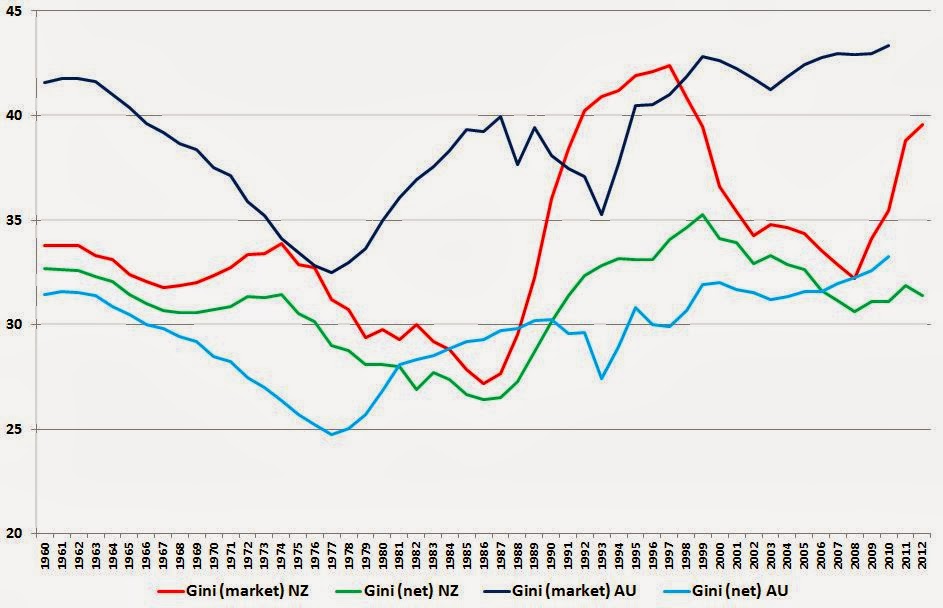
Out of idle curiosity I wondered what had happened across the ditch, so here are the same two Kiwi Gini coefficients (still red and green), plus their Aussie equivalents (darker and lighter blue).


No doubt everyone will see the patterns they want to: for what it's worth, I'd conclude that, in general, the Aussies have more unequal market incomes than we do, but their tax/transfer system is generally a lot more redistributive, so the net Gini coefficients aren't too different. There are timing differences: inequality (gross and net) started rising in Australia a good decade before it did here. And there's a difference of substance: inequality is still likely rising in Australia (though their data stop at 2010), whereas at least on a net basis it's heading down here at home (I wonder what's caused that fairly sharp rise in market inequality in the last couple of years in NZ?).

A hopefully helpful technical note: if you download the SWIID data to have a look yourself, you'll find yourself starting here. Where it says '2. Data', check the box beside 'SWIIDv4_0.zip'. When you've downloaded the zip file and unzipped it, you'll find that the data is mostly designed for two statistical packages, Stata and R, but do not despair if (like me) you're only going to use Excel. In the directory you've unzipped into, you'll find an Excel-compatible .csv file called SWIIDv4_0summary, and you're home free. By the way, for some mysterious reason there are no NZ values for 1961, so in the chart above comparing NZ and Australia I've created 1961 by averaging 1960 and 1962.