Showing posts with label statistics. Show all posts

Friday, 23 May 2025

Too slow? I don't think so

Ignoring the predictably partisan knee-jerk assessments from the usual suspects, there were two broad camps of reaction to yesterday's Budget. 

One was that it didn't actually do enough to boost growth, its signature objective. The accelerated investment incentive is fine, especially given that part of our productivity problem relates to New Zealanders working with less capital equipment than their counterparts overseas, but it's having to do a lot of work on its own. Yes, there were other Budget things that will help (notably increased spending on infrastructure) but overall it didn't deliver an adequate pro-growth punch.

The other reaction, from what you might term the fiscal 'hawks', was that it didn't move fast enough to close the fiscal deficit. It's easy to ramp up public spending, run deficits, and borrow, but quite a lot harder to cut back, get the books into surplus, and pay back some of the debt: there's a ratcheting effect where public spending boosts tend to be larger than any subsequent windbacks. Retrenching this time round hasn't got any easier: on the Budget projections there's only a minuscule surplus in the fiscal year to June '29, and even if we get there (and a $0.2 billion surplus is well within any margin of measurement or forecasting error) that's still four years away. 

There was probably no way Nicola Willis was going to simultaneously satisfy both the pro-growth and pro-windback camps, and I think it's fair to say that both are far from gruntled.

My own reaction is that, while I'm sympathetic to the general point that we need to rebuild the fiscal books, I think Willis is doing it at what, in current circumstances, is a sensible pace, and the more rabid fiscal hawks should back off.

Why do I think that? Let's look at the 'fiscal impulse' - whether fiscal policy in any year has become more expansionary or contractionary compared to the previous year*. This year I was somewhat concerned that an over-hawkish drive to an eventual fiscal surplus might be too aggressive, and risk further damaging an economy that is still in a somewhat fragile state. I also wanted to see whether fiscal policy was playing nicely with monetary policy: as the RBNZ said at its latest OCR review, there are "downside risks to the outlook for economic activity and inflation in New Zealand", and it wouldn't be the best of ideas to have fiscal policy braking the economy too hard.

Here's what the fiscal impulse looks like (from p67 of the Budget Economic and Fiscal Update, the 'BEFU'). Bottom line, the pace of withdrawing fiscal support looks pretty sensible to me. According to the BEFU forecasts, GDP growth in the current fiscal year to June '25 will have fallen by somewhere between 0.3% (expenditure measure of GDP) and 0.8% (output measure). and by a stonking 1.9% in per capita terms. In those circumstances what has turned out to be a modest fiscal boost makes complete sense.

For the year to June '26, there's a marginal fiscal boost which is macroeconomically speaking irrelevant, and even if it were a bit larger, it mightn't be such a bad idea given the uncertainty around the economic outlook. And then there are three years of moderate but meaningful windback of fiscal policy. You may have your own views, but I can live with that. 

In passing, there were a couple of initiatives in the minutiae of the Budget that I particularly warmed to. If you're interested in exactly what new stuff is planned, by the way, the place to go is the 'Summary of Initiatives' document.

Statistics New Zealand is getting $63.8 million over the next four years which "provides funding held in contingency to deliver eight updated macroeconomic measures by the end of 2030, to meet new international standards and better measure changes in the economy. Funding will also deliver new monthly indicators by 2027 to provide timely updates on economic activity", and another $16.5 million to "deliver a more frequent, reliable measure of inflation by moving from quarterly to monthly Consumers Price Index (CPI) reporting. Data will be collected on a monthly rather than quarterly basis, with regular monthly CPI reporting delivered from the beginning of 2027". We've been falling behind other OECD countries (and indeed behind some poorer non-OECD economies) in terms of the timeliness and range of our macroeconomic data, and this is a long overdue revamp. 

The other was the $130 million allocated to social investment initiatives. 'Social investment' is jargon for social support programmes targeted on 80:20 rule lines to those most in need, and typically delivered outside the traditional one-size-fits-all centralised social welfare spending channels. I wrote a bit abut it here, and I think it's a highly promising and progressive approach. The new Social Investment Fund "will use data and evidence to guide investment in effective, outcomes-focused social services. The Fund will invest in new programmes and in changes that strengthen existing arrangements". The Budget also said that "This initiative also provides departmental funding for the oversight and delivery of the Fund". This may just be a statement of the bleeding obvious, but I also very sincerely hope that it isn't code for the Wellington disease of excessive micromanagement of anything new or different.

*The fiscal impulse can be a bit of a heffalump trap to interpret. Suppose in Year 0 the government is in fiscal balance. In Year 1 it goes into deficit and buys 100 widgets, supporting widgetmakers. In Year 2, it is still in deficit but buys only 60 widgets. The fiscal impulse will show a reduction in the scale of fiscal support, from 100 to 60 widgets. At the same time, while less so, fiscal policy is still supportive: there are still 60 widgetmakers who benefit from the residual purchases. 

Thursday, 31 August 2023

Coordinating in the dark

While laid up at home with a very belated case of Covid - we're okay, thanks for asking - I thought I'd use the downtime to read the IMF's latest report on New Zealand. I'm tempted to add the traditional "so you don't have to". While you don't expect an airport novel, even economists' eyes will glaze over when they find pieties like "The OCR [official cash rate] path should be calibrated to developments in the economy, including external shocks and fiscal and other policy responses". Well, duh.

Cheap shots aside, you can't argue with the big macro conclusion - we've overheated, and fiscal and monetary policy need to brake the economy: "With exemplary management of the pandemic, New Zealand recovered faster than most other advanced economies. This supported activity and, together with generous fiscal and monetary support, resulted in strong investment and consumption. But this came at the cost of overheating against capacity constraints exacerbated by restrictions on labor movement due to border closures, and disruptions in global supply chains". 

You could argue that the RBNZ has done its bit, but that Treasury hasn't. As the graph below shows, we have a largeish positive (i.e. stimulatory) fiscal impulse in the current 2023-24 fiscal year, when if everything was nicely coordinated fiscal policy would also be tightening. Given the Auckland floods and Gabrielle I'm happy enough to cut some (but only some) slack in the circumstances and trust (hope?) that the fiscal largesse will unwind in coming years. It's also true, as Oscar Parkyn, New Zealand's alternate director at the IMF, points out in an accompanying statement, that "While the fiscal impulse is estimated to be positive in the current fiscal year, the authorities [i.e. the New Zealand government] note that near-term fiscal impulse forecasts are highly uncertain", and maybe there won't have been an unhelpful 1.8% of GDP boost to an already overstretched economy when the final beans are counted. All that said, some of the discretionary measures in the 2023 Budget, or other programmes that could have been put on the back burner, really ought to have been deferred till a more cyclically opportune time


The Executive Board assessment in the report - "Directors underscored the importance of careful calibration of the fiscal and monetary policy mix to rebalance the economy and help address long-term structural needs" - is surely right. And I'm not convinced we have a good institutional mechanism to make that happen and to expose the consequences of fiscal and monetary policy not pulling together. If Joe and Joan Public had been told that you can have your Budget goodies, but your mortgage is now going to 6% rather than 5%, how impressed would they have been?

Elsewhere in the report, the Executive Board said that "Compiling a monthly inflation index would enhance the effectiveness of monetary policy", and it crops up in various places: in the staff report (para 19), "During the consultation, the RBNZ flagged the need to improve data and real-time information to aid monetary policy decisions and highlighted the lack of monthly consumer price data as an important gap. The lack of a monthly CPI series makes New Zealand an outlier among advanced economies and is holding back a timelier formulation and assessment of monetary policy. A review of the financial resources of the RBNZ is ongoing" and (para 20, in the government's response), "Stats NZ is examining the possibility of publishing more price data on a monthly basis to enable more timely monitoring of inflation developments but noted that a monthly CPI series would require additional resources".

Sadly, we have form here. When Covid hit, we discovered we didn't have timely enough data on how the economy was tracking, and we started on a mad scramble in the middle of a crisis to develop some ('Getting real', 'Getting even more real'). Two years later along comes the worse outbreak of inflation in 30 years, and do we have the statistics to help us best cope with the latest challenge? No we don't. In our current and deeply strange ordering of statistical priorities, the Stats database can tell us what we spend monthly on imports of 'Preparations of vegetables, fruit, nuts or other parts of plants' from Bulgaria*, but it can't tell us our own country's monthly inflation rate.

Just over a year ago the Aussie Bureau of Statistics got with the plot and started its 'Monthly CPI indicator'. We saw its value yesterday when the latest number (4.9% for July) came in below the expected 5.2% - useful new info all round, with reactions across numerous markets. Here? We're still twiddling our thumbs.

*$46,015 in May

Wednesday, 12 August 2020

It helps, but we'll need more than this

No surprises in today's Monetary Policy Statement from the Reserve Bank. The official cash rate (OCR) was kept at 0.25% - as every one of us surveyed in the Finder forecaster survey had expected - and the size of the Bank's Large Scale Asset Purchase (LSAP) programme was increased to $100 billion. The point of the LSAP is to keep longer-term interest rates down by buying bonds: me, I'd be tempted to go the Aussie route where they've explicitly said what rate they're aiming for (0.25% for the Aussie three-year government bond). The RBNZ governor got asked at the press conference if the RBNZ was minded to some explicit bond yield targeting: it isn't ruled out, but it's not being ruled in, either. Can't see it hurting, as it would add to the information available on where the RBNZ is headed over time, its 'forward guidance' in the jargon.

Speaking of which, I'm not really sure anymore why the RB is keeping the OCR at 0.25%. Yes, it seems to want to have its forward guidance seen as rock solid, and it had said back in March that the OCR would be on hold "for at least the next 12 months". There may also have been some element of giving the banks a heads up about a timetable for getting their systems in order to handle a negative OCR. But in the wider scheme of things I'm inclined to think the extra support from a 0.25% cut now, especially if it helped weaken the NZ$, trumps the forward guidance credibility. And there is  not a lot of credibility downside risk anyway, given the recent turn of events and a new community outbreak. When the facts change, etc.

It's also worth pointing out that some of the Bank's other policy options would also get more bang per buck if the OCR were lower. As the Statement said, "Because the NZGB [New Zealand Government Bond] curve is already relatively flat around the current level of the OCR, a lower OCR would likely increase the effectiveness of LSAPs by lowering short-term interest rates and allowing LSAPs to flatten the yield curve at a lower level" (p19) and "A term lending programme may be increasingly useful for supporting the pass-through of monetary stimulus if the OCR were reduced" (p20).

But in any event further policy support, if only by way of a bigger LSAP at this stage, is absolutely the right thing to do, and would have been even without the latest Covid outbreak. And it's helpful that its previous easing is also quietly bearing fruit: as the Statement pointed out, "At least 50 percent of mortgages are due to be re-priced in the next 12 months" (p18), which will make quite a difference to a lot of households. 

At the same time you can't help feeling that monetary policy is well into diminishing returns territory. As cropped up in the press conference, marginal changes to interest rates aren't going to make much difference if, in deeply uncertain times, borrowers won't borrow and lenders won't lend. So the heavy lifting from here is going to have to be done by fiscal policy, and earlier plans to put the revolver back in the holster now look behind the curve.

Fiscal policy has been hugely important up to now: the Statement rightly pointed out that "The Wage Subsidy has temporarily supported more than 71 percent of New Zealand businesses and 1.7 million workers, helping employers to retain staff. As a result, the [Covid] impacts on employment to date have been small despite the unprecedented reduction in economic activity" (p25). The reality is that it's going to have to do a lot more again: "Fiscal stimulus is likely to be more significant and more front-loaded than we assumed in the May Statement" (p18). 

At this point, though, we don't have a great feel for what's likely to happen on the fiscal front, or as the Statement phrased it, "The exact timing, composition, and magnitude of government spending remains uncertain" (p10). August 20's Pre-Election Economic and Fiscal Update is going to be one of the most important policy statements of recent times. And I very much hope it doesn't fall into the election campaign's depressing "I can out-austere you" heffalump trap.

Finally a wonkish point that only an economist will warm to, but it's important all the same. One of the things you need to know when you're trying to figure out how monetary policy is working is what interest rates people actually pay or receive (duh, but bear with me). The Statement noted, however, that "Detailed data on business lending rates is limited. The Reserve Bank has begun collecting information on actual new lending rates faced by firms, which will enable better monitoring of monetary policy transmission to businesses in the future" (p18)

Better late than never, and well done the Bank for getting on with it, but it's yet another Covid-revealed instance of our statistical infrastructure letting us down. On the other side of the election, the next Prime Minister could usefully appoint herself Minister for Statistics, and find out why have we been so bad over long periods of time at collecting the fuller set of data that policymakers - and the rest of us - need. It's a gap that's all the more bizarre when the world is awash in data that can be turned into useful official info, as Stats, the RB and Treasury recently showed when they came up with the New Zealand Activity Indicator

In campaign season, the pols are prepared to make all sorts of commitments: how about committing to a fully First World set of statistics?

Monday, 13 July 2020

Another improvement

Covid exposed, not for the first time, how New Zealand is short on timely official measures of the economic cycle. 

While that's true, let's acknowledge some qualifications. For one thing, it's not just us: many countries have struggled to figure out anything close to a real-time view of the state of the economy. And for another, we've had some progress in filling in the gaps, notably Stats' publication of monthly electronic transactions and monthly filled jobs. And where the official statistics haven't fronted up, there's a wide variety of timely private sector information, notably the ANZ's various monthly surveys and the BNZ/BusinessNZ ones.

But the general proposition stands: we haven't had a good enough range of near-real-time official data to give policymakers at the Reserve Bank, Treasury, or elsewhere a good enough feel for where we are and, from that, what needs to be done about it.

So let's put our hands together and applaud Stats, the Treasury and the Reserve Bank for cooperating to design the New Zealand Activity indicator (announcement, first results, technical note, Q&A). It's bound to become one of the go-to statistics for reading the shape of the business cycle. And another round of applause, please, for the decision to keep the thing going beyond the covid-inspired need. One of the things that's bothering me is that while people in various organisations have scrambled hard in difficult circumstances to provide quicker information on the economy, it's by no means certain that the new, useful data that Stats and others have been providing will be maintained post-covid. Daft, of course, that anyone would think of going back to where we were, but there you have it.

I really like this new Activity indicator, or NZAC as I suppose we'll have to get used to calling it. I'm a great fan of the statistical method used to put it together (principal components): it basically tries to identify what common factor is driving the variability across a whole range of different measure such as traffic count and electricity generation. The answer of course, is the overall level of economic activity, and with principal components analysis you can get a good handle on the behaviour of that underlying driver.

How good? Startlingly good, as it happens, as this graph shows (from p5 of the technical note) .


Let's face it. NZAC, and GDP, when shown a year on year percentage changes, are essentially the same thing. And no, I don't want any lectures from the people who put NZAC together, that NZAC and GDP aren't the same thing. I know that. You know that. And strictly speaking I suppose that Stats / the RB / Treasury are right when they say (p4 of the technical note) that "NZAC should not be interpreted as a 'flash estimate' or high-frequency measure of GDP" (though many angels could dance on what exactly 'estimate' means, and why something that gets remarkably close to the eventual outcome isn't for some reason an 'estimate'). So while the purists behind NZAC are technically right, and even as you read this there's probably some analyst at Stats going "See, I told you so! They're going to make a balls-up of it", I'm going to go ahead and say that NZAC is a pretty good advance estimate of GDP.

Which, by the way, you can figure out from the technical note itself. On p4 it says that the NZAC registered year on year changes of 1.5% (January), 1.8% (February), and -4.3% (March). Average those out and you get an average NZAC decline for the quarter of -0.3%. That compares with the official GDP figure of -0.2%. Pretty good, eh? The Q&A document (p3) shows that the NZAC in late 2019 registered 1.3% (October), 1.8% (November), and 1.7% (December), which averages 1.6%, again pretty close to the official 1.8% outcome. There are commercial forecasters who'd dine out on that level of accuracy.

Parking all that, let's use the NZAC to try and figure out what actually happened to GDP in the June quarter. It's a critical thing to know: it's not the only cost of covid, but it was a big one, and it informs how hard fiscal (and monetary) policy needed to push back. 

Here's the calculation. At the moment we've only got the April and May NZACs, so I'm going to make three guesses at June - continued improvement (a reading of -3), a stronger recovery taking us back to last year's activity level (a reading of 0), and a pent-up demand rebound that actually takes up well up last year's level (+5). That'll give three averages for the June quarter NZAC, which I'll then take to be the percentage change in GDP from Q2 2019, giving us Q2 2020 GDP. We already know Q1 2020, so we can then see the change from Q1 2020 to Q2 2020.

One wrinkle. The NZAC Q&A documents says (in Question 14) there's a good chance that the April NZAC may not have captured the full fall in economic activity in the month: "Many areas of activity that were severely hit under level 4 – such as tourism, hospitality, education, and construction (to name just a few) – are not necessarily well captured in NZAC ... We consider it likely that if indicators of such activity could be obtained, the magnitude of the drop in April shown by NZAC would be magnified. In fact, we fully expect the size of this drop to be revised as the index is refined". So as well as three possibilities for the June NZAC, I've run with three possibilities for the April NZAC: as reported (-19), a bit worse (-25) and a lot worse (-40).

And here's what comes out as the estimated decline in June quarter 2020 GDP.


The good news is that all of these estimates are less than Treasury's earlier take in the Budget forecasts "indicating a decline in real GDP of around one-quarter" (p4 of the BEFU). Nothing wrong with Treasury's view at the time, but it looks as if we came through the lockdown levels faster than earlier seemed likely, and possibly with lower hits to business and consumer confidence than originally feared.

These estimates are also a bit less downbeat than the median forecast of the bank forecasters: I collected their picks for the June quarter GDP decline a week or two back, and the median pick was -16.8%; my own first stab at the decline had been 18-19%. So there's a real chance that June will have turned out rather less bad than we'd all thought. The latest government financial statements, for May, say that GST revenue was "not as adversely affected by lower economic activity as assumed in the GST forecast" in the BEFU, again hinting at a better June GDP outcome than anticipated.

None of this is to minimise the extent of the counter-cyclical fiscal and monetary task ahead. Even after a better than expected June, we face umpteen challenges including some permanent scarring, the sectors shattered by closed borders (tourism, education), and our exporters' prospects in a soggy covid-riddled world economy. But it's something that things could have been a lot worse.

Monday, 4 May 2020

Where are we?

Perforce, a wide variety of public and private sector organisations have stepped into the breach and done a good job of filling in the long-standing gaps in our ability to track the economy in close to real time. I've probably said enough about the need for Stats NZ, in particular, to keep up the effort when we get back to normal, so instead let's have a look at what the indicators are actually telling us.

On the upside, Sense Partner's update today showed that electricity generation is on the rise. There has to be a pretty good link between generation and overall economic activity: the data (originally from the Electricity Authority's useful database) suggest that the economy was running some 20% below normal levels: since dropping back to Level 3, we look to be operating some 10% below where we were. Better, but still a large shock to production and incomes.


The TradeMe jobs listing and job ad views also suggest some decent improvement from the very worst, though both are still well down on normal. Other indicators - particularly those for transport volumes - are however still at dire levels. Sense has started reporting usage of the Apple Maps app, which indicates mobility (Apple has the data on a variety of countries here): there was a bit of a blip immediately around the time we announced Level 3, but it's dropped back since to a small fraction of previous levels. An arm of Stats, Data Ventures, also has a good range of mobility data here. They show a similar collapse, concentrated on retail, employment and tourism mobility.


Treasury's latest dashboard has especially useful data on retail sales. It's dreadful: eyeballing it, it looks like consumer spending is roughly half of its pre-covid levels, even after some improvement from the depths of Level 4.


The data suggests that the setback to New Zealand retail sales is a good deal more severe than the one in Australia. This is from the AlphaBeta / illion dashboard I mentioned the other day. But that should be no great surprise, as our lockdown has been stricter than theirs.


Incidentally, there's been a bit of sniping here in New Zealand about firms that supposedly shouldn't have applied for the Jobseeker Support scheme. By way of perspective, the Aussie Bureau of Statistics, as part of its covid-19 coverage, has discovered that overall some 61% of Aussie businesses have registered or intend to register for their equivalent JobKeeper Payment scheme. Here's their graphic (from this report) of what percentage of each industry has registered, with the boxes proportionate to industry shares of total employment. The industry pattern is exactly what you'd expect. Domestic critics should pull their heads in: everything we see (and bear in mind we have it worse than them) is overwhelmingly showing real difficulty for businesses in both countries, not bludging.


The severity of our setback raises the question about whether we're doing enough to push back with expansionary policy. Here's a chart from the Treasury dashboard that looks at some comparators.


It's early days, but I suspect that our fiscal response is going to have to be a good deal larger again than it has been to date. The Jobseeker Support scheme was an excellent start - especially the quick non-bureaucratic process - but I strongly doubt that 7% of GDP in fiscal support is going to be the final bill for effective economic pushback.

Wednesday, 29 April 2020

Even more real-time data

An economist colleague - oh all right, Kieran Murray of Sapere - sent me through some fascinating near-real-time economic data in Australia. It's from a partnership between illion, previously the Australian operations of Dun & Bradstreet, and Aussie economic consultants AlphaBeta.

Their very up to date data covers, among other things, consumer spending by region and by category, as well as indicators of personal or business financial distress. Here for example is the overall consumer spending graph. The distinction between the 'crisis' and 'stimulus' periods mainly reflects the impact of the A$750 cheques that went out from the end of March to over six million lower-income Australian households.


The sectoral breakdown of spend shows exactly how we've managed through lockdown: the biggest increases were on food delivery, online gambling, furniture and office (it's become evident from Zoom meetings that many folks, to start with, didn't have anything like a half-way equipped home office), home improvement (ditto), and alcohol and tobacco. While the bets and the booze don't reflect very well on how we've spent our enforced time at home, there's a small solace that the next largest increase was on pet care. Subscription TV was up too, though not as much as I'd have expected (11% more than in a 'normal' week).

This is excellent stuff. Yet again we've shown, if we put our minds to it, that we can actually get a much better handle on the real-time state of the economy than we've had before: if the Australian Treasury or others with skin in the game didn't know the likely scale and shape of the covid hit to retail sales, they do now.

Next thing is to keep this going on the other side of covid. As I've been banging on for a while (eg here and here), over the years we've had inadequate indicators of the cyclical state of the New Zealand economy: they've been too few and they've been too late. As we're now discovering in both New Zealand and Australia, there are treasure troves of near real-time data all over the place that can be used to fill in the gaps. Hopefully operators like illion and AlphaBeta will keep these data flows going but if not, and in any event, Stats NZ and their counterparts ought to be getting alongside these data providers and developing a suite of timely high-frequency indicators. Covid's been no time to be blundering in a statistical fog, but neither is anytime else.

Friday, 24 April 2020

Getting even more real

No sooner had I posted about some promising 'dashboards' from Sense Partners and the Treasury, which aim to use a variety of data to try and gauge exactly where economic activity has got to through lockdown, than Stats also came to the party with its own data portal (media release here, portal itself here).

It's excellent. They've even found a data sources I'd never heard of, and I've played around with quite a few. It's from the GDELT Project, showing weekly economic sentiment (it's in the 'Economic'/'Confidence' section). I'm not sure whether it's New Zealand specific or global, but either way it's informative.


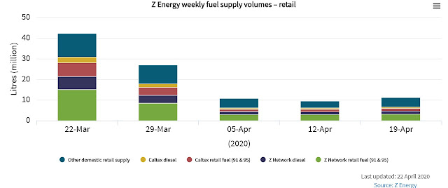
Here's Z's weekly fuel sales (in 'Economic'/'Activity'): hat-tip to them for sharing.


Gift horses and mouths and so on, but if the portal could organise some weekly (or even daily) electronic card expenditure data, that would be a useful extension to what is already a good (and easy to use) data set.

Stats says all the right things about the data being other peoples', not theirs, and go look up the methodology of the original creators if you want to find out more about what they mean and how they've been created.

All good stuff - and let's hope that on the other side of covid, Stats give some thought (and Treasury gives some money) to a permanent improvement in our ability to keep our finger on the day to day pulse of the economy.

Saturday, 18 April 2020

Getting real

We don't have an adequate grasp on the real-time state of the economy. We need much more close-to-real-time data.

That's it. The rest of this post is a riff on the same theme.

As covid wreaks its damage, it would be good to know, now, what that damage is: what's the initial hit to GDP? Where are the worst impacts? How are the knock-on ripple effects going? Among many other things, it would inform how hard fiscal policy needs to fight back. As it is, we - and many other countries - are at the "Oops, did I say $10 billion? I meant $40 billion" stage of Finance Ministers' groping for what the fiscal response needs to be.

Crises apart, we should always have had better high frequency cyclical data than we've actually had. As Michael Reddell said recently in the 'Measuring the slump' post on his Croaking Cassandra blog, "We and Australia are the only two OECD countries without a monthly CPI, our GDP estimates (quarterly only, as with most countries) come out only with a very long lag, we don’t have a monthly industrial production series, and we still don’t have an income-based measure of GDP". These deficiencies have been known for a long time - I can remember discussions over the years at Stats' Advisory Committee on Economic Statistics (since disbanded) - but the debate never got as far as prising open Treasury's chequebook.

Michael had several constructive ideas on how to improve things, including having Stats publish the monthly results from its rolling quarterly Household Labour Force survey, and having Stats also "look at hosting some sort of dashboard pulling together, and making openly available, all manner of formal and informal economic indicators. There have to be lots".

The good news is that at least two parties (though not Stats, yet) have had a go at dashboards.

First out of the blocks was Sense Partners: you can access their latest six-variable dashboard here. It's good, isn't it? I especially liked the electricity generation graph (below). You'd think that it must be reasonably close to the fall in GDP, and is suggesting something like a drop of close to 20% in output since late March (though there may be seasonal stuff going on, too).


They were closely followed by Treasury, who've just put out theirs (media release here, access to the pdf dashboard here). Personally I felt the Sense set gave me more of a real-time feel, though Treasury's information was interesting in its own right, especially the traffic data and the data on uptake of the job subsidy scheme (below).


The next thing that would be really useful would be some composite indicator of all these glimpses of the overall underlying reality. As it happens economists have a nifty way of devising one: it's called 'principal components', and works by assembling a lot of data, hopefully all related (positively or negatively) to some underlying common influence, and then analysing it econometrically to see if you can identify a common background factor.

Treasury's dashboard helpfully included some international data, and one of the series shown was, indeed, one of those composite indicators, for the US. It looks like this.


If you want to follow the series yourself it's here at the Fed of New York site, and there is a (short) write-up of how it all works here. The devisers of the index have calibrated it so that percentage changes in the index can be (give or take) read as percentage changes in GDP, or as they put it, "a reading of 2 percent in a given week means that if the week’s conditions persisted for an entire quarter, we would expect, on average, 2 percent [GDP] growth relative to a year previous". So we know that if early-April conditions persisted for the whole of the June quarter, US GDP would be some 9% lower.

Can we be sure that the weekly economic index does in fact track US GDP pretty well? Yes, we can, as you can see below (this is from Chapter 1, 'US economic activity during the early weeks of the SARS-Cov-2 outbreak', in Issue 6 of the Centre for Economic Policy Research's covid economics series, well worth following).


Two things to finish with.

One, obvs, wouldn't it be nice if someone did the same number crunching on New Zealand data and gave us close to a real-time reading on where GDP has got to? And yes, I'm happy to be part of the effort if anyone feels the urge to get it done.

Two, the wider point about the limited range of our current official cyclical data, and the speed with which what we have gets published, needs to be addressed. You can't go to a competition or regulation conference these days without people blathering on about how 'big data' enables market power, or threatens privacy, but you don't see anything like the same focus on how the torrents of big data could be used to generate near-real-time cyclical gauges.

It's fine to have the business as usual, industrial strength, quality-assured things like the quarterly national accounts. But as Grant Robertson and the lads at Treasury - and the rest of us - are finding out, there's a big role for the cheap and cheerful but timely and informative indicators, too. We've shelled out some $9 billion on wage support: in the greater scheme of things a couple of mill to zero in on where we actually are would be money very, very well spent.

Thursday, 13 December 2018

Our financial cycles

Two economists at the University of Auckland, Caitlin Davies and Prasanna Gai, have come up with a really useful bit of practical macroeconomics. They've devised a Financial Cycle measure for New Zealand - an indicator of the overall tightness or looseness of financial conditions. Their paper, 'The New Zealand financial cycle 1968–2017', is available here in the online version of New Zealand Economic Papers.

Financial conditions indices (FCIs) are an established thing overseas. They were always relevant - changes in financial conditions have played a lead part in many business cycles, and even when not the lead have been important channels for propagating non-financial shocks - but have naturally become of greater interest since the GFC. As Davies and Gai say (p1), "Recent [academic] work ... suggests that strong credit growth and house price booms are good predictors of crisis and significantly shape macroeconomic outturns".

In the States, for example, there are a herd of them. The chart below shows five FCIs - three produced by various regional Federal Reserve Banks (Chicago, Kansas City, St Louis), two by the private sector (Bloomberg, Goldman Sachs) - plus a market-derived measure, the VIX, which is the volatility investors expect from holding the S&P500 index and which can be backed out of the prices for S&P500 options. They've all been normalised to be comparable, as described here by the St Louis Fed. Higher values for these indices mean tighter conditions.


You can see, for example, how financial conditions (ex the VIX) had been tightening ahead of the GFC, and then hit all-time highs for financial distress and unavailability of credit through the GFC itself. And if you subscribe to Austrian or Minsky style theories of business cycles, you'd argue that the pronounced period of unusually easy monetary conditions you can see in 2004-2006 sowed the seeds for the over-exuberant risk-taking that fuelled the eventual GFC bust.

Highly useful and informative things, these FCIs. And now we've got one of our own. To get it, Davies and Gai went the principal components route - take a bunch of finance and credit indicators, and see if there's a common influencing component in the background - and found that yes, there was. It combines six variables into an overall index: real credit, credit to GDP, credit to the M3 measure of money supply, real house prices, real share prices, and housebuilding to GDP.

Here's what the results look like, in raw form: for this New Zealand index, you read it the other way round to the US ones, in that higher values show easier financial conditions. The authors say that "Our measure of the New Zealand financial cycle appears to be broadly consistent with the main economic developments during the period", and I agree. You can see, for example, the surge in credit availability in the mid 1980s following banking deregulation, and the subsequent bust after the 1987 sharemarket crash. You can also see our experience of the GFC.


The authors usefully superimposed their financial index results on the business cycles identified by Viv Hall and John McDermott. The FCI for this comparison has been expressed in smoothed cyclical terms showing whether it is rising or falling (there's econometrics behind this we don't need to explore here), but same diff. Here's how they compare.


"Of the six contractionary episodes during the past fifty years, five occur less than three years after a peak in the financial cycle", the authors say (p8), and while I wouldn't immediately leap to cause and effect (and they don't either), it's a suggestive pattern.

The authors modestly say (p14) that their work "should be regarded as a tentative first-step in constructing a set of stylised facts on the financial cycle in New Zealand", but it's more than that. We had a rather large gap in documenting our recent macro history, and they've filled it. They've also created something that could easily be kept up to date, and serve as a real-time indicator of trouble brewing. As they mention, it's of obvious relevance to macroprudential policy: you might want to keep a weather eye out for where the FCI is before, for example, tightening or loosening LVRs. Indeed, you'd wonder why the RBNZ hadn't developed an FCI of their own by now.

And you can see extensions to it. This FCI is based on whatever quarterly series were available all the way back to 1968, and for a paper looking at the grand sweep of history, that's fine and unavoidable. But you can easily imagine an FCI using data that became available only more recently:I think it's highly likely, for example, that moves in corporate credit spreads, unavailable back to 1968 but available for more recent years, would feature strongly. And I think it's plausible that you could get to a monthly FCI: the Americans certainly have, and the Fed of Chicago has even gone as far as producing a weekly one (conditions are currently on the easy side of normal).

In any event this is a great start: I hope there's someone out there - the RB? a bank? the University itself? - who'll take up the baton and turn this into an ongoing up-to-date macro indicator.

Sunday, 9 December 2018

In their prime

Our latest monetary policy targets agreement requires policy to "contribute to supporting maximum sustainable employment within the economy", and the Reserve Bank now spends a fair bit of each Monetary Policy Statement reporting on where we are relative to the maximum sustainable level, using a suite of different labour market indicators.

In the latest Statement, the Bank said that "employment is near its maximum sustainable level" (p22). It might be above it: "Evidence reported by employers suggests the labour market is currently tight, and that employment is above its maximum sustainable level" (p22). Or it might be below it: "some other indicators of the labour market suggest that employment may still be below its maximum sustainable level. One example is the job-finding rate" (p23). But overall we look to be there or thereabouts.

While the Bank deploys a whole battery of perspectives on the state of the labour market, one line of attack that doesn't appear is what is happening to what the Americans call the "prime age labour force", those aged 25 to 54. They're the bedrock of the labour force - they're typically out of education and not yet contemplating retirement - and the argument is that it's the state of the core  labour force that matters most for things like wages growth.

Overseas what's happening to the prime age labour force consequently gets quite a bit of air time: here, for example, is the Wall Street Journal's graph explaining the November US jobs report (from 'Did the Job Market Slow in November? Here’s How It Compares', if you've got access).


Interestingly, despite the long post-GFC expansion in the US, neither the participation rate nor the employment rate for prime age people have got back to where they were just before the GFC, and there is a mix of structural and cyclical trends going on: there looks to have been a gentle trend downwards in participation even before the GFC hit.

The corresponding numbers for New Zealand don't get much focus at all (they weren't mentioned, for example, in Stats' news release on our latest employment data), so in the spirit of inquiry I went and dug them out to see what they might be able to tell us (they're easily calculated from the data in Infoshare). Here are the headline unemployment results.


The unemployment rate for prime age people is, as you'd expect, markedly lower than for the labour force as a whole. And it's certainly signalling a tight market: the latest unemployment rate (2.0%) is getting close to its all-time low (1.5% in late 2007). You'd imagine that a fair chunk of this low rate is frictional unemployment, and that there's precious little cyclical unemployment left.

Here is the participation rate picture. It's harder to interpret: we're in uncharted territory, as the prime age participation rate has been hitting record highs. Can it keep on rising? Is there still a large reserve of people who could be tickled out into employment? Who knows, but you'd guess that the reservoir must be getting lower. We're down to only 14% of prime age people who are not in the labour force, and who are doing things like looking after young or elderly family.


The prime age participation rate is usefully splitabble into male and female participation rates, and here they are.


The overall rise to record levels of prime age participation is largely driven by a sharp and ongoing rise in female prime age participation, and like in the US there are surely both structural and cyclical things going on. That drop in the male rate over 1986-2000, for example, may well reflect the post-Rogernomics shrinking of traditionally male-dominated activities like meat processing. Changing social attitudes about (for example) who should stay at home and look after the kids will be in there, too. So it's very hard to unpick the purely cyclical component. I don't have any good feel at all for where the prime age female participation rate might peak.

Overall, the data don't give any huge overlooked insights into where we are relative to maximum unsustainable employment, mostly because the grand sweep of history and the changing attitudes to who works, and works at what, overlap the more cyclical aspects you'd like to isolate. If there is one useful extra bit of data, it's the prime age unemployment rate, which is confirming the RBNZ's "there or thereabouts" assessment.

Tuesday, 21 August 2018

A little light on a mystery

There's been something quite odd happening for quite a while. Employers are saying they are having a lot of difficulty finding staff, as this graph from the latest Monetary Policy Statement shows.


But at the same time there are large numbers of people telling the Household Labour Force Survey (HLFS) that they are currently part-timers but are available, and want, to work more hours. So how can we have employers tearing their hair out that they can't get people, and yet a whole bunch of people are saying "Pick me! Pick me!"?

Quite apart from being a mystery that it would be nice to unpick, it's also a reasonably important macroeconomic issue. If there really is a reserve army of people ready to take up jobs, or at the very least more hours in their current jobs, then the labour market mightn't really be as strong as it looks. Big wage increases wouldn't look terribly likely either if there are lots of people standing ready to take jobs at the current prevailing rates of pay. Conversely, if this reserve army isn't really there, then maybe employers' concerns are the thing to watch as an indicator of likely pay increases down the track, as employers bid against each other for the limited staff availability.

The regular HLFS tables don't shed a lot on these 'underemployed' people. We know from Table 12 of the HLFS that they are disproportionately women: of the 117,000 (seasonally adjusted) who were recorded as 'underemployed' in June, two-thirds (78,000) were female, compared to the roughly 50:50 male:female split of employment. And we know from Table 13 that of the 112,800 underemployed (not seasonally adjusted this time) in June, some 48,000 of them are not 'actively seeking' work.

That might suggest that they're not, actually, awfully interested in taking on full-time jobs, and maybe the employers' view is more descriptive of reality. But I'm not sure about that. I don't think it's the right thing to do, in these days of online job ads, to say that someone is not actively seeking work if all they've done is read the ads. But that's how Stats views things: you have to do more than scan Seek (or wherever) to be counted as 'actively seeking'. Not how I see today's world, but there we go.

Other than those little nuggets, though,we know nothing from the headline HLFS about these underemployed folk. So I asked Stats if they could break out the underemployed by industry or by occupation. And the ever-helpful people at Stats came up with the goods. Here are the answers. Stats would like me to say "Source: Statistics New Zealand, customised report and licensed by Statistics NZ for re-use under the Creative Commons Attribution 3.0 New Zealand licence", so there it is.


I'd love to say, Aha! Solved it! But the data, interesting and useful though they are, don't crack the puzzle.

You'd wonder, for example, when the housebuilding industry is desperate for anyone who can carry a hod, how 21,400 labourers say they can't get as many hours as they'd like.  That kinda points in the "yes, there's slack available" direction.

On the other hand the highish number of underemployed represented by retail trade and accommodation points another way. No matter how strongly business picks up at the motel, the motelier is very likely not going to add another full-time person: more likely, it'll be another person to do the 8.00am to 2.00pm shift to clean up the 10 extra units being occupied. The economy can pick up all it wants and won't make a blind bit of difference to motel cleaner-uppers (or peak-time sales assistants) who'd like longer hours.

And then you start asking yourself, why don't the motel and shop people move to other lines of business where there might well be a full week's work on offer? Is it because they have low level skills that aren't in demand? Unlikely, since demand for unskilled and low skilled staff is actually stronger than it is for skilled or highly skilled, as MBIE's latest online vacancies survey shows. Plus you look at the 7,400 managers (who you'd think have transferable generic skills) and the 17,000 professionals (a fair proportion ditto, you'd guess), and wonder why they don't move.


Still at least as many questions as answers, I'm afraid, but at least we've now got more data to be ignorant about.

You're welcome.

Friday, 30 June 2017

MBIE's slick new collection of data

I'd headed over to MBIE's website to see if that inquiry into petrol stations had come out yet - it hadn't - but by happy accident I found that MBIE had come out with something else, its new Labour Market Dashboard. The announcement is here and the thing itself here.

It's a pretty impressive effort at gathering and displaying a variety of labour market data into the one spot. Here's just one interesting graph as a sampler: it shows the different ways companies recruit (there's another one showing it by firm size rather than by industry). It's in the 'Workplace' section, below the health and safety graphs.


Isn't it fascinating? Top of the list is 'Word of mouth', which in a small, informal, high-trust economy doesn't surprise me at all. And as in so many other areas, the internet has changed everything - TradeMe and Seek are now more commonly used than the traditional print job ads. Plus there's a useful self-help lesson here too: 'Candidate approaching us' is the fourth most common way jobs get filled.

I've wondered for a while whether we're any good at 'active labour market policies', programmes designed to make the labour market match up people better, usually with a focus on getting unemployed people back into the game. I'm leaning towards the view that we aren't, and the low prevalence of jobs sourced through Work & Income rather points that way. Not that other potential allies in the fight show up much better: on this showing, there are few school or university offices getting on the blower to employers and saying, "Listen, I've got this student who'd be just the right person for you".

I don't know who did the donkey work on the software, but it's pretty slick. I especially liked the automatic rescaling of the Y axis when you replace one X variable with another, which might be small beer to you pro dataviz types but wowed me (if there's a way to do it in Excel, I've not found it). And yes, whoever the uncredited developer is, I did notice your 'mbienz.shinyapps' heading for the site.

MBIE is looking for feedback. I've suggested the site could carry the unionisation data that the HLFS is now picking up, and I've just also had the thought it would be interesting to see the distribution of people on the minimum wage. You'll have your own ideas: why not help out this useful source and get in touch, the e-mail address is

LabourMarketDashboard@mbie.govt.nz

Just  noticed that this is the second nice thing I've written about MBIE this week. We'll be picking out curtains next.

Saturday, 1 April 2017

More good books - April 2017

A history of Britain's Census may not be many people's first idea of a good read, so you'll be pleasantly surprised by Roger Hutchinson's The Butcher, the Baker, the Candlestick Maker: The story of Britain through its census, since 1801. It's full of interesting themes and 'fancy that' detail: the 1841 census, for example, was the first to record people's names and ages (the previous ones were effectively just enumerations), but among the details it got wrong was Queen Victoria's birth date ('about 1821') when in fact it was 1819. As Hutchinson says (pp60-1), "If the national census could consistently get wrong the personal details of the Queen of Great Britain and Ireland and future Empress of India, what hope had anybody else?".

But that's to do the early census takers a bit of an injustice. In the days when the IT infrastructure was paper, pens and horses, the early censuses got the job done remarkably quickly: first results from the census of March 1 1801 were published in June 1801, and 600 pages of summaries and abstracts in December 1801. I doubt if we could manage the same today. Our technology has improved out of all recognition, but so have assorted deadweight managerial costs and, especially, mission creep. You should see the form that our census enumerators will be using in 2018 to record answers to the religion question, which includes at its most detailed level 167 different 'Religions', 'Beliefs' and 'Philosophies', including Satanism, Maoism, and the Church of the Flying Spaghetti Monster (aka Pastafarianism).

Some of the recurrent themes remain highly topical. The late 19th century influx of Jews from eastern Europe, as documented in the 1891 census, got the racists slavering: as the author says (p225) "Right-wing populists denounced an 'alien invasion' which was apparently taking British jobs from British workers. Ratepayers were, according to the Manchester Evening Chronicle, being bilked of excessive poor relief" (the rates-financed social welfare of the day), just like today's incoherent reactions where immigrants are supposedly both stealing jobs and bludging on the dole. An inquiry as part of the 1901 census, however, found that in the archetypal Jewish refuge, the East End of London, "The proportions of indoor Paupers [i.e. totally destitute and reliant on workhouse relief] among the general population and among the European Foreigners were 15.1 and 1.7 per 1,000 respectively" (p233). And among those damn job stealers were people like Michael Marks (first counted in the 1891 census), who had the temerity to go on and build Marks & Spenser. Shouldn't be allowed.

We've moved on from that, haven't we? Then you read on Wikipedia that in the 2011 UK census, "Other new questions involve asking migrants their date of arrival and how long they intend to stay in the UK; respondents also required to disclose which passports they held". But no doubt that's all intended to inform sound policy analysis. In any event, you'll find yourself following Hutchinson down all sort of interesting historical side alleys, and learning a fair amount of economic history on the way. It's a good read.

I try to stay in touch with Aussie politics, and my latest foray is David Marr's Faction Man: Bill Shorten's Pursuit of Power, a short portrait of the Australian Labour Party leader that is an updated and extended version of a 2015 Quarterly Essay. Shorten has made it to the top of Labor via the Australian Workers' Union, where he was initially an organiser, then National Secretary from 2001 to 2007, when he became a federal MP. I knew next to nothing about Shorten before this book, which broadly makes the case that he is a rough-house player of Australia's factional politics, with little commitment to any settled philosophy beyond self-advancement: a Paul Keating without a programme. I'll be interested to learn more beyond this initial worrying impression.

I've been having a good run with fiction. Top of the list is debut author Jane Harper's The Dry, a riveting and extraordinarily well written novel about murders in rural drought-ravaged Australia: even if you're not normally a crime/murder reader, make an exception for this one. I came to Jonas Jonasson backwards - I read his later Hitman Anders and the meaning of it all ahead of his earlier (and now filmed) The 100-year-old man who climbed out the window and disappeared - but they're both good, though hard to categorise (black comedy? satire on modern Sweden?). If time's short, try Hitman Anders and see if you like the style. And I very much enjoyed David Thorne's East of Innocence, where an ex City of London lawyer is now reduced to scraping by in Essex and gets involved with police brutality and the local Essex hard men.

In 'more of the same but just as enjoyable', there's the fourth (Silk Chaser) in Peter Klein's series about an Australian professional better on the horses who finds himself caught up, Dick Francis style, in industry shenanigans, this time the serial murders of 'strappers' (horse grooms). And there's the latest (Tatiana) in Martin Cruz Smith's series about Russian police investigator Arkady Renko, where an investigative journalist falls foul of the Russian powers that be.

Good intelligence/espionage novels can be hard to find, so you might want to try Alan Judd's series about a chap making his way up through the British security service. I've finished Legacy and am half-way through Uncommon Enemy, with Inside Enemy still to come. And then there's the ever reliable Gerald Seymour's latest, Jericho's War, about a semi-officially-sanctioned raid on high value Al Qaeda targets in the back blocks of Yemen. All good stuff. And let's hope that one of the great maestros of the genre, Alan Furst, gets his mojo back into top gear this year.

Tuesday, 21 March 2017

Jobs and spin

Politicians everywhere spin the economic data, and the labour market data in particular. So it's no surprise that the Trump administration does it, too, nor that the Trump numpties do it with more more ineptitude and hypocrisy than most. Having claimed on the election trail that the official American employment and unemployment numbers were variously either bad measures or outright faked, the Trump team is now claiming the latest official data (a big rise in jobs and a fall in the unemployment rate in February) are mysteriously unfaked after all, and the right things to focus on.

Plus they've dissed a Federal regulation saying that Federal officials can't comment on official data until an hour after their release - a quid pro quo for the dubious practice of giving the President (via the Chair of the Council of Economic Advisers) advance access to the numbers, since it would be all too easy otherwise for incumbent Presidents to use that access to screw the first impression scrum.

We haven't followed the Americans down that path to privileged access for the executive, and good job, too. We do have pre-release 'lock ups' for the media for important statistics, which I see as a useful evening-the-playing-field device to ensure that independent, informed comment goes out at least as quickly as Executive spin. From that perspective it's also a shame that some thoughtless nerk led the Reserve Bank to cancel its lock ups for the Monetary Policy Agreements: not everyone agrees, but the Governor's take having the airwaves to itself for an uncontested hour is a step backwards, compared to the previous arrangements where journalists had a way to put out their own considered view at the same time.

Not that we're always saints and the Americans always sinners: if, for some great sin in a previous life, you listen to our Parliamentary Question Time long enough, you'll find the same smart-alecking going on about our own employment and unemployment numbers, though not to the shameless Trump standard. Some Minister will point to the low official unemployment rate, and some Opposition member will say "Aha! But if you look at the underemployment rate...". And they will of course swap positions on the data when they swap roles.

So as a bit of an air-clearer, here's how we've been travelling, based on our new and improved Household Labour Force Survey.


The graph shows three ways of looking at unemployment. The green line is the headline, official, unemployment rate. The orange line adds in people who are underemployed - people working part-time but who are available to work full-time, and would like to. And the red line adds in what Stats calls the 'potentially available' workforce, which is made up of two groups: people who aren't actually looking for a job right now but would be available and willing to take one on if it cropped up, and people who are looking and willing and will be able to take up a job in the coming month, but not right now.

All these are valid ways of looking at unemployment and underemployment, and depending on what you're most interested in, you'll follow one rather than another. But what's also very clear is that the trend is almost exactly the same across all three series. So next time you hear a politician saying, "Well, the official unemployment rate may be getting better, but the underemployment rate isn't", or some variation thereof, you'll know that you've got a gasbag talking his partisan position, just like the Yanks have been doing.

The other thing that occurred to me as I trawled my way through the data is that I'm left unsure about the solidity of estimates of the 'natural' rate of unemployment. That's the rate when the labour market has become so tight that employer competition for scarce staff starts to bid up pay rates and eventually the national rate of inflation.

There are sophisticated ways of measuring it: the latest I'm aware of is Weshah Razzack's Treasury Working Paper 'New Zealand Labour Market Dynamics: Pre- and Post-global Financial Crisis', which estimated the natural rate in recent years to be around 4.5%. But I wonder. Let's suppose that the official unemployment rate did indeed start going below 4.5%: is it really likely that wages/inflation would start accelerating at that point, when there are currently 115,000 people who are working part-time and would like to work longer hours? A more likely initial response is more employers wanting, and more employees agreeing, full-time hours.

Or another way of putting it is that I suspect the sky would not fall if our unemployment rate went into the low 4s or even below. Sure, institutional arrangements vary, and you can't always (or even often) say that what works in one country will work everywhere else. But there are countries, as you can see in the table below, which have got their unemployment rates down to lower levels than ours, without inflation starting to roar away (or even raise its voice much).

Monday, 12 September 2016

Unions and collective agreements

Our revamped Household Labour Force Survey now collects information on union membership and on types of employment agreement, which sounded interesting, but when I went and downloaded the HLFS Excel files (here) the info wasn't there. So I got in touch with Stats and their helpful chap Ken Joe told me two things.

One was that Stats had put out a specific article about these very topics on August 25 (which for some reason I'd missed, and I may not be alone, as there doesn't seem to have been much media coverage of it). And the other was that the data is available, though not where I went searching for it first. If you'd like to look it up for yourself, it's on Infoshare: go to 'Work, income and spending', then 'Household Labour Force Survey' and scroll down to the P's where you'll find 'Paid employees by type of employment agreement' and 'Paid employees by union membership'.

The article said that "Statistics NZ collected this information only twice previously, in the Survey of Working Life 2008 and 2012": they didn't compare the new HLFS data for June 2016 with the previous years' estimates, however, so I've dug out the earlier data. If you missed the Stats release (like I did), and would like the wider historical sweep (such as it is), here is the result.


It's not a pretty picture if you're sympathetic to organised labour. The absolute numbers probably show it even more clearly: in 2008, an estimated 525,000 people were members of a union; by 2012, that had dropped a bit, to 501,000; but it's slumped in the past four years, to 379,000. The drop in numbers of people on collective contracts isn't as dramatic (467,000 to 440,000 to 410,000) but it's still substantial. If the declines continue at these rates in coming years, unions face an existential threat.

Especially if anything arises to weaken membership in the sectors where they are still important. As Stats said, "Some industries are far more unionised than others (see figure 2). Over 4 in 10 employees in both health care and social assistance (43.5 percent) and education and training (42.2 percent) belonged to a union. Given the size of these industries (231,100 and 203,500, respectively), this means half (49.2 percent) of the 379,300 union members worked in only two industries".

Here's that figure 2 Stats was talking about.


Outside what are largely public sector industries, union membership has fallen to insignificant levels - even in sectors such as finance, where unions were once a reasonably large player, but are now down to 10% of the workforce in the sector.

Originally I'd set out to look up some data releases I'd unaccountably missed (I'm on Stats' distribution lists for pretty much everything they put out), and not to do any policy research into the role of unions in a modern economy, and I'm not going to start now. All I'd observe is that the sharp membership fall of the past few years is a lot faster than I intuitively (econospeak for "at a total guess") would have expected to see, and I'd guess there are some worried people around the tables in unions' head offices.

Tuesday, 6 September 2016

Hard core unemployment

The latest set of Treasury's Monthly Economic Indicators came out yesterday. The media reported on the headline news - the economy picked up in June and carried on in good nick in September - and I was tempted to leave it at that, but there's often something quite interesting in the Indicators that flies below the radar (particularly in the accompanying Chart Pack) so I had a fossick.

Have a look at this.


From which we learn three things.

One is that, as cyclical indicators, the 'underemployment' rate and the 'unemployment' rate tell almost exactly the same story and it doesn't really matter which one you focus on. For some policy purposes the broader 'underemployment' rate, which emerged from the recent revamp of the Household Labour Force Survey and which, as Treasury says "includes people who are unemployed, underemployed and who would like a job but are not actively looking or immediately available for work", is probably the better pick. But as indicators of the cyclical state of the labour market, they're well nigh identical.

The second thing that emerges, with hindsight, is the immense and long-lasting damage the GFC-related recessions here and overseas wrought. Even after six years of recovery we're still well shy of getting back to the labour market outcomes we had pre-GFC.

And the third thing follows from the second: there is still a wide 'output gap' of spare labour market capacity. On a totally instinctive eyeball-the-graph basis, I'd guess that a roughly full-capacity economy would be running an unemployment rate of around 4% (going down to under 3½% near cyclical peaks). Our current unemployment rate (5.1%)  is well above that. And in turn this helps explain why the Reserve Bank has been having such difficulty in getting inflation back up to 2.0%: that's not going to happen unless our domestic spare capacity gets used up a lot more than it has to date.

But there's also one graph in the Chart Pack that makes you wonder about some of this apparently spare capacity.


It's a bit surprising, if there's this supposed slack in the labour market, that employers are reporting that it's getting difficult even to find unskilled employees, and even more difficult again to find skilled employees. Even well-meaning initiatives like the New Zealand Seasonal Workers scheme, which aims to get people off unemployment and at least into temporary work, aren't helping out, as this report from Radio New Zealand showed ("We had 1400 people be interviewed and we struggled to fill an eight-seater bus").

What I see in these graphs, taken together, is that the best we can manage, when times have been good for a while and anyone with a pulse should be able to get a job, is that we would still be left with an unemployment rate of around 4% (and a bit lower again in real boom time conditions). But even allowing for the fact that we'll always have a bit of transitional unemployment, that would still leave a couple of percent of the labour force high and dry in all economic weathers.

We - well, I - don't know exactly why there is this irreducible rump, and it's only restating the issue to say there's a mismatch between what employers are looking for and what would-be employees have (or want) to offer, which might be down to anything. The education system would be near the top of my list, but you'd also wonder about technological change, family background, discrimination, and [insert your own hobbyhorse here]. And perhaps we should be grateful that it's only a couple of percent of the workforce. That's a good deal better than some economies can manage: good luck if you're young and not well-connected in large swathes of western Europe

But it's still an issue worth unpicking and working harder at. There's something going wrong at one end of our workforce when the underemployment rate is still in double digits but employers can't get bums on seats.