Friday 31 October 2014

Are we asleep?

On Wednesday I was passing through Dublin Airport on my way back to New Zealand, when I saw poster ads promising people up to 150,000 euros as a reward, if they've been responsible for introducing a new foreign company as a direct investor in Ireland. You can see how the scheme works here.

It's a clever idea, and it comes on top of an already impressive track record in attracting foreign direct investment (FDI) into Ireland. The agency involved, IDA Ireland, is widely regarded as one of the best of its kind: as one example, in the 'Achievements' bit of its website, it says that "2013 was a record year for FDI in Ireland as IDA client employment reached its highest ever level at 166,184. FDI alone created 25,000 jobs in 2012 and 2013".

And it is quality investment. As a recent report from an IBM unit says:
For most countries it is not just the number of jobs created that is of interest, but also the type of investment projects and their value to the economy. Comparing countries on what
projects are attracted, and not just the number of jobs, is therefore an increasingly important metric for gauging inward investment performance. To this end, IBM-Plant Location International has developed an FDI value indicator that assigns a value to each investment project, depending on the sector and the type of business activity. This value indicator assesses the added value and knowledge intensity of the jobs created by the investment project. Using this measure, Ireland continues to be the top performer in the world, resulting from the country’s success in attracting research and development (R&D) activities in life sciences and ICT coupled with high-value investment in financial services. 
It's left me wondering whether we are doing anything at all in New Zealand to attract inward FDI, let alone anything comparably slick or substantial or successful. Quite the contrary: I can recall people arguing against the desirability of FDI in the first place (repatriated profits would supposedly weaken the balance of payments) and some crassly populist criticism of the cost of wining and dining potential investors.

While Ireland's got some unique advantages - it's a low tax, business friendly, English speaking base within the EU -  we have our own selling points. But when's the last time you saw any recent government making a serious attempt to capitalise on them? And why aren't we getting our share of the FDI that's creating those high value added and knowledge intensive jobs?

Thursday 23 October 2014

The way we live now

Today's release of the September quarter Consumer Price Index incorporated the latest three-year review (pdf) of spending patterns, and some other changes, notably using technology to capture the prices of many consumer electronic goods. Instead of Stats people visiting physical stores or browsing electronic retailers' websites, info will now be gathered from retail transaction data collected by market research firm GfK.

It's another fine example of how using data collected for one purpose can be cleverly used by Stats for another - something that Stats has become quite adept at (and from casual observation, rather better at than many other national statistical agencies). In this case, it's a rich data set: "The data includes price and quantity information, as well as information about the characteristics of individual products. This allows us to use sophisticated methods to measure price change". In areas like electronic goods, where the grunt of the microchip or the amount of RAM or the quality of graphics is changing all the time, it can be quite hard to figure out how much of an apparent price rise is down to quality changes in the goods being bought. A laptop might have gone up 10% in price, but could well be effectively cheaper if you're actually getting 20% more performance. With this rich data Stats can figure out the trade-offs.

The other interesting thing in the new improved CPI is the list of items being dropped from the CPI shopping basket. Here it is: it's an interesting squint at the way we live now. The common theme is how new technology is making once ubiquitous products obsolete, with smart phones and tablets in particular dealing to a variety of other products.


What's gone into the basket? Pets, mainly - not because we've all suddenly decided in the past three years to become petowners when we weren't before, but because Stats used to reckon that it couldn't get a good price series for puppies and kittens, and now it reckons it can. Here's the full list.


We're apparently drinking more cider (excellent), using ferries more (good), but grabbing an UP&GO or similar as we rush out the door (not my ideal breakfast, though Sanitarium say it's "a nutritious liquid breakfast range that's designed for people who live life on the go" and that "Not only does UP&GO taste great, it's also good for you", so what do I know). And then there's that damned post-Canterbury-quake nuisance, having to hire someone to get you an accurate fix on rebuild costs for your house insurance.

So it's another interesting peek into changing lifestyles. Stats has been doing this for just over 100 years now, and it's fascinating to look at the patterns. If you've never seen it, head over to '100 years of CPI', and in particular the link there to '100 years of CPI - Basket change', which is an "Interactive basket visualisation showing when selected goods and services were added or removed from the CPI". It's almost a complete social history in itself.

In food, for example, saveloys came into the basket in the drear 1970s (1974) but we progressively got our culinary act together, with fancier cheese (1988), avocado, courgettes, capsicums, fresh pasta (all 1999), and hummus and free-range eggs (2008), which is also when saveloys got ejected from the basket. And if you want a bit of "I don't know whether to laugh or to cry" reminiscing - press the 'Really?' button, where you'll see the rise and fall of the tinned herring, the waterbed, and, most poignantly of all, the Buzzy Bee toy.

Good news from charter schools

Radio New Zealand told me this morning that, according to copies of Education Review Office reports RNZ had been shown, two of the early group of charter schools have been found to be doing well ('Big ticks for charter schools').

I'm delighted to hear it. Charter schools have the potential to address what is one of our main educational challenges: the long tail of underachievers in our public schools. To be clear: our educational performance on average is pretty good, and we score well on international comparisons like the PISA ones. But there's a large group at the bottom who struggle. For one reason or another, the standard state school isn't working for them.

What's encouraging about the experience overseas is that the main positive impact of charter schools tends to be the improved performance of precisely those groups who struggle most in the traditional schools. Here's what the big (many would say definitive) study of charter schools in the US had to say (executive summary here, pdf):
Looking back to the demographics of the charter school sector in the 27 states, charter school enrollment has expanded among students in poverty, black students, and Hispanic students. These are precisely the students that, on average, find better outcomes in charter schools. These findings lend support to the education and social policies that focus on education as the mechanism to improve life chances for historically underserved students. Charter schools are especially beneficial learning environments for these students (p18)
Enrollment and persistence in charter schools is especially helpful for some students, particularly students in poverty, black students, and English language learners all of whom post significantly higher learning gains in both reading and math. Hispanic students are on par with their TPS [traditional public school] peers in both reading and math. For students with multiple designations (such as being black and in poverty), the impacts of charter schooling are especially positive and noteworthy (pp23-4)
It's interesting to see that on these early ERO findings the same thing is happening here. RNZ quoted the ERO report on Vanguard Military School as finding that "A significant proportion of students have not experienced success in their previous schools. At this school they are responding positively to adults' high expectations".

Just what you'd expect when you get a variety of options, where students have more opportunity to match up what they want with a school that provides it. As usual, greater choice, more competition and more innovation work, and they work most for those who had least choice previously - typically those on the outer, for one reason or another.

Neither of these two schools, by the way, would have worked for me or my wife or our kids - Vanguard, according to an earlier report by RNZ, has gone for "the ethos and training methodology of the military", and South Auckland Middle School for "project-based learning based on Christian philosophy and values". But then there are lots of people who'd have hated the school I did well at (and others did well there too, if they were either academic or rugby-playing - the rest, not so much).

And that's the whole point. Students need to be able to access the approach that best suits them. Vanguard and South Auckland are just the ticket for some kids who would otherwise have floundered.
More choice is an excellent idea: we shouldn't be lumbered with markets in important areas like education and health, where there are limited "one size fits all" options on offer, and especially when the losers from limited choice are towards the bottom of the social and economic ladder.

Friday 17 October 2014

Do we need some JOLTS?

...JOLTS being the Job Openings and Labor Turnover Summary that the American Bureau of Labor Statistics (BLS) publishes every month. You can find the text of the latest one here and it's on FRED (the St Louis Fed's economic database) if you'd like to download the data or create some graphs of your own.

Right now, the financial markets and the mainstream media have been heavily focussed on the big statistic that the BLS publishes - the monthly jobs report - and that's fair enough. So have I, in one of my day jobs as a tracker of the main macroeconomies.

But as I've got to know it a bit better I've found the JOLTS data actually gives you a much better feel for what's going on in the US labour market than the big headline jobs and unemployment numbers, and I'm beginning to think we could do with the same insight into what's going on in our own economy.

In the US, for example, in the most recent month there were some 4.6 million hires, offset by some 4.4 million 'separations', for a net employment gain around the 200K mark. 'Separations' were made up of 2.5 million 'quits' (people who voluntarily leave their jobs), 1.6 million layoffs and discharges (involuntary moves), and 0.4 million 'other' (retirements, deaths, disability etc). And yes, the numbers don't add up exactly, because of rounding, but that's the internal logic of the numbers. What the media mostly report - the net 200K gain - is actually the net resultant of giant (by comparison) gross flows, as I mentioned before in commenting on an excellent graphic display of some of these trends.

Looking at separations, here's the layoffs and discharges component. The shaded areas are recessions. There are always large numbers of layoffs, in good times and bad, because the US labour markets tend to be very flexible, but they're now way down on where they were during the worst of the GFC. Indeed they're down to the levels typically seen in pretty good times.


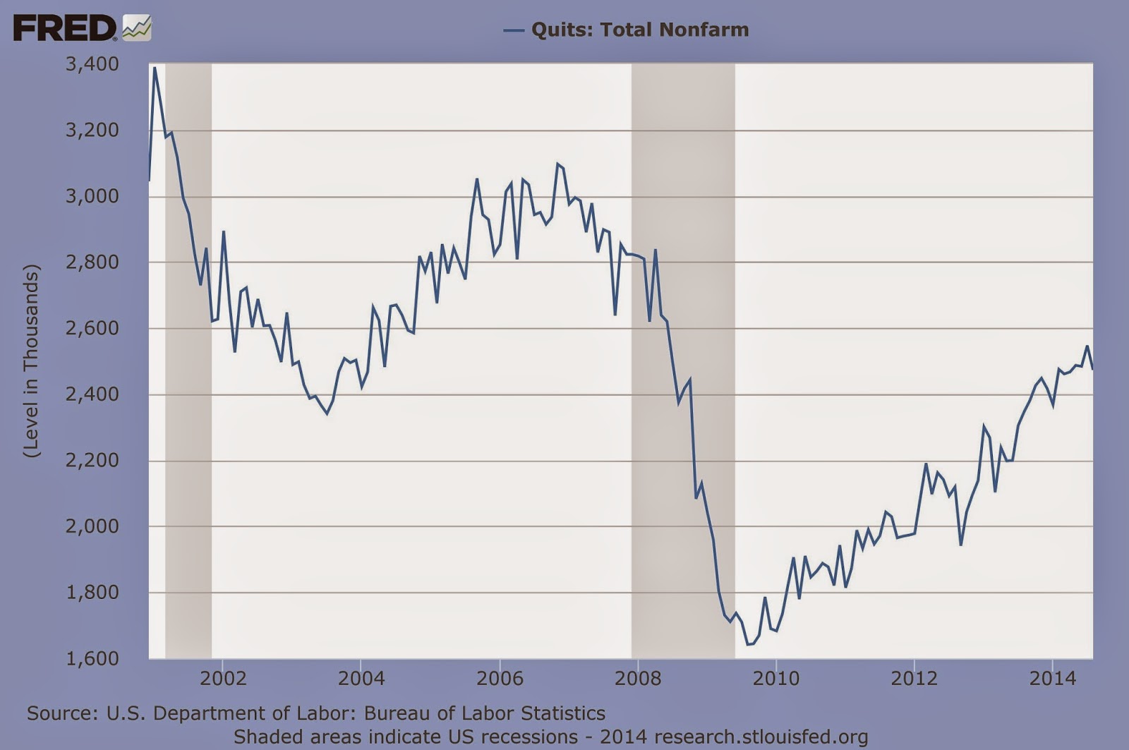
And here's what has been happening to quits. As you can see, quits drop sharply in tougher times: people are less prepared to risk leaving what they've got, plus there are fewer opportunities to move to. Interestingly, from this perspective, the US labour market hasn't yet got back to its buoyant pre-GFC level of quits.


And that's not because the opportunities aren't there. As the graph below shows, the number of job openings (red line) has actually just climbed back to its pre-GFC level. Actual hires, though (blue line), haven't quite got back there.


Overall, you'd say that this adds up to a positive picture. The haemorrhaging of layoffs has dropped to relatively low levels, and the number of job openings (which I'd take as the most forward-looking indicator in all of this) is back up at a robust level, though there seems to be some residual caution on both the employer (hires) and employee (quits) sides of the market. You don't get anything like the same degree of insight from the monthly new jobs number, or the monthly unemployment rate.

I think there's a good case for having the same sort of insight into our own labour market. I'm pretty sure that we don't have these American-style gross statistics (I did have a quick re-look at the Quarterly Employment and Household Labour Force surveys, and couldn't find them, but if I'm wrong, no doubt someone will put me right).

Yes, we know (say) what the total number of filled jobs was each quarter, so we know what the change in jobs was from one quarter to the next. But we don't know if a 10,000 increase in jobs was down to 10,000 hires, no quits, no sackings, or 100,000 hires, 60,000 quits and 30,000 layoffs. And I'm not sure you can make a good enough fist of either tracking the economic cycle or devising labour market policy without some clearer sighting of those gross flows.

We're even more in the dark on job openings (in US terminology) or vacancies (ours). That's not to knock MBIE's vacancies index (latest reading shown below), which is a useful macroeconomic indicator in its own right. But it's an index, of the main online job ads only, and not the sort of 'ask the employers directly' numbers the US collects.


I'm just about the last person who'd wish an extra or unnecessary burden on Stats - I've been up close and personal with them for a long time, and I know the pressures on resources - but I'm starting to think we could do with better tracking of the dynamics of our labour market. And we could probably do it cheaper than the Americans do, as we're more adept at re-using 'administrative data' (like the IRD's) that's been collected already for other reasons (the Americans use a separate standalone survey).

As it happens, it looks as if Stats think so, too. I dug out Stats' list of the important Tier 1 statistics (background here, list itself here as a pdf). 'Job and worker turnover' is listed as a currently produced Tier 1 statistic, though I'm not sure the 'turnover' part is comprehensive and I reckon this could usefully be expanded on JOLTS lines. MBIE's vacancies index was recently made a Tier 1 statistic, but is not yet anything like a full headcount of job openings. And layoffs, unfortunately, is on the long finger: 'redundancies' is at the research stage, with no decision thus far on how often the data might be collected, or when the exercise might start.

In sum, we know that the JOLTS data give us much better understanding of the US economy; we can be pretty sure they'd do the same for us if we had their equivalents; and we've agreed that they should be on the Tier 1 list. Maybe time to get on with it?

Wednesday 15 October 2014

Three decades later, still bonkers

Last week the Australian Productivity Commission came out with a couple of reports, on the Aussie dairy trade (pdf) and on Aussie retailing (pdf). I wrote up the dairy one because it had various angles relevant to us, notably some discussion of our Fonterra-centred industry structure, a good smackdown of the 'national champions' idea, and some useful analysis of the economics of the global dairy trade.

I've only just got round to taking a squizz at the retail report, and it's equally good. It points out, for example, that a lot of planning/zoning regulation can be both inefficient and anti-competitive, and that there's a reasonably straightforward path to fixing both problems:
Two reforms have been identified as being of particular importance: first, the need to
reduce the number of business zones and increase the permissible uses of land (to reduce
prescriptiveness) within these zones; and second, to remove consideration of the effects on existing individual businesses from the approval process for development applications (to avoid anticompetitive outcomes) (p11)
The Commission is strongly of the view that state, territory and local governments can
assist consumers and the retail sector by developing and applying zoning policies that
ensure the areas where retailers locate are both sufficiently large (in terms of total retail
floor space) and sufficiently broad (in terms of allowable uses, particularly those relating to business definitions and/or processes). This would allow new and innovative firms to enter local markets and existing firms to expand (p11)
As an example of how those reforms would work, the Commission had heard submissions about high rents being charged to retail outlet tenants by shopping centre owners, and while it noted that following best practice in leasing wouldn't be a bad idea, it also found that "the root cause of most retail tenancy lease problems are unduly restrictive planning and zoning controls that limit competition and restrict retail space, particularly in relation to shopping centres. Addressing the latter would also resolve many of the problems in the retail tenancy market" (p12).

More generally, the report got me thinking about how far Australia, and New Zealand, have got with pro-growth, pro-efficiency, pro-competition deregulation. Because, as this report found, despite years and years of economic reform, there are still thickets of regulation that are absolutely bonkers.

Three examples. I'll let them speak for themselves, other than to note the Aussie Commission comment (p113) that "In many cases, these [trading] rules are anachronistic and have no apparent rationale".

Here's a map of trading hours regulation in Western Australia (p7, repeated on p113).


And here's a decision tree on whether you're allowed to open for business in Australia on Easter Monday (p114).


And here's what Woolworths discovered about trading rules in Western Australia for its Masters Home Improvement Stores (which are like Mitre 10 or Bunnings Warehouse megastores):
in Western Australia, regulations prevent Masters Home Improvement stores from trading in line with the hours enjoyed by other hardware stores. To be eligible to trade as a ‘domestic development shop’ Masters must only sell those goods that are prescribed by the Retail Trading Hours Regulations 1988. The regulations prescribe a list of what a ‘domestic development shop’ can sell, which gives rise to all sorts of inconsistencies and anomalies. The regulations allow the sale of:
• light bulbs but not light fittings
• outdoor lighting but not indoor lighting
• kitchen sinks but not dishwashers
• wood-fire heaters but not gas heaters
• indoor television antennae but not outdoor television aerials (p10)
I suppose the good news is that both Australia and New Zealand now have Productivity Commissions that are able to turn over the flat stones and tell us what they're finding underneath, and there's the occasional one-off inquiry like Australia's recent Competition Policy Review that has been doing the same thing (have a read here in particular). It's good to know that there's still some kind of following wind to keep the momentum of reform going.

But isn't it strange, and a bit dispiriting, that after the best part of 30 years of progress in both countries, we're still lumbered with this kind of malarkey. And while I suspect we may not be as bad as the Aussies on most shop regulation (though I could be wrong about the  Easter trading, where our regime is probably as chaotic as theirs), I wonder what we'd find if, for example, we turned over some flat stones of our own. I wonder what's underneath the occupational qualifications one?

Monday 13 October 2014

Did we lose the fiscal plot?

I've been engaged in a bit of tweeting to and fro about the rise in New Zealand's government debt in recent years, and what's behind it.

The background is that there's been a fair bit of political point-making going on about the large rise in debt on National's watch, with some people arguing that National seems to have got the kudos for responsible economic management while simultaneously presiding over a very large rise in government indebtedness.

Personally I don't care for or about the political point-scoring, and my take on it is that practically any New Zealand government, of virtually any political persuasion, would have ended up doing what National found itself doing - supporting the economy in the grim days after the GFC hit, and paying to rebuild the infrastructure destroyed by the Canterbury earthquakes. And there would have been a lot of completely appropriate questioning along the lines of 'have you forgotten the lessons of the Depression', and 'does the name John Maynard Keynes mean anything to you', if there hadn't been that support. I don't reckon there was a great deal of policy leeway for any incumbent government in these very unusual circumstances.

But it's kind of hard to make any kind of fact-driven argument in 140-character bursts, so I thought I'd take a bit of space to deal with one strand of the debate, namely how much of a fiscal boost did the government provide to the economy in the wake of the GFC.

Here are Treasury's estimates. They come from the 'Additional Fiscal Indicators' document which was part of the 2014 Budget Economic and Fiscal Update. The 'fiscal impulse' shown in the graph is the size of fiscal policy changes, measured by changes in the true underlying surplus or deficit, when you've taken out any cyclical effects affecting it. Bit of a mouthful, I know, but there you are.

What is shows is that there was a big boost to GDP, of the order of 3.5% of GDP, in the year to June 2009, and another fairly sizeable one, of about 1.75% of GDP, in the year to June 2010. In money terms, that's about $6.5 billion in the June '09 year, and about $3.4 billion in the June '10 year. Call it a round $10 billion or so for the whole package (you could probably add in a little more for another bit of fiscal support in the June '11 year). Formally, yes, $10 billion worth of fiscal boost occurred on National's watch over the two years, but I think it a very high probability that something similar would have happened - and should have happened - no matter who was at the helm.


But there's another way to see what might have happened if someone else's hand was on the tiller, and that's to look at what other governments did in exactly the same situation. So I've rounded up a bunch of the usual suspects and I've calculated the same 'fiscal impulse'. These data come from the IMF's World Economic Outlook database. Positive numbers are fiscal tightening, negative numbers are fiscal loosening.


You'll see that nobody was doing a lot in 2005, 2006 or 2007. Then fiscal policy gets loosened a good deal in 2008 (we're in the middle of the pack), even more again in 2009 (we're again in the middle of the pack), and generally was loosened a bit more in 2010, where we let it rip a bit more than the others. You'll note, incidentally, that at that point the UK took the 'austerity' route (a big fiscal tightening).

Over the three worst GFC crisis years, 2008-10, our cumulative fiscal boost was 6.7% of GDP, in the same ballpark as Australia's 6.1%, and a bit more than America's (5.6%) or Canada's (4%). The UK had chosen a completely different tack, and was taking back support in 2010, so its cumulative boost was least, at 3.1%.

Bear in mind that these numbers, while looking precise, are very spongy indeed (as even their creators will tell you), so they only tell a broad picture story, and the overall story is that everyone loosened fiscal policy, and everyone loosened appreciably, with us and Australia doing a bit more of it than the others. On the other hand we clawed back a good deal more than everyone else in 2012, so there's not a lot in it over a five year view (ex the UK). All of us took a distinctly Keynesian tack. So it's kind of hard to argue that there was something distinctively National about our absolutely typical response. Ditto if it had been Labour at the wheel.

Finally I came across a nice picture of US fiscal policy, for those of you who like graphs more than tables of numbers. It's from the Hutchins Center on Fiscal and Monetary Policy at the Brooking Institution. They call it their 'fiscal barometer', and you can see the original graph and read about the methodology here. It's a broader measure than the 'fiscal impulse' calculations mentioned thus far, so the numbers tend to be a bit bigger when it comes to measuring the fiscal impact. You want to look at the dark blue line.


You'll see that in 2007 US fiscal policy was not adding to GDP at all, shifted to a boost of around 1% of GDP by the end of 2008, to a boost of around 2.5% by the end of 2009, and peaked out at around 3% of GDP in 2010. That's a total of about 6.5% of GDP - pretty much identical to our cumulative fiscal impulse over the same period.

Look at it any way you like, the answer keeps coming up the same. A lot of countries, hit with the same sort of shock, responded in much the same way and to much the same extent, and appropriately so. The colour of the political rosette on the incumbent's lapel generally didn't matter a damn, except later in the piece in the UK. There was nothing unusual about our part in the proceedings.

Three strikes, and you're - still going....

In a previous post I mentioned that Australia's Competition Policy Review had put a torpedo into the side of 'national champions' - requiring or allowing mass consolidation of an industry to produce what will supposedly be a more internationally competitive player.

And last week, I'm pleased to say, the drifting hulk took another blow as Australia's Productivity Commission got it amidships with another one.

The occasion was the Commission's report on dairy manufacturing (pdf) - the latest in an industry series on 'Relative Costs of Doing Business in Australia'. There's lot of interesting stuff in the report, including the short but informative Appendix B down the back on 'Economics of dairy markets',  but for me the highlights were the bits where the Commission responded to submitters arguing that Australia should go the Fonterra route (these are all on p3):
the Australian dairy industry is a price taker on global markets and has no capacity to alter this, irrespective of the structure of the industry. A belief that any single Australian dairy company could exert market power is not consistent with market realities
the emergence of a dominant manufacturer is not a prerequisite for developing distinctive Australian branding for dairy products
there are potential risks associated with highly concentrated industry structures if the overall performance of the industry is linked with one company
Fonterra-like arrangements are not necessary to ensure that scale benefits at the plant level are realised — indeed, there is considerable evidence that Australian dairy manufacturers are taking advantage of scale benefits where it is profitable
And the Commission wrapped it up on p8 with this:
...industry participants are best placed to balance the various tradeoffs and commercial considerations they face (such as between scale and transport costs). Other than where legitimate competition concerns are relevant...the most beneficial dairy industry structure for Australia will be determined by the market place. Attempts by governments to ‘second guess’ market outcomes to achieve a particular industry structure are fraught with difficulty, and likely to impose net costs on the industry and the community more generally. It does not require much imagination — or experience with price setting by government — to envisage highly problematic judgements in setting an Australian price (or prices) for guaranteed domestic milk supply, as occurs today in New Zealand.
The Commission also quoted (pp115-6) from a recent speech by Rod Sims, the head of the ACCC, where he said:
We are seeing a return to calls for ‘national champions’ in Australia. It is, of course, terrific when companies out compete their rivals and take on the world. The concern is when they call for restrictions on competition at home so they can better compete on the world stage. The argument is a contradiction: if you cannot beat your rivals at home how can you hope to do so overseas? Firms involved in cosy duopolies or oligopolies in Australia are unlikely to succeed on the world stage.
So it looks as if the old rustbucket SS National Champion has now taken three hits in a row. Unfortunately, if past experience is any guide, it will manage to struggle back to port, get patched up, and in due course set out again on another hopeful journey.

Thursday 2 October 2014

No national champions, please

In earlier posts (main one here, follow-up here) I've commended the wonderful work done by Australia's Competition Policy Review. They've systematically taken a pro-consumer, pro-competitive approach without wandering off piste into anti-business populism.

They didn't get stampeded, for example, into "doing something" about the concentrated Aussie grocery business, noting that "While concentration is relevant, it is not determinative of the level of competition in a market...competition between supermarkets in Australia appears to have intensified in recent years... consequently, few concerns have been raised about prices charged to consumers by supermarkets" (p181). If there are issues of the big supermarkets strongarming their suppliers ("unconscionable conduct" in Aussie competition-speak), well they are before the courts, "where they are best considered" (p182). And if the arrival of the big chains tended to deal to the traditional mom-and-pop high street shops, "Undoubtedly these changes can damage individual businesses. However, consumer preferences and choice should be the ultimate determinant of which businesses succeed and prosper" (p183), and "While the Panel is sensitive to these concerns, they do not of themselves raise competition policy or law issues" (p184).

Along the way I wrote about some of the ridiculous anti-competition regimes that the Policy Review uncovered - notably Western Australia's bizarre potato regulations and New South Wales' monopoly organisation of the rice market, and I had some reader feedback that perhaps here in New Zealand we weren't much better, given the way we've allowed the creation of Fonterra.

As it happens, the Aussies looked at the "national champion" issue, too, and again took the pro-competition road. They had a bit (Box 15.1 on p196) specifically about Fonterra, and said that it wasn't in fact the kind of "national champion" monopolist that some Aussies were promoting. "The [Fonterra establishment] legislation included provisions and obligations on Fonterra designed to provide for domestic competition and prevent harm to consumers and farmers as a result of the merger. Concerns were raised that the farm-gate price would be depressed due to Fonterra's dominance as a buyer. These were addressed through a combination of regulation and incentives...To achieve domestic competition in the sale of milk products Fonterra had to divest several brands to competitors and is obligated to supply them on competitive terms". And they quoted Bill English as saying, "Sometimes they think in Australia that we've got a monopoly and it works, but we don't and having one doesn't".

Then they turned to the general issue of whether creating "national champions" is a good idea, as there's always someone lurking with a cunning plan along those lines (our meatworks industry is a plausible candidate for the next one). As far as I'm concerned, these next couple of paragraphs (from p195) ought to be carved in stone and erected outside any government departments or agencies thinking about going along with a bit of "national champion" industrial planning. The added emphasis is mine.
From time to time there are calls for competition policy to be changed to allow the formation of ‘national champions’ — national firms that are large enough to compete globally. While the pursuit of scale efficiencies is a desirable economic objective, it is less clear whether, and in what circumstances, suspending competition laws to allow the creation of national champions is desirable from either an economic or consumer perspective.
Porter and others have noted that the best preparation for overseas competition is not insulation from domestic competition but exposure to intense domestic competition. Further, the purpose of the competition laws is to enhance consumer welfare through ensuring that Australian consumers can access competitively priced goods and services. Allowing mergers to create a national champion may benefit the shareholders of the merged businesses but could diminish the welfare of Australian consumers.