The Economist's Free Exchange column last week had an article (based on IMF working papers) on 'Inequality v growth' that has got a lot of coverage, partly because of its conclusion that "Up to a point, redistributing income to fight inequality can lift growth". It's been picked up locally: Brian Fallow at the Herald can always be relied on to be up with the play, and has been again with his article today, 'Playing politics with poverty hides truth', with the (characteristically) evenhanded assessment that "Both the Left and Right are too quick to push ideas about inequality that don't stand up to scrutiny". And various local bloggers have also been on the case, including Anti-Dismal, Groping towards Bethlehem, and The Visible Hand in Economics.
I have to admit that income inequality in New Zealand is not anything I've looked at closely before, and I'd never consulted the Standardised World Income Inequality Database, or SWIID, created by Professor Frederick Solt at the University of Iowa, which has provided the basis of much of the recent analysis of links between inequality and other economic outcomes. You probably haven't either, so I thought it might be useful to lay out the bare facts of what the data show. People can argue about causes and consequences afterwards.
Here's just over 50 years (1960-2012) of income inequality in New Zealand, as summarised by the Gini coefficient, in two flavours - one based on market incomes, and one (arguably the more important one) based on net incomes after the impact of tax and transfers. As you'd expect, the post-tax, post-transfer level of inequality (green line) is less than the pre-tax pre-transfer level (red line) because of the progressive nature of the combined tax and transfer system.

You can see the trends for yourself. Eyeballing the thing, the only vaguely analytical comment I'd make is that the tax/transfer system didn't seem to be very strongly redistributive up to the mid 1980s, though my memory of it was of very high marginal tax rates back then, but it obviously had a much larger redistributive impact in the 1990s. The SWIID database includes an estimated percentage reduction in market income inequality due to taxes and transfers: in the mid 1970s it was about 7-8% of the pre-tax inequality, but in the mid 1990s it was more like 18-20%.
Gini coefficients aren't the only way to look at inequality: if your interest lies in what's happening at the megarich end of the income distribution, the SWIID also includes the share of pre-tax income going to the top 1% of taxpayers. Here are those results: they show broadly the same overall pattern.

Out of idle curiosity I wondered what had happened across the ditch, so here are the same two Kiwi Gini coefficients (still red and green), plus their Aussie equivalents (darker and lighter blue).
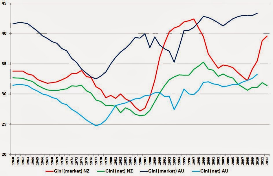
No doubt everyone will see the patterns they want to: for what it's worth, I'd conclude that, in general, the Aussies have more unequal market incomes than we do, but their tax/transfer system is generally a lot more redistributive, so the net Gini coefficients aren't too different. There are timing differences: inequality (gross and net) started rising in Australia a good decade before it did here. And there's a difference of substance: inequality is still likely rising in Australia (though their data stop at 2010), whereas at least on a net basis it's heading down here at home (I wonder what's caused that fairly sharp rise in market inequality in the last couple of years in NZ?).
A hopefully helpful technical note: if you download the SWIID data to have a look yourself, you'll find yourself starting here. Where it says '2. Data', check the box beside 'SWIIDv4_0.zip'. When you've downloaded the zip file and unzipped it, you'll find that the data is mostly designed for two statistical packages, Stata and R, but do not despair if (like me) you're only going to use Excel. In the directory you've unzipped into, you'll find an Excel-compatible .csv file called SWIIDv4_0summary, and you're home free. By the way, for some mysterious reason there are no NZ values for 1961, so in the chart above comparing NZ and Australia I've created 1961 by averaging 1960 and 1962.
No comments:
Post a Comment
Hi - sorry about the Captcha step for real people like yourself commenting, it's to baffle the bots