Thursday, 15 May 2014

The Budget - a big picture view

It's Budget day, and here I'm going to be concentrating on some of the more important issues that may not get the coverage they should. So I won't be spending much time on the headline policy items, which will be well covered by mainstream media, and in any event I'm part of a communal economists' Twitter project (look for #NZ14) which will be reporting on each item as it is announced in Bill English's Budget speech in Parliament. If you want the breaking news and analysis on the big spending initiatives in the likes of education and health, head over to them.

I will mention, though, some smaller  individual items that rang my bell - notably money to accelerate Auckland roading projects (though I note that the 'compared to the non-accelerated timetable' info has been left out), the abolition of cheque duty ("a relic from a bygone age"), more money to tackle kauri dieback disease, and the temporary (and I'd argue for permanent) removal of all duties on imported building products. "Reducing the barriers to competition ensures we have a more competitive market. This reform will reduce costs for residential business construction" says my old mate from the BNZ, Commerce Minister Craig Foss, and he's 100% correct.

Back to the big picture.

First, the economic outlook. Treasury's forecasts look reasonable enough: they show that in the year to this June, GDP will have grown by 3.4%, and in the June '15 year will accelerate a bit more, to 3.9%. The year to June '16 is expected to be pretty good too, with 2.6% growth, and by March '16 the unemployment rate is expected to be down to 5.1%. All good: the big issue is what we do for an encore after the earthquake rebuild and after (if?) world commodity prices ease off. Real GDP growth in the 2018 and 2019 years is forecast to be only 2.1-2.2%, a growth rate that will see us slipping down the OECD standard of living league tables if we don't raise our game to something better.

Next, one of the biggest questions to ask of any Budget: how much of the headline movement in the fiscal balance is down to purely cyclical influences, and how much is the genuine underlying position? For which, as I said on Wednesday about the Aussie Budget, you need what some people call the structural balance (as the Aussies do) and what some people call the cyclically adjusted balance (as we generally do). It aims (with considerable imprecision, but never mind) to strip out those cyclical impacts. Is the $372 million fiscal surplus forecast for 2014-15 a 'real' surplus, or is it just an artefact of higher tax revenues in a couple of cyclically strong years?

Here's the cyclically adjusted balance (you can find the original, and the discussion on how it's calculated and its virtues and vices, in the 'Additional Fiscal Indicators' section of the 'Additional Information' addendum to the Budget and Economic Fiscal Update) .


On this showing, the headline numbers and the real underlying position are not that different, so yes, you'd conclude, we're looking at a real track towards surplus rather than smoke and mirrors artifice derived from the current business cycle. But at the same time there's one important qualification to make. If you assumed that our terms of trade were back at their average level of the past 30 years, rather than the current situation where we are enjoying very high export prices, the surpluses vanish, as the chart below shows. 


We'd be improving our position - the deficit would be falling in more normal commodity conditions - but we'd still be in deficit as far as the forecasting eye can see. Not good. Of course, demand from China (or wherever) might keep prices high for a long time, and we mightn't see that relapse back to how things used to be. But if you assumed that there is still a degree of potential fragility to the fiscal outlook, you'd probably be right.

Before the Budget, a lot of people  wanted to know, if a surplus is on the cards, how will it be used - more spending? lower tax? lower debt? some combo? We didn't get all the jigsaw puzzle  today, but we get some of the bigger pieces. Lower debt looks the most favoured. That's partly because there's a new fiscal objective: "After net debt has gone below 20 per cent of GDP, the Government intends to manage this debt within a range of 10 to 20 per cent of GDP over the economic cycle". I gather there was some debate in officialdom over this formulation, but I'm all for it. It's customary these days to formulate the aims of monetary policy, for example, in terms of some average target over the business cycle, and I think it makes equal sense to do the same on the fiscal policy front.

There was  some increase in spending (an extra $1.5 billion contingency for the 2014-15 year, $500 million more than in 2013-14, and rising by 2% a year thereafter), but not a lot of enthusiasm for it, and Bill English produced some Treasury analysis showing that an increase of more than $500 million would risk pushing up interest rates and the exchange rate. From Bill's political perspective, his reference to the Treasury work helps to undermine any Opposition plans to spend more, but Treasury's analysis makes sense on its own terms. Even this modest $500 million, Treasury figured, would lead to some unhelpful outcomes. "Lifting future operating allowances by $500 million per Budget would have an OCR [Official Cash Rate] impact of around 15 to 30 basis points for higher government spending and around 10 to 20 basis points for lower tax revenue. The interest rate impacts are unlikely to be felt immediately, but rather over the next four or so years as the fiscal impulse is injected. The real exchange rate would be higher than otherwise by around 0.5 to 1 percent for around 3 years. Exports would be lower than otherwise by around 1 to 2 percent (0.4 to 0.6% of GDP)".

Overall, I'd say that working debt down came out ahead, with a kick for touch on other priorities, as one of the Budget  handouts said more or less explicitly: "This is a moderate [spending] increase that will provide the Government with future options around investment in public services and modest tax reductions".

Finally, I'd say that modern Budgets are hugely more informative and transparent than they used to be. I may have said this before - as I write, I'm in the Budget analysts' lockup, and under the embargo I can't access my blog posts on previous Budgets - but in the '80s and '90s, analysing a Budget was like one of those nightmares where you're in an exam hall and the test paper has questions on a subject you've never studied. Budget analysts were under severe time pressure to find that year's concealed bit of financial or accounting trickery. These days, we may or may not agree with the policy decisions, but at least we've been given the data to be able to make the call. Thanks, too, to the always helpful Treasury staff who answer sometimes recondite questions in the lockup with tact and skill.

Wednesday, 14 May 2014

The key to yesterday's Aussie Budget

Yesterday's Aussie Budget has naturally had huge media coverage - my favourite (pictured opposite) is this gloriously OTT, but accurate, summary from the tabloid Herald Sun - but in all the publicity there has, as usual, been far too little attention given to what I think is the most important set of numbers in the whole thing.
That's the estimate of what is happening to Australia's structural fiscal balance - what the fiscal balance looks like when it is shorn of good year effects (tax revenue relatively high, welfare assistance relatively low) and bad year effects (lower tax take, higher assistance spend). It's the only way of knowing, for instance, whether politicians have spent up large in the boom times, leaving a financing problem for their successors in more normal times.

Now, I'm aware that making the structural balance calculation is, to put it charitably, an imprecise exercise, and some might even call it outright ropey. I've seen estimates of the underlying fiscal balance in the Eurozone economies, for example, that looked bonkers. As the Australian Treasury wallahs put it in their sobersides way, "Structural budget balance measures are sensitive to the assumptions and parameters underpinning the estimates...Due to the sensitivity of estimates to assumptions, it is best to consider a range of structural budget balance estimates based on plausible assumptions for the underlying parameters as one element of a broader assessment of fiscal sustainability".

Health warning duly noted, here's the structural picture for Australia (you can find it for yourself towards the bottom of this page).


The solid line is what you're interested in, and (as the health warning advised), there's a range around it, with the bottom of the range corresponding to Australia's terms of trade being around their long-term level, the top of the range corresponding to the terms of trade staying around the unusually high level of the past decade or so, and the solid line itself based on the Aussie Treasury's forecast for the terms of trade over the next few years.

What this shows is a remarkable turnaround from the small structural surpluses of the Howard years to sizeable structural deficits in the Rudd/Gillard/Rudd years. They weren't drunken sailor, Irish or Greek style deficits, sure, but they weren't small potatoes, either. And you can understand some of the motivation: there's probably some entirely appropriate countercyclical stuff thrown in there to help ride out the GFC, that would have been reversed in the fullness of time. But you're also left with the impression that the structural balance has indeed found what it is able to detect - a government spend-up in the Aussie resource boom that was more than could be paid for in more conventional economic conditions.

Monday, 12 May 2014

Let Stats know what you think

If you haven't noticed before, Statistics New Zealand has a nice little feature (shown below) where they ask you for feedback on their write-up of the latest data releases.


Could I encourage people to use the feedback opportunity? Not every statistical agency bothers to ask - quite a few, in fact, just chuck the stuff out, with rather mechanical boilerplate commentary - so it would be good if Stats' efforts to survey user needs got a decent level of take-up.

One issue in particular that tends to come up in this context is how much interpretation Stats should do of what's going on in the data. Those down the more purist end tend to believe official statistical agencies should shy well away from any kind of commentary that might be seen as judgemental, while those down the more flexible end (including me) think there's room for statistical agencies to add some more value for users than they typically do at the moment. If you've got a view, these feedback boxes are one way to get it on board.

You might also be interested in having a look at the list of what have been ranked as New Zealand's most important ('Tier 1') statistics to produce: the link is here and the list itself here.

I mention this for a bunch of reasons: many people don't know this list exists; some people won't have known about, or won't have taken up, their chance to put in their tuppenceworth on what they'd most like to see Stats producing (though obviously there has been a solid degree of consultation to derive the current priorities); and I've been struck by what looks like a high level of public interest in what Statistics does and publishes. Going by page views on this blog, the pieces I posted about Day 1 and Day 2 of the recent Statistics User Forum have attracted unusually high levels of interest - even more than a somewhat provocative piece on foreign ownership of housing - so what Stats gets up to appears to be important to a wide range of people. Which is all the more reason to use Stats' open door policy on user feedback.

Chorus's conundrums in a single chart

There was a nice graph in Chorus's latest half year investor presentation (links to it here, download here), which I've reproduced below (it was tucked away at the back in Appendix B on p39). Note that the vertical axis starts at $30, which has the optical effect of making the $34.44 price look very low indeed. I'm not being critical - I use non-zero vertical axes all the time, I usually don't bother with that squiggly little sign we're supposed to use to indicate a non-zero start, and I'd likely have started the axis at $30, too - but just be aware that's how the graph comes out looking.


If you ever wanted a very simple explanation of Chorus's various predicaments, here it is.

First of all, the Commerce Commission's proposed drop in the wholesale copper-based internet access price means that Chorus stands to lose a slug of revenue, revenue which it says it needs to keep rolling out the ultra-fast fibre-based broadband network to the planned timeframe.

And second, the drop in the copper price upsets the nice relativities between copper and fibre that Chorus (and the government) had been counting on. Swapping copper ($44.98) for faster fibre (only $37.50) would have been a no-brainer. Trading up from cheaper copper to more expensive fibre is less obviously a great deal.

But I'm still largely unmoved by Chorus's plight. From a demand side perspective, the Commission's lower copper price stacks up as it should: you'd think the older, slower technology ought to be priced less than the new whizzbang one. From a supply side perspective, I'm pretty sure that the old $44.98 for copper was well above cost, thanks to (a) Telecom-as-was rarking up the line rental year after year in line with the CPI and (b) the impact of substantial depreciation of the copper network on the revenue stream required to earn Chorus its fair rate of return on capital invested.

I hadn't thought too much about the proposed pattern of fibre pricing but looking at the graph I was struck by the large price premia heavy fibre users are expected to pay - which, as I've noted before, imperils the innovative uses that underpinned the case for a national fast fibre network in the first place - and by the odd pattern of the falling high-speed price and the rising slower-speed price.

Maybe there's something in the engineering or the economics that says this is how things ought to play out, but damned if I know what it is. Until put right by people who know better, I think I'm going to assume that these prices are not as fully cost-related as they might be, either.

Friday, 9 May 2014

People have looked at the labour market, and like what they see

Wednesday's employment data were very strong, confirming that the economy is in good shape, although there were some predictably inane comments from the political sidelines trying to suggest it isn't really happening, and mostly focusing on the unchanged unemployment rate (6%).

In fact, the unemployment rate stayed the same not because employment isn't growing - it is, and strongly - but because large numbers of people have moved into the labour force, encouraged by the improved likelihood of getting a job in this improved economy, even if they haven't landed one quite yet.

This rise in the "participation rate" isn't always and everywhere necessarily a good sign. You could imagine, for example, that in tough times, when one partner in a relationship loses their job, the other partner rallies to the cause and stops (say) child-minding or home-running and moves into the labour force as well, to try and help find some replacement source of income. The kids could be drafted, too, to start looking for part-time or full-time work. The participation rates goes up, with both partners and maybe the older kids, all now looking for work in the labour market where only one was before - but out of necessity in hard times, not because the economy has improved. Tough times might, in principle, drive the participation rate up.

In reality, though, it doesn't work that way at an aggregate national level (though there may well be individual families in the 'driven to it' position). A rising participation rate is reliably correlated with improving economic conditions, as the graph below shows for New Zealand since 1986 (which is as far back as the online data on Statistics' Infoshare site go).


You'll note the strong rises in the good times of the mid 1990s and the first half of the 2000s, and conversely the sharp fall in the troubled late 1980s and the more modest fall post GFC. More recently, since a low point in March '13, the participation rate has been rising very strongly to record levels. People may not be the economic calculating machines that economists sometimes depict them as, but they're certainly capable of knowing  a better job market when they see one.

It's the same picture overseas, by the way: the participation rate tends to fall in worse times, and rise in better. Here's the US experience over the past half century or so.


The vertical shaded bars are periods when the US was in recession, and you can see that recessions tend to, at the least, stop the participation rising, and more usually lead to a lower participation rate. And generally good times - like the Reagan and Clinton eras - see the participation rate go up. You'll also note why some people reckon the US economy is still fragile - this far past the GFC, you'd expect the participation rate to have turned for the better, but at most it's stabilised, and certainly isn't clearly on the up yet. Evidently there are a lot of people in the US who are still pessimistic about their chances of finding a job.

'FRED' in the graph, by the way, is the Federal Reserve Economic Database hosted by the Fed of St Louis, which is free to access and holds a treasure trove of US data.

It's not just the US that we stack up well against, either. In the Stats data on the household labour force survey, there's this comparison of unemployment rates across the OECD.


Not bad, is it? As developed economies go, we're doing pretty well in a world economy that's still a bit sub-par in terms of its economic growth rate. Incidentally, you can also see why President Hollande's party got slaughtered in the recent municipal elections: there's only Slovakia and the 'PIIGS' to the right of France in this graph.

If there's anything slightly troubling in the latest data, it's the NEET rate - the 'Not in Education, Employment or Training' rate for 15-24 year olds. This is an important social indicator, as - for their and our sakes - we don't want a large group of alienated, unskilled, unemployed young people, and thus far, as I've noted before, we're a bit worse than the average OECD country on this score. Here's the latest data: hopefully the uptick in the NEET rate in the March quarter is an aberration (there's a fair bit of random volatility in the data) and the generally improving trend will reassert itself from June onwards.


I'm pretty sure both our relative and absolute performance is indeed going to improve further over the next few quarters: the participation rate can't go on climbing indefinitely, and any slowdown is going to see the strong demand from employers translate straight into a lower unemployment rate - possibly much lower. The most recent (March) set of consensus forecasts collated by the NZIER had the unemployment rate dropping to 5.4% over the next year and to 5.1% in the year to March '16, and there are even some especially optimistic souls in the forecasting community who see it going below 5% within the next twelve months.

Wednesday, 7 May 2014

Should we jack up the minimum wage?

I was reading an article in the always interesting Slate magazine - it's been published under various titles, but the one I like best is 'Jobless in Seattle' - about plans by the current Seattle mayor to raise the minimum wage in the city to US$15 an hour, when I came across the graph shown below. It shows that New Zealand has a relatively high real minimum hourly wage* by OECD standards, which is partly to be expected as we are down the wealthier end of this group (you'd expect our minimum wage to be well above that in the likes of Mexico and Turkey), and party a bit of a surprise, as you might wonder why ours is higher than the UK's or Canada's. The Slate article helpfully included a link to the source OECD data if you'd like to have a hands-on look for yourself (if you go there, you might have to change the display from 'annual' to 'hourly' to get the data graphed below).


I'm sympathetic to poverty and inequality reduction objectives, but even so this graph left me with the impression that we ought to be a bit careful about pushing on with further substantial rises in the minimum wage as a way to achieve them, and more careful still about introducing the 'living wage', which on the calculation by Living Wage Aotearoa New Zealand is $18.80 an hour and which Wellington City Council has already adopted. As Treasury noted in a report on the living wage last year, the minimum wage has been rising fairly rapidly (first graph below), and the living wage proposal would be very much at the high end of similar initiatives overseas (second graph below). In the second graph, in the left hand box Treasury uses spot exchange rates to make the comparison, which is conceptually not the best thing to do, so the right hand box is a better guide.


Whether to press the minimum wage button harder or not is currently one of the livelier topics in policy circles, as the two excellent articles cited in the Slate piece explain - "Should We Raise the Minimum Wage? 11 Questions and Answers", and "Liberals Need to Think Beyond the Minimum Wage", both from the online version of The Atlantic magazine. I'm down the mildly sceptical end of the spectrum of views myself, partly because I'm not sure all the downsides of high minimum wages have been counted, over and above the obvious one of shutting some lower-paid out of employment.

But more importantly I'm not sure interventions in the labour market are the best way to achieve these kinds of social objectives. I don't mind some minimum standards to prevent opportunities for ratbag exploitation, but I think we're better off letting the labour market work on its own, and then try and fix any resulting problems through the tax system, as we do with the likes of Working for Families. And I'd be loath to introduce any more distortions to the labour market, when we're starting from such a good starting position of a clean, undistorted system.

Here is the OECD's recent calculation of the 'tax wedge', which is "a measure of the difference between labour costs to the employer and the corresponding net take-home pay of the employee". For example, an employer might offer a job on a salary of $60K a year, and a jobseeker might take it, but the employer's cost could be $70K after adding in the likes of payroll taxes or social security contributions, and the employee's take-home will certainly be less, mainly through income tax but also possibly through social security deductions. Ideally, smaller tax wedges are better than larger.
Here's how New Zealand stacks up.


So far we've done a very nice job, relatively speaking, of leaving the labour market alone, and not making it serve a dual purpose as a social policy instrument by loading it with assorted levies. And I think we should keep it that way.

*These are 'real' minimum wages, deflated by each country's CPI and then converted into US$ at purchasing power parity rates (I've had my doubts about these PPP rates before, but they're still the best available tool for making these sorts of comparisons). I mention this in case you're trying (as I initially did) to line up the US$8.60 shown in the graph for us, with the actual minimum wage in New Zealand. At the OECD's PPP rate for 2013 of NZ$1.46/US$ (or 68.5 US cents the way we usually quote exchange rates in our part of the world), the US$8.60 translates into NZ$12.55. This is lower than the actual minimum wage in 2o13 (NZ$13.50 to March 31, NZ$13.75 for the rest of the year), because of that deflation to 2012 prices.

Friday, 2 May 2014

Two minds with but a single thought, two hearts that beat as one...

I didn't realise, when I posted some criticism  the other day of plans to restrict foreign ownership of New Zealand housing, that the New Zealand Initiative was taking a broader view of our barriers to all kinds of overseas investment. As it happens, they arrived at the same place I did, but on a much wider and more deeply researched basis. In their latest publication, "Open for Business: Removing the barriers to foreign investment", the Initiative's Bryce Wilkinson and Khyaati Acharya let rip about the illiberal and inefficient shortcomings of our Overseas Investment Act.

"The Act is not fit for purpose as it stands...No public policy case appears to have been made that gaps in other laws and regulations relating to immigration, national security, land use, takeovers, mergers and acquisitions, or competition are so serious as to justify the Act’s most costly and intrusive provisions. Any populist view that such restrictions and impositions on foreigners are a ‘free lunch’ for New Zealanders is seriously wrong. In short, the Act is seriously deficient from a public policy point of view, with a strong bias against both inwards foreign investment and New Zealanders’ property rights" (p35). And they've got a bunch of liberalising recommendations (pp37-9) to improve matters, all of which look sensible to me.

I was particularly struck by their comment, in regards to foreign ownership of land, that "the principle should be to identify precisely what it is feared that a foreign owner could do to the land with impunity that a New Zealand owner could not do with impunity". Quite. As far as I can see, much of the recent brouhaha over foreigners buying Auckland houses has been based solely on their foreignness, and not on any rational examination of what's wrong with their purchases (nothing, in my opinion).

It also occurred to me that investment liberalisation, along the lines the Initiative argue for, is exactly what you'd want to do if the latest OECD analysis of our low productivity is correct.

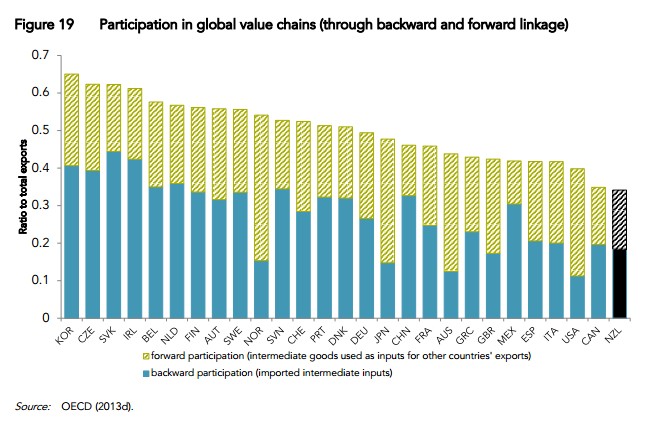
You might recall that the Productivity Commission published a report last month written by three OECD economists, "An International Perspective on the New Zealand Productivity Paradox". One of its conclusions was that we are not as well plugged into global value chains ('GVCs') as we might be: these chains are "a wide range of value creation beginning from the development of a new concept to basic research, product design, supply of core material or components, assembly into final goods, distribution, retail, after service and marketing (including branding). Participating in these segments of a GVC enables firms to capture world demand without having to develop a whole supply chain and full set of underlying capabilities" (p27), which is why they would be so handy for a smaller economy like ours. Currently, we're relatively unconnected to these global supply chains, as the chart below (from p28) shows, so we're missing out.


But as the OECD authors point out, "Participation in GVCs often involves increases in trade and FDI [foreign direct investment], which enables countries – China being a prominent example – to develop industries and narrow the technological gap vis-à-vis the world frontier over a short period of time".

What we ought to be doing, in short, is making it as easy as possible for overseas firms to operate part of these chains in New Zealand (ideally the better paying, upmarket bits). Seen from that perspective, moaning about migrants isn't just xenophobic: it's also blocking the linkages we need to build to become better off.

Thursday, 1 May 2014

How to get regulated

Last night I was the speaker at the latest Law and Economics Association seminar in Auckland with a presentation entitled, somewhat tongue in cheek, "How to get yourself regulated", or, implicitly, the Seven Things you should not do if you a major incumbent in an industry and want to avoid the whole nine yards of heavyhanded sectoral regulation. They are:

  1. Over-encourage the government to take an active role in the strategic direction of your sector (everyday government-to-business interactions are OK)
  2. Have a headstrong chair or chief executive with a "my way or the highway" approach to the industry
  3. Take a short-sighted view of the company's financial interests (where I quoted a speech I once heard Milton Friedman give, "The suicidal impulse of the business community"), ignore the potential for longer-term regulatory backlash, and in particular go over the grey line between high profitability and profiteering
  4. Take an overly legalistic, die-in-a ditch, see-you-in-the-Supreme-Court approach to disputes and issues, and buttress it with inflexible legal and economic advisers
  5. Destroy your credibility by taking inconsistent positions before different regulators in different jurisdictions
  6. Annoy influential politicians, in particular at Select Committees, and if you're still not regulated after all of that, then...
  7. Do something especially outrageous to tip the scale, where I gave the example of a recent and particularly gross case of mobile roaming charges, and the European Union's regulatory response to similar overcharging in the EU

Unfortunately we have had too many companies and industries that have fallen into at least one - usually several, and sometimes all - of these heffalump traps, with the result that we now have several regimes of very complex, very expensive, very intrusive regulation. It still amazes me that a country that has generally opted to take the lighter-handed regulatory route, and if pressed would prefer to go with some of the more modern forms of less clunky incentive regulation ("CPI minus X" and the like), has nonetheless ended up with old-style price controls of the "WACC on a regulated asset base" variety and other complex regulatory schemes like the telco "final pricing principle" cost models. For that, the regulated companies must themselves take a fair share of the responsibility: if they hadn't steadily worked their way through the Seven Easy Pieces above, they wouldn't be in the regulatory dogbox today.

Thanks to everyone who came along and contributed to a lively Q&A session, and thanks, too, to Gary Hughes of Wilson Harle who did the intro and wrapup, and especially to James Craig and the rest of the team at Simpson Grierson, who generously hosted the evening.