Here's the first one.

I've seen similar pictures over the years, and every time I do, it bothers me. Look at that 'Non-tradables' inflation line. There's a stubborn structural persistence to our domestically-generated inflation: indeed, on the RBNZ's projections, domestically generated inflation will be running at around 3-4% a year from 2014 onwards. I appreciate that a lot of the non-tradables sectors don't benefit from the large productivity gains that can occur in some of the tradable sectors (eg much more bang for your buck across all sorts of ICT and electronic gear) and which helps keep tradables inflation lower than non-tradables inflation. But you'd still wonder if there isn't a slab of the domestic economy that still feels it can jack up prices with ease, unconstrained by competition.
Here's the second one.

If the first graph left you wondering about some structural rigidities in the New Zealand economy, this one gives you more optimism about flexibility. Real wages are clearly flexible, and track the cycle closely, slowing when there's excess capacity (i.e. on the graph when the output gap is in negative territory) and picking up in better times.
Here's the third one.
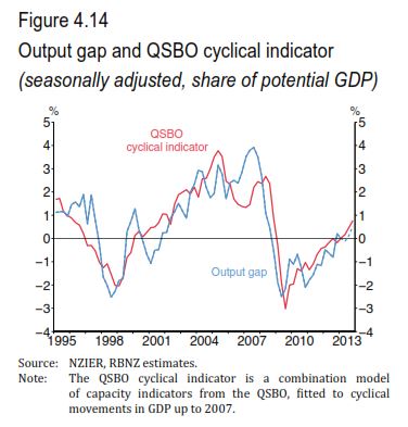
The point here is to show how useful business opinion surveys are (something I've noted before, here and here). On their surface they look very simple tools - asking businesspeople generally qualitative questions, and graphing the net balances that result (eg percentage optimistic less percentage pessimistic). And yet they systematically generate highly reliable and (I would argue) sophisticated insights into the cycle. In the graph, you've got the RBNZ's measure of the output gap, which is derived from some very fancy econometrics, and you've also got what the RBNZ calls the 'QSBO cyclical indicator', which is a combination of various capacity readings from the NZIER's Quarterly Survey of Business Opinion. In the end, they turn out to be virtually identical. The yes/no/maybe answers turn out to be just as accurate as the heavy duty econometrics.
Here's the fourth one.

This, I thought, was a nice way to illustrate the supply/demand dynamics in the Auckland housing market. The red line is the ratio of house sales to house listings, and (obviously enough) it rises when houses are selling faster than the stock of listings is, i.e. demand is growing faster than supply. And, as you'd expect, there's a strong link between this demand/supply indicator and house prices.
Here's the fifth one.

'PLT' means 'Permanent and Long-Term' migration of New Zealand citizens. And it shows some interesting patterns - we're still, net, losing people to Australia, but it's down from around 10,000 people a quarter in 2011 to more like 6,000 people a quarter now, as both fewer people are leaving and more people are coming back. And in turn that reflects (as the RB pointed out) a cyclical upswing here and a cyclical slowdown over there. More generally it shows the progressive integration of our two economies and the ability of people to make shrewd assessments of the two labour markets.
And finally there's this.

No comments:
Post a Comment
Hi - sorry about the Captcha step for real people like yourself commenting, it's to baffle the bots